
Updated on Sep. 21 2026
Current Supported Indicators
This section explains all elements available when building and testing strategies on CoinQuant.
Supported Timeframes:
Order Types
1. Market Order
Executes immediately at the best available market price.
Best used when entering or exiting a trade quickly is more important than price precision.
Key Details:
- Instrument – the asset being traded
- Side – Buy or Sell
- Quantity – amount to trade
- Order Duration (optional) – how long the order remains active
- Tag (optional) – label for tracking or categorization
Example:
“Buy 1 BTC at market now.”
2. Limit Order
Places an order at a specific price and executes only if the market reaches that price.
Best used when you want control over the exact execution price.
Key Details:
- Instrument – the asset being traded
- Side – Buy or Sell
- Quantity – amount to trade
- Limit Price – the exact price you want to buy or sell at
- Order Duration – how long the order remains active
- Post Only (optional) – ensures the order adds liquidity
- Reduce Only (optional) – ensures the order only reduces an existing position
- Tag (optional)
Example:
“Place a buy limit for 5 ETH at 1,500 and keep it GTC.”
3. Stop-Market Order
Triggers a market order once a specified price level is reached.
Commonly used for stop-losses where guaranteed execution matters more than price.
Key Details:
- Instrument, Side, Quantity
- Stop Price – price that activates the order
- Trigger Source – Last / Bid / Ask / Mark
- Order Duration, Reduce Only, Tag (optional)
Example:
“If BTC drops to 30,000, sell 1 BTC at market.”
4. Stop-Limit Order
Triggers a limit order when the stop price is reached.
Provides price control but execution is not guaranteed.
Key Details:
- Instrument, Side, Quantity
- Stop Price – activates the order
- Limit Price – price of the resulting limit order
- Trigger Source, Order Duration
- Post Only, Reduce Only, Tag (optional)
Example:
“If BTC hits 30,000, place a sell limit at 29,950.”
5. Market To Limit (MTL)
Executes immediately as a market order, then converts any unfilled portion into a limit order at the price of the initial execution.
Best used when fast execution is needed without unwanted price exposure.
Key Details:
- Instrument – the asset being traded
- Side – Buy or Sell
- Quantity – amount to trade
- Order Duration – how long the resulting limit order remains active
- Post Only(optional) – applies to the limit portion only
- Reduce Only(optional) – ensures the order only reduces an existing position
- Tag(optional) – label for tracking or categorization
Example:
“Buy 10 SOL using market to limit; execute immediately and leave the remainder as a limit order.”
6. Limit If Touched (LIT)
Triggers a limit order once a specified price level is reached.
Used when precise entries or exits are required.
Key Details:
- Instrument, Side, Quantity
- Trigger Price, Limit Price
- Order Duration
- Post Only, Reduce Only, Tag (optional)
Example:
“If BTC reaches 30,150, place a buy limit at 30,100 until noon UTC.”
Operators (Entry & Exit Logic)
Operators define how conditions are evaluated and when they trigger.
Supported Operators
- Above – condition stays true while the value remains above another
- Below – condition stays true while the value remains below another
- Greater Than – triggers when a value is higher than a defined level
- Less Than – triggers when a value is lower than a defined level
- Greater Than or Equal – condition stays true when a value is at or above another
- Less Than or Equal – condition stays true when a value is at or below another
- Between (X and Y) – condition stays true when a value remains within a defined range
- Crosses Above – triggers only at the moment one value moves from below to above another
- Crosses Below – triggers only at the moment one value moves from above to below another
- Lookback (N) – compares a value to its value from a specified number of candles ago
- Highest High (N) – returns the highest price reached within the last N candles
- Lowest Low (N) – returns the lowest price reached within the last N candles
- For N Bars – triggers only if a condition remains true for a specified number of consecutive candles
- Within N Bars – checks whether a condition occurred within the last N candles
- Wait N Bars – prevents new signals from triggering for a specified number of candles
- Take Profit (Percentage) – exits a trade once a target profit percentage is reached
- Stop Loss (Percentage) – exits a trade once a maximum loss percentage is reached
- Take Profit (Indicator) – exits a trade when a condition defined by an indicator signals a take-profit
- Stop Loss (Indicator) – exits a trade when a condition defined by an indicator signals a stop-loss
Examples:
- “RSI crosses above 30”
- “Price is above the 50-day EMA”
- “Take profit at 5%, stop loss at 3%”
Supported Price Types
Defines which part of the candle is used for calculations.
- Close – last traded price of the candle
- Open – first traded price of the candle
- High – highest price during the candle
- Low – lowest price during the candle
- Typical (High + Low + Close) / 3 – balances extremes with the closing price
- Mid (High + Low) / 2 – midpoint of the candle range
- OHLC Average (Open + High + Low + Close) / 4 – full candle average of the entire candle
- Volume – total traded volume during the candle (can be used as an indicator input)
Example:
“Use Typical price for Bollinger Bands.”
Supported Actions
Actions define what the strategy does when a condition is met.
- Buy – places a buy order using the selected order type
- Sell – places a sell order using the selected order type
- Enter Long – opens a long position
- Enter Short – opens a short position
- Exit Long – closes an existing long position
- Exit Short – closes an existing short position
Example:
“When MACD crosses above Signal, enter long. When RSI is above 70, exit long.”
Supported Indicators
CoinQuant supports over 36 technical indicators, grouped into intuitive categories.Each indicator explains what it measures, when it is useful, and how it is typically applied.
1. Trend Indicators
SMA – Simple Moving Average
Overview
The SMA is the average price over a set number of candles, plotted as a smooth line that helps you see the overall trend direction at a glance.
What Is SMA?
The SMA measures the average price over a chosen lookback period. By averaging out the noise of individual candles, it shows you the underlying direction of the market: rising, falling, or flat.
Why Traders Use SMA
Trend direction: a rising SMA means uptrend, a falling SMA means downtrend.
Smooths noise: filters out choppy candle-to-candle swings.
Dynamic support/resistance: price often bounces off a key SMA.
Simple crossovers: fast vs. slow SMA crossings give clear signals.
Universal: works on any asset and any timeframe.
Input Source
In CoinQuant you choose which input the SMA is calculated on. Supported sources:
Close (default), Open, High, Low
Volume
Another indicator (for example SMA of OBV, or SMA of RSI)
Close is the standard choice, but applying an SMA to volume or to another indicator unlocks more advanced setups (see Advanced Use Cases).
Formula
SMA(n) = (P1 + ... + Pn) / n
n is the lookback period (e.g. 50)
P1...Pn are the source values (Close by default) of the last n candles
You add them up and divide by n
Example
Using SMA(5) on Close, with the last 5 closes = 100, 102, 101, 103, 104:
SMA(5) = (100 + 102 + 101 + 103 + 104) / 5 = 510 / 5 = 102
So the SMA(5) value is 102.
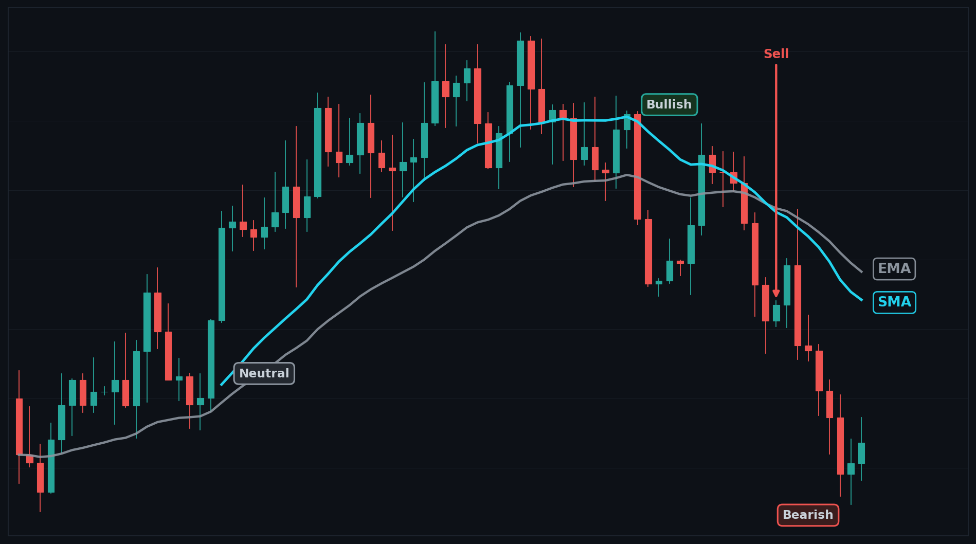
SMA Example Chart
How to Interpret SMA
Bullish: price is above a rising SMA.
Bearish: price is below a falling SMA.
Neutral: price is hugging or crossing a flat SMA, no clear trend.
Common Use Cases
Trend following: trade in the direction the SMA is sloping.
Crossover signals: fast SMA crossing a slow SMA flags a trend shift.
Support/resistance: watch for bounces or rejections at a key SMA.
Trend filter: only take longs above the SMA, shorts below it.
Advanced Use Cases
Trend alignment (long): When SMA(50) is above SMA(200), and both SMA(50) and SMA(200) are rising, take a long. This confirms the trend on two horizons before entering.
Enter long when SMA(50) is above SMA(200), and both SMA(50) and SMA(200) are rising.
Smoothed volume momentum (SMA of OBV): If SMA(9) of OBV is rising for 2 candles, buy. Sell when SMA(9) of OBV is falling for 2 candles. This applies the SMA to another indicator (OBV) to gauge accumulation/distribution.
Enter long when SMA(9) of OBV is rising for 2 candles.
Exit long when SMA(9) of OBV is falling for 2 candles.
CoinQuant Examples
"Buy when Close crosses above SMA(50); sell when Close crosses below SMA(50)."
"Buy when SMA(20) crosses above SMA(50); sell when SMA(20) crosses below SMA(50)."
Advantages
Dead simple to understand and read.
Great at showing the overall trend.
Works on any asset and timeframe.
Flexible source (price, volume, or another indicator).
Limitations
Lags price because it averages old candles.
Whipsaws in choppy, sideways markets.
Slow to react to sharp reversals.
Not a standalone system, best paired with confirmation.
Works Best With
RSI or Stochastic: confirm momentum, avoid overbought/oversold entries.
MACD: confirm trend strength and direction.
OBV: confirm trend with volume flow.
ATR: size stops and filter low-volatility chop.
Default Settings
Period (n): 50
Source: Close

EMA – Exponential Moving Average
Overview
The EMA is a moving average that weights recent prices more heavily, so it reacts faster to new moves than a simple average.
What Is EMA?
The EMA measures the average price over a chosen lookback period, but it gives more importance to the most recent candles. This makes it track the current trend more closely and turn sooner when price changes direction.
Why Traders Use EMA
Faster reaction: responds to new price action quicker than an SMA.
Trend direction: a rising EMA means uptrend, a falling EMA means downtrend.
Smoother entries: less lag means earlier signals.
Dynamic support/resistance: price often respects a key EMA.
Popular crossovers: EMA(12)/EMA(26) underpins tools like MACD.
Input Source
In CoinQuant you choose which input the EMA is calculated on. Supported sources:
Close (default), Open, High, Low
Volume
Another indicator (for example EMA of RSI, or EMA of OBV)
Close is the standard choice, but applying an EMA to volume or to another indicator unlocks more advanced setups (see Advanced Use Cases).
Formula
EMA(today) = (Price × k) + (EMA(yesterday) × (1 − k)), k = 2/(n+1)
n is the lookback period (e.g. 21)
k is the smoothing multiplier, larger for shorter periods
Price is the source value (Close by default) of the current candle
The first EMA value is seeded with an SMA
Example
Using EMA(10), so k = 2 / (10 + 1) = 0.1818. If yesterday EMA = 100 and today Close = 110:
EMA = (110 × 0.1818) + (100 × 0.8182) = 19.998 + 81.82 = 101.82
So today EMA is about 101.82, already leaning toward the new higher price.
EMA Example Chart
.png)
How To Interpret EMA
Bullish: price is above a rising EMA.
Bearish: price is below a falling EMA.
Neutral: price is hugging or crossing a flat EMA, no clear trend.
Common Use Cases
Trend following: trade in the direction the EMA is sloping.
Crossover signals: a fast EMA crossing a slow EMA flags a trend shift.
Pullback entries: buy when price pulls back to a rising EMA.
Trend filter: only take longs above the EMA, shorts below it.
Advanced Use Cases
Fast trend confirmation (long): When EMA(20) is above EMA(50), and both EMA(20) and EMA(50) are rising, take a long. The faster EMA confirms momentum sooner than SMAs.
Enter long when EMA(20) is above EMA(50), and both EMA(20) and EMA(50) are rising.
Smoothed momentum (EMA of RSI): If EMA(9) of RSI crosses above 50, buy. Sell when EMA(9) of RSI crosses below 50. This applies the EMA to another indicator to smooth out noisy RSI swings.
Enter long when EMA(9) of RSI crosses above 50.
Exit long when EMA(9) of RSI crosses below 50.
CoinQuant Examples
"Buy when Close crosses above EMA(21); sell when Close crosses below EMA(21)."
"Buy when EMA(12) crosses above EMA(26); sell when EMA(12) crosses below EMA(26)."
Advantages
Reacts faster than the SMA, less lag.
Tracks the current trend closely.
Great for crossover and pullback strategies.
Flexible source (price, volume, or another indicator).
Limitations
More sensitive, so it can whipsaw in choppy markets.
Still lags price, just less than the SMA.
Can give early or false signals in ranges.
Not a standalone system, best paired with confirmation.
Works Best With
RSI or Stochastic: confirm momentum, avoid overbought/oversold entries.
MACD: built on EMAs, confirms trend strength and direction.
Volume or OBV: validate that a move has participation.
ATR: size stops and filter low-volatility chop.
Default Settings
Period (n): 21
Source: Close
WMA – Weighted Moving Average
Overview
The WMA is a moving average that gives the most recent candles the heaviest weight in a straight-line (linear) way, so it reacts faster than a simple average.
What Is WMA?
The WMA measures the average price over a chosen lookback period, but instead of treating every candle equally, it multiplies the newest candle by the biggest weight and the oldest by the smallest. This makes it follow the current trend more closely than the SMA.
Why Traders Use WMA
Faster than SMA: weights recent prices more, so less lag.
Clear trend read: a rising WMA means uptrend, falling means downtrend.
Smoother than price: filters out single-candle noise.
Good for crossovers: fast vs. slow WMA gives timing signals.
Tunable: the linear weighting is simple and predictable.
Input Source
In CoinQuant you choose which input the WMA is calculated on. Supported sources:
Close (default), Open, High, Low
Volume
Another indicator (for example WMA of RSI, or WMA of OBV)
Close is the standard choice, but applying a WMA to volume or to another indicator unlocks more advanced setups (see Advanced Use Cases).
Formula
WMA(n) = (P1×1 + P2×2 + ... + Pn×n) / (1+2+...+n)
n is the lookback period (e.g. 20)
P1 is the oldest candle, Pn is the newest candle
Each price is multiplied by its position weight (newest = heaviest)
The bottom is the sum of all the weights
Example
Using WMA(3) with closes (oldest to newest) = 100, 102, 104:
Weights = 1, 2, 3 (sum = 6)
WMA(3) = (100 × 1 + 102 × 2 + 104 × 3) / 6 = (100 + 204 + 312) / 6 = 616 / 6 = 102.67
So the WMA(3) value is about 102.67, pulled toward the newest price.
WMA Example Chart
.png)
How To Interpret WMA
Bullish: price is above a rising WMA.
Bearish: price is below a falling WMA.
Neutral: price is hugging or crossing a flat WMA, no clear trend.
Common Use Cases
Trend following: trade in the direction the WMA is sloping.
Crossover signals: a fast WMA crossing a slow WMA flags a trend shift.
Pullback entries: buy when price pulls back to a rising WMA.
Trend filter: only take longs above the WMA, shorts below it.
Advanced Use Cases
Trend alignment (long): When WMA(20) is above WMA(50), and both WMA(20) and WMA(50) are rising, take a long. The linear weighting confirms momentum faster than SMAs.
Enter long when WMA(20) is above WMA(50), and both WMA(20) and WMA(50) are rising.
Smoothed volume momentum (WMA of OBV): If WMA(9) of OBV is rising for 2 candles, buy. Sell when WMA(9) of OBV is falling for 2 candles. This applies the WMA to another indicator (OBV) to read accumulation and distribution with less lag.
Enter long when WMA(9) of OBV is rising for 2 candles.
Exit long when WMA(9) of OBV is falling for 2 candles.
CoinQuant Examples
"Buy when Close crosses above WMA(20); sell when Close crosses below WMA(20)."
"Buy when WMA(10) crosses above WMA(30); sell when WMA(10) crosses below WMA(30)."
Advantages
Reacts faster than the SMA, less lag.
Simple, predictable linear weighting.
Good for crossover and pullback strategies.
Flexible source (price, volume, or another indicator).
Limitations
More sensitive, so it can whipsaw in choppy markets.
Still lags price, just less than the SMA.
Can give early or false signals in ranges.
Not a standalone system, best paired with confirmation.
Works Best With
RSI or Stochastic: confirm momentum, avoid overbought/oversold entries.
MACD: confirm trend strength and direction.
Volume or OBV: validate that a move has participation.
ATR: size stops and filter low-volatility chop.
Default Settings
Period (n): 20
Source: Close
HMA – Hull Moving Average
Overview
The HMA is a fast-reacting moving average that smooths out price noise while staying close to current price, so you can spot trend changes earlier than with a normal moving average.
What Is HMA?
The HMA measures the direction and momentum of a trend with very little lag. A normal moving average is slow because it averages a lot of old prices. The HMA cleverly weights recent prices more heavily and applies a smoothing pass, so it turns up or down faster while staying smooth.
Why Traders Use HMA
Spots trends earlier: reacts faster than SMA or EMA.
Reduces lag: less delay between a real move and the signal.
Smooths out noise: fewer false wiggles than a raw price line.
Easy to read: slope up means uptrend, slope down means downtrend.
Great for fast markets: useful in volatile crypto where speed matters.
Input Source
In CoinQuant you choose which input the HMA is calculated on. Supported sources:
Close (default), Open, High, Low
Volume
Another indicator (for example HMA of RSI, or HMA of OBV)
Close is the standard choice, but applying an HMA to volume or to another indicator unlocks more advanced setups (see Advanced Use Cases).
Formula
HMA(n) = WMA( 2 × WMA(n/2) − WMA(n) )
n is the lookback period (e.g. 20)
WMA(n/2) is a fast weighted average over half the period
WMA(n) is a slower weighted average over the full period
2 x WMA(n/2) - WMA(n) removes lag by emphasizing recent prices
The result is smoothed with a final WMA over sqrt(n) periods
Example
Using HMA(4), so sqrt(4) = 2:
WMA(2) of recent closes = 101
WMA(4) of recent closes = 99
Raw value = 2 × 101 - 99 = 103
Final HMA = WMA(2) of the raw values ≈ 102.67
So the HMA(4) is about 102.67, already leaning toward the latest price.
HMA Example Chart
.png)
How To Interpret HMA
Bullish: HMA is sloping up and price is above it.
Bearish: HMA is sloping down and price is below it.
Neutral: HMA is flat or choppy, no clear trend, best to wait.
Common Use Cases
Trend following: trade in the direction the HMA is sloping.
Reversal confirmation: a change in HMA slope can flag a turning trend.
Breakout confirmation: price breaking out while HMA turns up adds conviction.
Trend filter: only take longs when HMA is rising, shorts when falling.
Advanced Use Cases
Fast trend alignment (long): When HMA(20) is above HMA(50), and both HMA(20) and HMA(50) are rising, take a long. The low lag confirms the turn earlier than slower averages.
Enter long when HMA(20) is above HMA(50), and both HMA(20) and HMA(50) are rising.
Smoothed momentum (HMA of RSI): If HMA(9) of RSI is rising for 2 candles, buy. Sell when HMA(9) of RSI is falling for 2 candles. This applies the HMA to another indicator to catch momentum shifts quickly.
Enter long when HMA(9) of RSI is rising for 2 candles.
Exit long when HMA(9) of RSI is falling for 2 candles.
CoinQuant Examples
"Buy when Close crosses above HMA(20); sell when Close crosses below HMA(20)."
"Buy when HMA(9) crosses above HMA(21); sell when HMA(9) crosses below HMA(21)."
Advantages
Very low lag vs. SMA and EMA.
Smooth, with fewer false signals than raw price.
Easy to interpret at a glance.
Excellent for fast-moving crypto markets.
Limitations
Can overshoot in choppy, sideways markets.
Being fast means it can occasionally give early or false signals.
Not a standalone system, best paired with confirmation.
Less useful in flat, low-volatility ranges.
Works Best With
RSI or Stochastic: confirm momentum and avoid overbought/oversold entries.
MACD: confirm trend strength and direction.
ATR: size stops and filter low-volatility chop.
Volume or OBV: validate breakouts.
Default Settings
Period (n): 20
Source: Close
DEMA – Double Exponential Moving Average
Overview
DEMA is a faster, smoother moving average that reacts to price changes more quickly than a normal EMA by reducing lag.
What It DEMA?
DEMA measures the average direction of price over a chosen period, but it is engineered to stay much closer to current price than a standard moving average. It does this by taking an EMA, then applying a second smoothing step that cancels out most of the delay you normally get from averaging. The result is a line that turns sooner when the trend changes, so you spot shifts earlier.
Why Traders Use DEMA
Faster trend detection: it reacts to reversals quicker than SMA or EMA, so entries and exits are more timely.
Less lag: the double-smoothing design removes much of the delay that makes traditional averages late.
Cleaner trend reads in fast markets: useful on crypto pairs that move sharply.
Earlier crossover signals: when paired with a slower average, DEMA crosses sooner.
Smoother than raw price: it still filters out a lot of noise while staying responsive.
Input Source
In CoinQuant you choose which input the DEMA is calculated on. Supported sources are Open, Close, High, Low, Volume, and even another indicator (for example a DEMA of OBV or a DEMA of RSI). Close is the default and the most common choice. Selecting a different source changes what the average tracks: a DEMA of Volume smooths participation, while a DEMA applied to another indicator (an indicator of an indicator) lets you build advanced, layered setups that filter signals more precisely.
Formula
DEMA = (2 x EMA) - EMA(EMA)
Where:
EMA = the Exponential Moving Average of the source over the chosen period.
EMA(EMA) = an EMA calculated on the first EMA values (a second smoothing pass).
The (2 x EMA) term pushes the line back toward current price, and subtracting the EMA of the EMA removes most of the leftover lag.
Example
Imagine a 3-period DEMA on these closes: 10, 11, 12.
First compute the EMA over the period. Suppose the EMA works out to 11.2.
Compute the EMA of that EMA series. Suppose it comes to 10.9.
DEMA = (2 x 11.2) - 10.9 = 22.4 - 10.9 = 11.5.
Notice 11.5 sits closer to the latest price (12) than the plain EMA (11.2), showing how DEMA reduces lag.
DEMA Example Chart
.png)
How To Interpret DEMA
Bullish: price is above a rising DEMA, or DEMA crosses above a slower average. Momentum is up.
Bearish: price is below a falling DEMA, or DEMA crosses below a slower average. Momentum is down.
Neutral: DEMA is flat and price is chopping around it. No clear trend, signals are less reliable.
Common Use Cases
Trend following: ride the trend while price stays on one side of a rising or falling DEMA.
Reversal confirmation: an early DEMA turn can confirm a momentum shift sooner than slower averages.
Breakout confirmation: price breaking out while DEMA slopes the same way adds conviction.
Volatility filtering: a flat DEMA warns you the market is ranging, so you can stand aside.
Support and resistance: in strong trends DEMA often acts as a dynamic level price bounces off.
Risk management: use a DEMA cross against you as a quick exit trigger.
Advanced Use Cases
Dual DEMA crossover: run a fast DEMA (for example period 9) and a slow DEMA (for example period 21). Go long when the fast DEMA crosses above the slow DEMA, exit when it crosses back below. This reacts earlier than an equivalent EMA crossover.
DEMA plus a momentum filter on another source: require price above a DEMA of Close (trend) AND a DEMA of RSI above 50 (momentum) before entering. Combining a price-based DEMA with an indicator-based DEMA filters out weak signals in choppy conditions.
CoinQuant Examples
"Buy BTC when the 9-period DEMA crosses above the 21-period DEMA, and sell when it crosses back below."
"Go long ETH when price closes above the 20-period DEMA and the DEMA is sloping upward; exit when price closes below the DEMA."
Advantages
Much less lag than SMA or EMA, so signals arrive earlier.
Reacts quickly to genuine trend changes.
Still smooths out a good portion of market noise.
Works well in fast-moving crypto markets.
Limitations
More sensitive means more false signals in sideways or choppy markets.
Can whipsaw when volatility is high and there is no clear trend.
Best paired with a confirmation tool rather than traded alone.
The faster response can feel jumpy to beginners used to smoother averages.
Works Best With
A slower moving average (EMA or SMA) for crossover signals.
Momentum indicators such as RSI or MACD to confirm strength.
Volume to validate breakouts.
A trend or volatility filter (such as ADX) to avoid trading flat markets.
Default Settings
Period: 20
Source: Close
Type: Double Exponential Moving Average
RMA – Running Moving Average
Overview
RMA is a very smooth, slow-reacting moving average created by Welles Wilder, used to filter out noise and reveal the underlying trend.
What Is RMA?
RMA (also called the Rolling Moving Average or Wilder's Smoothing) measures the average price over a period, but it smooths much more heavily than a normal moving average. It gives a steadier line that changes slowly, so short-term spikes and noise have less effect. This is the exact smoothing method built into popular indicators like RSI, ATR, and ADX, which is why RMA behaves consistently with those tools.
Why Traders Use RMA
Strong noise filtering: it ignores small jitters and shows the bigger trend.
Stability: the line is calm and steady, making the trend easy to read.
Consistency with Wilder indicators: it matches the smoothing inside RSI, ATR, and ADX.
Fewer false signals: because it reacts slowly, it whipsaws less in choppy markets.
Reliable trend backbone: useful as a slow anchor line in multi-average setups.
Input Source
In CoinQuant you choose the input the RMA is calculated on. Supported sources are Open, Close, High, Low, Volume, and another indicator (for example an RMA of RSI or an RMA of OBV). Close is the default and most common. Picking a different source changes what gets smoothed: an RMA of Volume smooths participation, while applying RMA to another indicator (an indicator of an indicator) creates a smoother, calmer version of that indicator for advanced filtering.
Formula
RMA(today) = (RMA(yesterday) x (period - 1) + price(today)) / period
Where:
period = the number of bars chosen (for example 14).
price(today) = the current value of the source (Close by default).
RMA(yesterday) = the previous RMA value, which is why the line carries a long memory and stays smooth.
The first RMA value is usually seeded with a simple average of the first set of bars.
Example
Use a 14-period RMA. Suppose yesterday's RMA = 100 and today's close = 114.
Multiply the old RMA by (period - 1): 100 x 13 = 1300.
Add today's price: 1300 + 114 = 1414.
Divide by the period: 1414 / 14 = 101.
So the RMA moves only from 100 to 101 even though price jumped to 114. That small step shows how heavily RMA smooths.
RMA Example Chart
.png)
How To Interpret RMA
Bullish: price stays above a gently rising RMA. The trend is up and stable.
Bearish: price stays below a gently falling RMA. The trend is down.
Neutral: RMA is flat and price drifts across it. No clear trend, treat signals with caution.
Common Use Cases
Trend following: use the slow RMA as the main trend direction filter.
Reversal confirmation: a slow RMA turn confirms that a shift is real, not just noise.
Breakout confirmation: breakouts that hold on the correct side of RMA are more trustworthy.
Volatility filtering: a flat RMA flags ranging conditions to avoid.
Support and resistance: in steady trends price often respects the RMA as a dynamic level.
Risk management: use a clear close on the wrong side of RMA as an exit cue.
Advanced Use Cases
RMA as a slow trend gate with a faster trigger: only take long signals from a fast EMA crossover when price is also above a 50-period RMA. The slow RMA blocks counter-trend trades and reduces whipsaws.
RMA of RSI for a calmer momentum read: apply RMA to RSI (an indicator of an indicator) to smooth out RSI's noise, then trade only when this smoothed RSI is above 50 and rising, combined with price above its RMA. This double filter targets clean, confirmed trends.
CoinQuant Examples
"Buy BTC when price closes above the 50-period RMA and the RMA is sloping upward; sell when price closes below it."
"Go long ETH only when a fast EMA crosses above a slow EMA and price is above the 100-period RMA."
Advantages
Excellent at removing noise and showing the true trend.
Very stable, so signals are calmer and less jumpy.
Matches the smoothing used in RSI, ATR, and ADX for consistency.
Reduces false signals in choppy conditions.
Limitations
High lag: it reacts slowly, so it confirms trends late.
Poor for fast scalping or catching early reversals.
Can keep you in a trade too long after a real turn.
Best paired with a faster signal for timing.
Works Best With
A faster moving average (EMA or DEMA) for entry timing.
Momentum indicators such as RSI or MACD for confirmation.
ATR for volatility-based stops.
ADX to confirm whether a trend is strong enough to trade.
Default Settings
Period: 14
Source: Close
Type: Wilder's Moving Average (RMA)
ER – Efficiency Ratio
Overview
The Efficiency Ratio measures how cleanly price is moving, scoring whether a market is trending smoothly or just chopping back and forth.
What Is ER?
ER (Kaufman's Efficiency Ratio) compares how far price has traveled in a straight line to how much total movement it took to get there. If price marches steadily in one direction, ER is high (close to 1). If price zigzags a lot but ends up near where it started, ER is low (close to 0). In short, it measures trend quality, not direction.
Why Traders Use ER
Trend strength gauge: it tells you if a move is efficient and worth trading, or messy and best avoided.
Chop filter: low ER warns you the market is ranging, helping you skip false signals.
Adapts other tools: ER is the engine behind adaptive indicators like AMA (KAMA), adjusting their speed.
Confidence check: high ER adds conviction to breakout and trend entries.
Simple scale: the 0 to 1 output is easy to read and threshold.
Input Source
In CoinQuant you choose the input ER is calculated on. Supported sources are Open, Close, High, Low, Volume, and another indicator (for example ER of OBV or ER of RSI). Close is the default and most common. Changing the source changes what efficiency you measure: ER of Volume shows how steadily participation is building, while applying ER to another indicator (an indicator of an indicator) tells you how cleanly that indicator itself is trending.
Formula
ER = Change / Volatility
Where:
Change = the absolute price move over the period: abs(price(now) - price(n bars ago)).
Volatility = the sum of every bar-to-bar absolute change over that same period.
The result ranges from 0 (pure chop) to 1 (a perfectly straight move).
Example Calculation
Use a 4-period ER on closes: 10, 11, 10, 13.
Change = abs(13 - 10) = 3 (net move from first to last).
Bar-to-bar moves: abs(11-10)=1, abs(10-11)=1, abs(13-10)=3. Sum (Volatility) = 1 + 1 + 3 = 5.
ER = 3 / 5 = 0.6.
A reading of 0.6 means the move was moderately efficient: it trended, but with some back-and-forth along the way.
ER Example Chart
.png)
How To Interpret ER
Bullish or bearish (strong): high ER (for example above 0.6) means a clean, efficient trend. Trend signals are more reliable, in whichever direction price is moving.
Neutral (weak): low ER (for example below 0.3) means choppy, inefficient price action. Trend and breakout signals are unreliable, favor range tactics or stand aside.
Note: ER itself does not give direction. Pair it with a directional tool to know which way to trade.
Common Use Cases
Trend following: only follow trends when ER confirms the move is efficient.
Reversal confirmation: a rising ER after a turn suggests the new move has real momentum.
Breakout confirmation: high ER during a breakout signals a clean move rather than a fakeout.
Volatility filtering: low ER is a direct ranging-market filter.
Risk management: scale position size up when ER is high and down when it is low.
Advanced Use Cases
ER as a regime switch for a moving average system: only allow EMA crossover entries when ER is above 0.5. When ER drops below 0.3, disable trend entries and switch to a mean-reversion approach. This adapts your whole strategy to the market regime.
ER plus directional momentum: combine ER above 0.6 (clean trend) with RSI above 50 for longs or below 50 for shorts. ER confirms the trend is efficient while RSI supplies direction, filtering out choppy traps.
CoinQuant Examples
"Only buy BTC on an EMA crossover when the Efficiency Ratio is above 0.5; skip the trade otherwise."
"Go long ETH when price breaks above recent highs and the Efficiency Ratio is above 0.6, confirming a clean trend."
Advantages
Cleanly separates trending markets from choppy ones.
Simple, bounded 0 to 1 scale that is easy to threshold.
Powers adaptive indicators for smarter, self-adjusting systems.
Strong filter that cuts down false signals.
Limitations
Gives no direction on its own, it must be paired with a directional tool.
Sensitive to the chosen period: too short is noisy, too long is slow.
A high reading confirms efficiency, not that the trend will continue.
Not a standalone entry signal.
Works Best With
A directional indicator (EMA, MACD, or price structure) to supply trade direction.
Adaptive moving averages like AMA that use ER internally.
RSI for momentum confirmation.
Breakout levels to validate clean breaks.
Default Settings
Period: 10
Source: Close
Output Range: 0 to 1
DM – Directional Movement
Overview
Directional Movement measures whether buyers or sellers are in control by comparing how much price expands upward versus downward.
What Is DM?
DM, created by Welles Wilder, breaks each bar's price expansion into two parts: upward movement (+DM) and downward movement (-DM). +DM captures how much today's high pushed above yesterday's high, and -DM captures how much today's low pushed below yesterday's low. Only the larger of the two counts for a given bar. Together they show which side, bulls or bears, is driving the market. DM is the raw building block behind the popular DI lines and the ADX trend-strength indicator.
Why Traders Use DM
Direction clarity: it shows whether upward or downward pressure dominates.
Foundation of ADX: +DM and -DM feed the +DI, -DI, and ADX system traders rely on.
Trend confirmation: rising +DM versus -DM confirms a bullish push, and the reverse confirms bearish.
Crossovers: when +DM dominance flips to -DM dominance (or vice versa), it can flag a shift.
Works on any market: it is calculated purely from highs and lows.
Input Source
DM is built from the High and Low of each bar by design, so its primary inputs are High and Low. In CoinQuant the available sources are Open, Close, High, Low, Volume, and another indicator, but because Directional Movement compares consecutive highs and lows, the High and Low inputs are the meaningful ones. The smoothing applied to DM (to build DI and ADX) uses Wilder's method, and advanced users can apply that smoothing to other inputs for experimentation.
Formula
UpMove = High(today) - High(yesterday)
DownMove = Low(yesterday) - Low(today)
+DM = UpMove if (UpMove > DownMove and UpMove > 0), otherwise 0
-DM = DownMove if (DownMove > UpMove and DownMove > 0), otherwise 0
Where:
UpMove = how much the high extended above the prior high.
DownMove = how much the low extended below the prior low.
Only the stronger direction records a value on each bar; the other is set to 0.
Example
Yesterday: High 105, Low 100. Today: High 108, Low 102.
UpMove = 108 - 105 = 3.
DownMove = 100 - 102 = -2.
UpMove (3) is greater than DownMove (-2) and is positive, so +DM = 3 and -DM = 0.
This bar recorded upward directional movement, signaling buyers expanded the range to the upside.
DM Example Chart
.png)
How To Interpret DM
Bullish: +DM is consistently larger than -DM. Buyers are expanding the range upward.
Bearish: -DM is consistently larger than +DM. Sellers are pushing the range downward.
Neutral: +DM and -DM are close together and crossing back and forth. No clear directional control.
Common Use Cases
Trend following: trade in the direction of the dominant DM (and the DI lines built from it).
Reversal confirmation: a flip from +DM dominance to -DM dominance can confirm a turn.
Breakout confirmation: a surge in +DM on an upside break adds conviction.
Volatility filtering: when DM values are tiny and tangled, the market is ranging.
Risk management: exit longs when -DM starts overtaking +DM.
Advanced Use Cases
DM with ADX strength gate: use +DM versus -DM for direction, but only act when ADX (built from DM) is above 25, confirming the trend is strong enough. This avoids taking directional signals in weak, choppy markets.
DM crossover plus higher-timeframe alignment: take a +DM over -DM crossover on the lower timeframe only when the higher timeframe also shows +DM dominance. Aligning two timeframes filters out minor counter-trend noise.
CoinQuant Examples
"Buy BTC when +DI crosses above -DI and ADX is above 25; sell when -DI crosses above +DI."
"Go long ETH when +DM dominance appears on both the 1-hour and 4-hour timeframes."
Advantages
Cleanly separates upward from downward pressure.
Forms the basis of the trusted DI and ADX trend system.
Works on any asset using only highs and lows.
Good at confirming who controls the market.
Limitations
Raw +DM and -DM are noisy before smoothing.
Gives direction but not trend strength on its own (ADX adds that).
Can flip frequently in choppy ranges.
Usually used through the DI/ADX layer rather than alone.
Works Best With
ADX to measure trend strength alongside DM's direction.
The +DI and -DI lines for cleaner, smoothed signals.
A moving average to confirm overall trend.
Support and resistance levels for entry timing.
Default Settings
Period: 14
Source: High and Low
Smoothing: Wilder's method
VIDYA – Variable Index Dynamic Average
Overview
VIDYA is a smart moving average that speeds up when the market is volatile and trending, and slows down when the market is quiet and choppy.
What Is VIDYA?
VIDYA (created by Tushar Chande) measures the average price like any moving average, but it changes its own reaction speed based on market momentum. It uses a volatility measure (the Chande Momentum Oscillator, CMO) to decide how fast to move: when momentum is strong, VIDYA hugs price tightly and reacts fast; when momentum is weak, it flattens out and ignores noise. In short, it is an adaptive EMA that adjusts to current conditions automatically.
Why Traders Use VIDYA
Adapts automatically: one line behaves like a fast average in trends and a slow one in chop.
Less whipsaw: it flattens during quiet periods, cutting false signals.
Fast in trends: it tracks strong moves closely so you stay with the trend.
Noise aware: it uses volatility to filter, not just a fixed period.
Cleaner crossovers: signals tend to be more meaningful than fixed-speed averages.
Input Source
In CoinQuant you choose the input VIDYA is calculated on. Supported sources are Open, Close, High, Low, Volume, and another indicator (for example VIDYA of OBV or VIDYA of RSI). Close is the default and most common. Changing the source changes what adapts: VIDYA of Volume creates an adaptive read of participation, while applying VIDYA to another indicator (an indicator of an indicator) builds an adaptive, self-adjusting version of that indicator for advanced filtering.
Formula
VIDYA(today) = price x (alpha x k) + VIDYA(yesterday) x (1 - alpha x k)
Where:
alpha = the base smoothing constant from the chosen period: 2 / (period + 1).
k = the absolute value of the CMO (Chande Momentum Oscillator), scaled 0 to 1, acting as a volatility throttle.
When k is high (strong momentum), VIDYA reacts quickly; when k is near 0 (weak momentum), VIDYA barely moves.
price = the source value (Close by default).
Example
Suppose period 9 so alpha = 2 / (9 + 1) = 0.2. Yesterday's VIDYA = 100, today's price = 110.
Strong trend case: CMO factor k = 0.8. Effective speed = 0.2 x 0.8 = 0.16. VIDYA = 110 x 0.16 + 100 x 0.84 = 17.6 + 84 = 101.6.
Quiet market case: k = 0.1. Effective speed = 0.2 x 0.1 = 0.02. VIDYA = 110 x 0.02 + 100 x 0.98 = 2.2 + 98 = 100.2.
Same inputs, but VIDYA moved far more when momentum was strong, showing its adaptive nature.
VIDYA Example Chart
.png)
How To Interpret VIDYA
Bullish: price is above a rising VIDYA, or price crosses above VIDYA as it turns up. Trend is up.
Bearish: price is below a falling VIDYA, or price crosses below it. Trend is down.
Neutral: VIDYA is flat during low momentum. The market is ranging, so signals are weak.
Common Use Cases
Trend following: ride trends while price holds on one side of a sloping VIDYA.
Reversal confirmation: a VIDYA turn after flattening can confirm a fresh move.
Breakout confirmation: VIDYA steepening as price breaks out adds conviction.
Volatility filtering: a flat VIDYA directly flags a low-momentum, choppy market.
Risk management: use a price close on the wrong side of VIDYA as an exit.
Advanced Use Cases
VIDYA as an adaptive trend gate with a fast trigger: only take fast EMA crossover longs when price is above a rising VIDYA. Because VIDYA flattens in chop, this automatically blocks most range-bound whipsaws without a separate filter.
Dual VIDYA on price and momentum: require price above its VIDYA (adaptive trend) AND a VIDYA of RSI above 50 (adaptive momentum). Combining a price-based adaptive average with an indicator-based one gives a robust, condition-aware entry filter.
CoinQuant Examples
"Buy BTC when price closes above the VIDYA and the VIDYA is sloping up; sell when price closes below it."
"Go long ETH when a fast EMA crosses above the VIDYA while the VIDYA is rising, and exit on the opposite cross."
Advantages
Adapts speed to market conditions automatically.
Reduces whipsaws by flattening in choppy periods.
Tracks strong trends closely with low lag.
Combines trend and volatility awareness in one line.
Limitations
More complex than a standard moving average to understand.
Behavior depends on the volatility measure, which can mislead in odd conditions.
Can still lag at the very start of a brand-new trend.
Less intuitive for beginners than a fixed EMA or SMA.
Works Best With
A faster trigger line (EMA) for crossover entries.
Momentum indicators such as RSI or MACD for confirmation.
Volume to validate breakouts.
ATR for adaptive stop placement.
Default Settings
Period: 14
Source: Close
Volatility Input: CMO (Chande Momentum Oscillator)
AROON – Aroon Up/Down
Overview
Aroon measures how recently price hit a new high or low to tell you if a trend is starting, strong, or fading.
What Is AROON?
Aroon (created by Tushar Chande) tracks the number of bars since the most recent highest high and lowest low within a chosen period. It has two lines: Aroon Up (based on recent highs) and Aroon Down (based on recent lows). Each ranges from 0 to 100. A high Aroon Up means new highs are happening very recently (strong uptrend); a high Aroon Down means new lows are very recent (strong downtrend). It measures the timing and freshness of extremes rather than price itself.
Why Traders Use AROON
Spots new trends early: a fresh push of Aroon Up or Down can flag a trend's birth.
Measures trend strength: readings near 100 show a strong, fresh trend.
Detects consolidation: when both lines are low and tangled, the market is ranging.
Clear crossovers: Aroon Up crossing above Aroon Down is a classic bullish cue.
Easy 0 to 100 scale: simple to threshold and read.
Input Source
Aroon is built from the timing of the highest High and lowest Low over the period, so its meaningful inputs are High and Low by design. In CoinQuant the available sources are Open, Close, High, Low, Volume, and another indicator, but because Aroon counts bars since the period's high and low, the High and Low inputs drive it. Advanced users can apply the Aroon logic to another series (an indicator of an indicator) to gauge how recently that series made its own extremes.
Components
Aroon Up: measures how recently the highest high occurred. High values mean fresh highs.
Aroon Down: measures how recently the lowest low occurred. High values mean fresh lows.
Formula
Aroon Up = ((period - bars since highest high) / period) x 100
Aroon Down = ((period - bars since lowest low) / period) x 100
Where:
period = the lookback length (for example 14 or 25).
bars since highest high = how many bars ago the period's top occurred.
bars since lowest low = how many bars ago the period's bottom occurred.
A value of 100 means the extreme is happening right now; a value near 0 means it was long ago.
Example
Use period 10. Suppose the highest high happened 1 bar ago and the lowest low happened 7 bars ago.
Aroon Up = ((10 - 1) / 10) x 100 = 90.
Aroon Down = ((10 - 7) / 10) x 100 = 30.
Aroon Up (90) is well above Aroon Down (30), signaling a fresh, strong uptrend.
AROON Example Chart
.png)
How To Interpret AROON
Bullish: Aroon Up is high (above 70) and above Aroon Down, especially right after an upward crossover.
Bearish: Aroon Down is high (above 70) and above Aroon Up, especially right after a downward crossover.
Neutral: both lines are low (below 50) and close together. The market is consolidating with no clear trend.
Common Use Cases
Trend following: trade in the direction of the dominant Aroon line.
Reversal confirmation: an Aroon Up/Down crossover can confirm a change of trend.
Breakout confirmation: Aroon Up spiking to 100 on a breakout shows fresh strength.
Volatility filtering: both lines low signals a range to avoid trend trades in.
Risk management: exit when your side's Aroon line collapses from high toward low.
Advanced Use Cases
Aroon crossover plus strength threshold: only act on an Aroon Up over Aroon Down crossover when Aroon Up also climbs above 70. Requiring both the cross and a high reading filters out weak, early crossovers during consolidation.
Aroon with a trend filter on a second source: take long signals only when Aroon Up is above 70 AND price is above a 50-period moving average of Close. Pairing Aroon's timing with a price-trend filter avoids fighting the larger trend.
CoinQuant Examples
"Buy BTC when Aroon Up crosses above Aroon Down and Aroon Up is above 70; sell on the opposite cross."
"Go long ETH when Aroon Up reaches 100 and price is above its 50-period moving average."
Advantages
Good at catching new trends early.
Clearly distinguishes trending from consolidating markets.
Simple bounded 0 to 100 scale.
Two lines give both direction and freshness.
Limitations
Can give early or false signals in choppy markets.
Frequent crossovers during consolidation can mislead.
Measures timing of extremes, not the size of the move.
Best combined with a price or momentum filter.
Works Best With
A moving average to confirm the larger trend.
RSI or MACD for momentum confirmation.
Volume to validate breakouts.
Support and resistance levels for entry timing.
Default Settings
Period: 14
Source: High and Low
Output Range: 0 to 100
AMA – Adaptive Moving Average
Overview
AMA is a self-adjusting moving average that moves fast in clean trends and slows down in choppy markets to cut out noise.
What Is AMA?
AMA (Kaufman's Adaptive Moving Average, also called KAMA) measures the average price like other moving averages, but it constantly adjusts its speed using the Efficiency Ratio (ER). When ER shows price is trending cleanly, AMA reacts quickly and tracks price closely. When ER shows choppy, inefficient movement, AMA slows almost to a standstill so noise does not drag it around. It blends the responsiveness of a fast average with the calm of a slow one.
Why Traders Use AMA
Adapts automatically: fast in trends, slow in chop, all in one line.
Strong noise filter: it nearly stops moving in sideways markets, avoiding fakeouts.
Low lag in trends: it keeps you close to price during strong moves.
Fewer whipsaws: the slowdown in chop cuts false crossover signals.
Smarter than fixed averages: it reacts to market conditions, not just a set period.
Input Source
In CoinQuant you choose the input AMA is calculated on. Supported sources are Open, Close, High, Low, Volume, and another indicator (for example AMA of OBV or AMA of RSI). Close is the default and most common. Changing the source changes what adapts: AMA of Volume gives an adaptive read of participation, while applying AMA to another indicator (an indicator of an indicator) produces a smart, condition-aware version of that indicator for advanced filtering.
Formula
AMA(today) = AMA(yesterday) + SC x (price - AMA(yesterday))
Where:
SC = the smoothing constant, which changes each bar: SC = (ER x (fast - slow) + slow) squared.
ER = the Efficiency Ratio (0 to 1), measuring how clean the trend is.
fast = the fast EMA constant, usually 2 / (2 + 1).
slow = the slow EMA constant, usually 2 / (30 + 1).
When ER is high, SC pushes toward the fast speed; when ER is low, SC drops toward the slow speed.
Example
Suppose yesterday's AMA = 100 and today's price = 110.
Clean trend: ER is high, so SC works out to about 0.5. AMA = 100 + 0.5 x (110 - 100) = 100 + 5 = 105.
Choppy market: ER is low, so SC works out to about 0.05. AMA = 100 + 0.05 x (110 - 100) = 100 + 0.5 = 100.5.
Same price jump, but AMA moved a lot in the trend and barely budged in the chop, showing its adaptive design.
AMA Example Chart
.png)
How To Interpret AMA
Bullish: price is above a rising AMA, or price crosses above AMA as it turns up. Trend is up.
Bearish: price is below a falling AMA, or price crosses below it. Trend is down.
Neutral: AMA is nearly flat. The market is choppy and signals are unreliable, so stand aside.
Common Use Cases
Trend following: stay with the trend while price holds on one side of a sloping AMA.
Reversal confirmation: an AMA turn after a flat stretch can confirm a real new move.
Breakout confirmation: AMA steepening as price breaks out adds conviction.
Volatility filtering: a flat AMA directly flags a choppy market to avoid.
Risk management: use a price close on the wrong side of AMA as an exit.
Advanced Use Cases
AMA as an adaptive trend gate with a fast trigger: only take fast EMA crossover longs when price is above a rising AMA. Because AMA flattens in chop, this automatically suppresses most range-bound whipsaws without a separate filter.
AMA plus ER threshold for regime control: combine price above AMA with the raw Efficiency Ratio above 0.5. Since AMA already uses ER internally, layering an explicit ER gate makes entries even stricter, trading only when the market is clearly efficient and trending.
CoinQuant Examples
"Buy BTC when price closes above the AMA and the AMA is sloping up; sell when price closes below it."
"Go long ETH when a fast EMA crosses above the AMA while the AMA is rising, and exit on the opposite cross."
Advantages
Adjusts speed to market conditions automatically.
Excellent at filtering out choppy-market noise.
Keeps low lag during strong trends.
Reduces false signals compared with fixed averages.
Limitations
More complex to understand than a basic moving average.
Relies on the Efficiency Ratio, which can misread unusual conditions.
Can still be slow at the very start of a brand-new trend.
Less intuitive for beginners than a fixed EMA or SMA.
Works Best With
A faster trigger line (EMA) for crossover entries.
The Efficiency Ratio for an explicit regime filter.
Momentum indicators such as RSI or MACD for confirmation.
ATR for adaptive stop placement.
Default Settings
Period (ER lookback): 10
Fast: 2
Slow: 30
Source: Close
ST – Supertrend
Overview
Supertrend is a trend-following line that sits below price in uptrends and above price in downtrends, flipping sides to give clear buy and sell signals.
What Is ST?
Supertrend measures trend direction using price and volatility. It is built on the Average True Range (ATR), which captures how much an asset typically moves. The indicator plots a single line that trails the market: when price is trending up, the line sits below price and acts as support; when price turns down, the line flips above price and acts as resistance. The flip itself is the signal. It measures both the direction of the trend and a volatility-aware level to lean on.
Why Traders Use ST
Crystal-clear signals: the line flip gives an obvious buy or sell point.
Built-in volatility: ATR makes the line adapt to how much the asset moves.
Dynamic stop level: the line doubles as a trailing stop in trends.
Easy to read: it is colored or positioned for instant direction recognition.
Good in trends: it keeps you on the right side of strong moves.
Input Source
Supertrend is calculated from price and ATR. The midpoint it builds around uses the High and Low (via the typical price), and ATR is derived from High, Low, and Close. In CoinQuant the available sources are Open, Close, High, Low, Volume, and another indicator, but Supertrend's design centers on the High, Low, and Close that feed ATR and the band midpoint. The ATR period and a multiplier are the key tunable inputs.
Formula
Basic Upper Band = ((High + Low) / 2) + (multiplier x ATR)
Basic Lower Band = ((High + Low) / 2) - (multiplier x ATR)
Supertrend then follows the lower band in uptrends and the upper band in downtrends, flipping when price closes through the active line.
Where:
(High + Low) / 2 = the bar's midpoint, the band's center.
ATR = Average True Range over the chosen period, the volatility measure.
multiplier = how far the bands sit from the midpoint (a larger multiplier means a wider, slower line).
Example
Suppose midpoint = 100, ATR = 4, multiplier = 3.
Upper Band = 100 + (3 x 4) = 112.
Lower Band = 100 - (3 x 4) = 88.
In an uptrend, Supertrend tracks the lower band at 88 and acts as support. If price closes below 88, the trend flips to down and Supertrend jumps to the upper band, now acting as resistance.
ST Example Chart
.png)
How To Interpret ST
Bullish: the Supertrend line is below price (typically green). Trend is up, treat the line as support and a trailing stop.
Bearish: the Supertrend line is above price (typically red). Trend is down, treat the line as resistance.
Neutral: rapid flips back and forth signal a choppy, directionless market where signals are unreliable.
Common Use Cases
Trend following: stay long while the line is green below price, short while it is red above.
Reversal confirmation: a line flip confirms a change of trend.
Breakout confirmation: a flip aligned with a breakout adds conviction.
Volatility filtering: frequent flips warn the market is ranging.
Risk management: use the Supertrend line as a trailing stop level.
Advanced Use Cases
Supertrend with a trend filter on a higher timeframe: only take a bullish Supertrend flip on the lower timeframe when the higher timeframe Supertrend is also green. Aligning two timeframes filters out counter-trend flips and reduces whipsaws.
Dual Supertrend (two multipliers): run a tight Supertrend (small multiplier) for entries and a wide Supertrend (large multiplier) as the trend filter and trailing stop. Enter only when both agree on direction, then trail the stop with the wider line to ride bigger moves.
CoinQuant Examples
"Buy BTC when Supertrend flips to green below price; sell when it flips to red above price."
"Go long ETH on a bullish Supertrend flip only when the 4-hour Supertrend is also green, and trail the stop on the Supertrend line."
Advantages
Very clear, easy-to-act-on signals.
Volatility-aware thanks to ATR.
Works as both a signal and a trailing stop.
Keeps you aligned with strong trends.
Limitations
Whipsaws badly in sideways, choppy markets.
A lagging, reactive tool, so flips can come after part of the move.
Sensitive to the ATR period and multiplier settings.
Best paired with a trend filter to avoid range traps.
Works Best With
A trend filter such as a moving average or ADX to avoid choppy ranges.
Higher-timeframe Supertrend for confirmation.
RSI or MACD for momentum confirmation.
Volume to validate breakouts and flips.
Default Settings
ATR Period: 10
Multiplier: 3
Source: High, Low, Close (via ATR)
2. Momentum Indicators
RSI – Relative Strength Index
Overview
RSI is a momentum gauge from 0 to 100 that shows whether an asset is overbought, oversold, or somewhere in between.
What Is RSI?
RSI (created by Welles Wilder) measures the speed and size of recent price moves to judge momentum. It compares the average size of up moves to the average size of down moves over a period, then scales the result from 0 to 100. High readings mean buyers have been dominating (possibly overbought); low readings mean sellers have been dominating (possibly oversold). It measures momentum strength, not price direction by itself.
Why Traders Use RSI
Spots extremes: classic overbought (above 70) and oversold (below 30) zones.
Times reversals: pullbacks from extremes often precede a bounce or drop.
Confirms momentum: a strong RSI supports a trend's staying power.
Reveals divergence: price making new highs while RSI does not warns of weakening momentum.
Simple bounded scale: the 0 to 100 range is easy to threshold.
Input Source
In CoinQuant you choose the input RSI is calculated on. Supported sources are Open, Close, High, Low, Volume, and another indicator (for example RSI of OBV). Close is the default and most common. Changing the source changes what momentum you measure: RSI of Volume gauges momentum in participation, while applying RSI to another indicator (an indicator of an indicator) measures the momentum of that indicator itself for advanced filtering.
Formula
RSI = 100 - (100 / (1 + RS))
Where:
RS = average gain divided by average loss over the period.
average gain = the smoothed average of up-day moves (using Wilder's RMA smoothing).
average loss = the smoothed average of down-day moves.
period = the lookback length, 14 by default.
Example
Use a 14-period RSI. Suppose the average gain = 2 and the average loss = 1.
RS = average gain / average loss = 2 / 1 = 2.
RSI = 100 - (100 / (1 + 2)) = 100 - (100 / 3) = 100 - 33.3 = 66.7.
An RSI of 66.7 shows solid bullish momentum that is approaching, but not yet in, overbought territory.
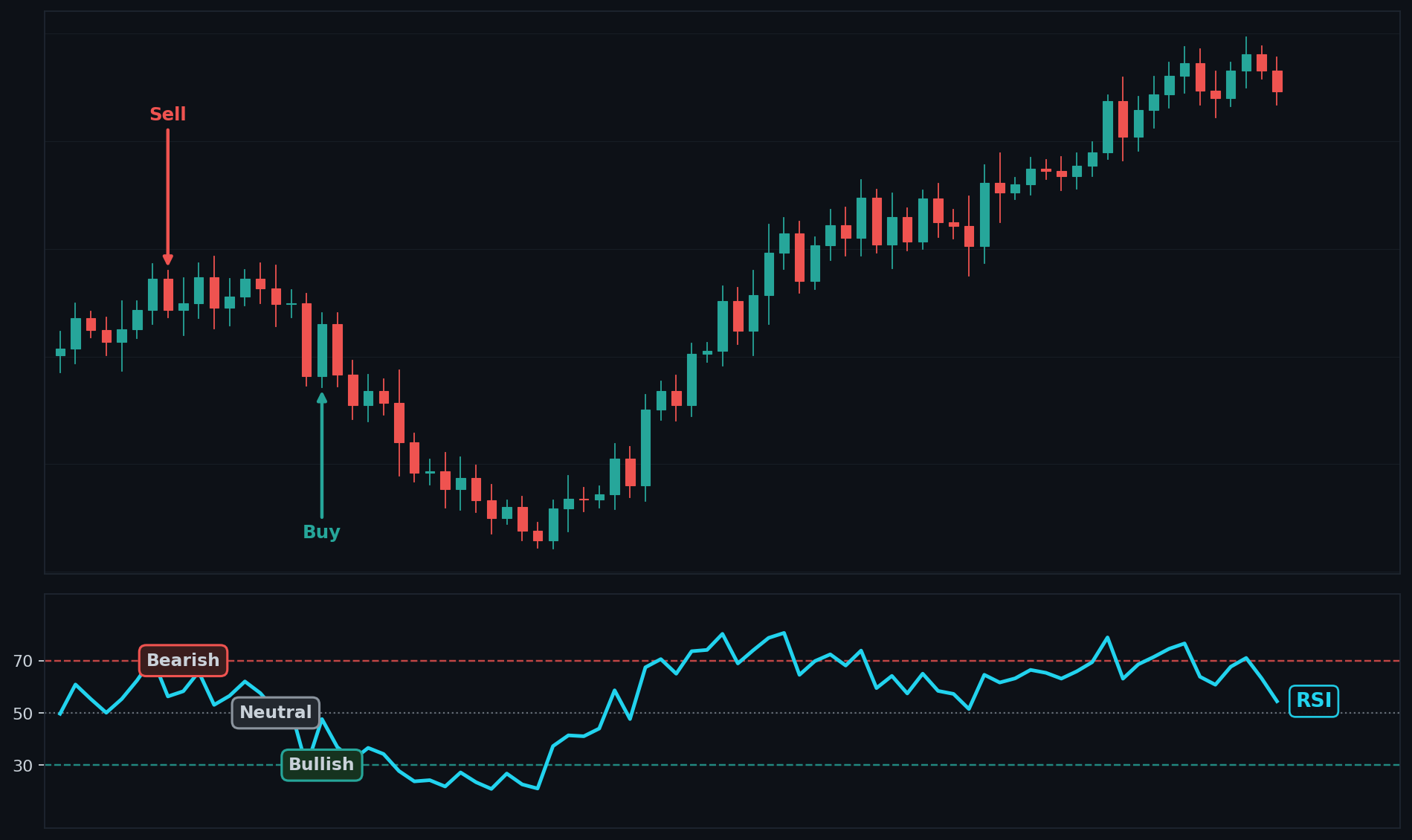
RSI Example Chart

How To Interpret RSI
Bullish: RSI turns up from below 30 (oversold), or holds above 50 in an uptrend.
Bearish: RSI turns down from above 70 (overbought), or holds below 50 in a downtrend.
Neutral: RSI drifts around 50 with no extreme. Momentum is balanced.
Common Use Cases
Reversal trading: buy oversold turns, sell overbought turns in ranging markets.
Trend confirmation: in an uptrend, RSI holding above 40 to 50 confirms strength.
Divergence: price highs not matched by RSI highs warn of a coming reversal.
Breakout confirmation: RSI pushing through 50 or 60 supports a breakout.
Risk management: exit longs when RSI rolls over from overbought.
Advanced Use Cases
RSI with a trend filter to avoid bad oversold buys: only buy RSI oversold turns when price is above a 200-period moving average. In a strong downtrend RSI can stay oversold for a long time, so the trend filter keeps you from catching a falling knife.
RSI divergence plus a structure trigger: take a long only when bullish RSI divergence (price lower low, RSI higher low) lines up with a confirmed swing low. Combining momentum divergence with price structure filters out weak divergences that fail.
CoinQuant Examples
"Buy BTC when RSI crosses above 30 and price is above the 200-period SMA; sell when RSI crosses below 70."
"Go long ETH when RSI holds above 50 and price breaks above recent highs."
Advantages
Clear, bounded momentum readings.
Effective at spotting overbought and oversold extremes.
Divergence gives early reversal warnings.
Works across all markets and timeframes.
Limitations
Can stay overbought or oversold for long stretches in strong trends.
Standalone extreme signals fail often without a trend filter.
Less reliable in fast, news-driven moves.
Best paired with trend or structure confirmation.
Works Best With
A trend filter such as a moving average to avoid fighting strong trends.
Support and resistance for entry timing.
MACD for momentum confirmation.
Volume to validate breakouts.
Default Settings
Period: 14
Source: Close
Overbought / Oversold: 70 / 30
CCI – Commodity Channel Index
Overview
CCI measures how far price has strayed from its average to spot overbought and oversold extremes and strong breakouts.
What Is CCI?
CCI (created by Donald Lambert) measures the distance between the current price and its average price, scaled by how much price normally varies. When price is far above its average, CCI is high and positive; when far below, CCI is deeply negative. Unlike bounded oscillators, CCI can run beyond +100 or -100, which is exactly where the useful signals appear. It measures the strength of a deviation from the norm.
Why Traders Use CCI
Spots extremes: readings above +100 or below -100 flag strong, unusual moves.
Catches breakouts: a push past +100 can mark the start of a strong up move.
Times reversals: returns from extreme zones often precede pullbacks.
Reveals divergence: price and CCI disagreeing warns of weakening momentum.
Flexible scale: the unbounded range highlights truly strong moves.
Input Source
In CoinQuant the CCI calculation centers on the Typical price ((High + Low + Close) / 3) by design, but you can choose the input. Supported sources are Open, Close, High, Low, Volume, and another indicator. Typical price is the standard for CCI; choosing a different source changes what deviation you measure, and applying CCI to another indicator (an indicator of an indicator) gauges how far that indicator has strayed from its own norm.
Formula
CCI = (Typical Price - SMA of Typical Price) / (0.015 x Mean Deviation)
Where:
Typical Price = (High + Low + Close) / 3.
SMA of Typical Price = the simple average of typical price over the period.
Mean Deviation = the average absolute distance of typical price from that average.
0.015 = a constant that scales most readings into the +100 to -100 range.
Example
Suppose Typical Price = 110, its SMA = 100, and Mean Deviation = 4.
Numerator = 110 - 100 = 10.
Denominator = 0.015 x 4 = 0.06.
CCI = 10 / 0.06 = 166.7.
A CCI of about +167 is well above +100, signaling a strong, possibly overbought upward deviation.
CCI Example Chart
.png)
How To Interpret CCI
Bullish: CCI rises from below -100 back above it (oversold bounce), or pushes above +100 on a breakout.
Bearish: CCI falls from above +100 back below it, or drops below -100 on a breakdown.
Neutral: CCI hovers between -100 and +100 near zero. No strong deviation.
Common Use Cases
Reversal trading: fade extreme readings back toward zero in ranging markets.
Breakout trading: trade in the direction of a push beyond +100 or -100 in trends.
Divergence: spot momentum weakening before price turns.
Trend confirmation: CCI holding above zero supports an uptrend.
Risk management: exit when CCI snaps back from an extreme.
Advanced Use Cases
CCI breakout with trend alignment: only take a CCI cross above +100 as a long when price is above a 50-period moving average. This turns CCI into a momentum trigger that fires only in the direction of the larger trend.
Dual-zone CCI for reversals: in a confirmed range, buy when CCI exits below -100 and crosses back above it, and sell when it exits above +100 and crosses back below, combined with price at a support or resistance level for confirmation.
CoinQuant Examples
"Buy BTC when CCI crosses above +100 and price is above the 50-period EMA; sell when CCI crosses below -100."
"Go long ETH when CCI rises back above -100 from oversold near a support level."
Advantages
Highlights strong deviations and breakouts clearly.
Works for both reversals and breakouts depending on settings.
Unbounded scale flags exceptionally strong moves.
Useful divergence signals.
Limitations
Unbounded readings can be hard to interpret without context.
Prone to false signals in choppy markets.
Sensitive to the chosen period.
Best paired with a trend filter.
Works Best With
A moving average for trend direction.
Support and resistance for entry timing.
RSI for a second momentum read.
Volume to confirm breakouts.
Default Settings
Period: 20
Source: Typical Price
Key Levels: +100 / -100
CMO – Chande Momentum Oscillator
Overview
CMO measures pure momentum on a scale of -100 to +100 by comparing recent gains against recent losses.
What Is CMO?
CMO (created by Tushar Chande) measures the net strength of buying versus selling. It sums all the up moves and all the down moves over a period, then expresses their difference as a percentage of total movement. A reading near +100 means almost all movement was upward (strong bullish momentum); near -100 means almost all movement was downward. Unlike RSI, it does not smooth the averages, so it reacts faster and swings more.
Why Traders Use CMO
Pure momentum read: shows the raw balance of buying and selling pressure.
Fast response: unsmoothed math reacts quickly to shifts.
Overbought and oversold: extreme readings flag stretched conditions.
Directional bias: above zero is bullish, below zero is bearish.
Powers other tools: CMO is the volatility input inside VIDYA.
Input Source
In CoinQuant you choose the input CMO is calculated on. Supported sources are Open, Close, High, Low, Volume, and another indicator. Close is the default and most common. Changing the source changes what momentum you measure: CMO of Volume reads momentum in participation, while applying CMO to another indicator (an indicator of an indicator) measures the raw momentum of that indicator for advanced filtering.
Formula
CMO = ((Sum of Up Moves - Sum of Down Moves) / (Sum of Up Moves + Sum of Down Moves)) x 100
Where:
Sum of Up Moves = total of all positive price changes over the period.
Sum of Down Moves = total of all negative price changes (as positive values) over the period.
The result ranges from -100 (all down) to +100 (all up).
period = the lookback length, 20 by default.
Example
Over the period, suppose Sum of Up Moves = 30 and Sum of Down Moves = 10.
Numerator = 30 - 10 = 20.
Denominator = 30 + 10 = 40.
CMO = (20 / 40) x 100 = 50.
A CMO of +50 shows clearly bullish momentum: up moves outweighed down moves by a wide margin.
CMO Example Chart
.png)
How To Interpret CMO
Bullish: CMO is above zero, especially rising toward or past +50.
Bearish: CMO is below zero, especially falling toward or past -50.
Neutral: CMO hovers near the zero line. Momentum is balanced.
Common Use Cases
Momentum confirmation: confirm trend direction with CMO's sign.
Reversal trading: fade extreme readings near +50 or -50 in ranges.
Zero-line crosses: a cross above zero is a simple bullish trigger.
Divergence: price and CMO disagreeing warns of a fading move.
Risk management: exit when CMO rolls over from an extreme.
Advanced Use Cases
CMO zero-cross with trend gate: take a CMO cross above zero as a long only when price is above a 50-period moving average. The trend filter keeps the fast, swingy CMO from generating counter-trend whipsaws.
CMO extreme plus RSI agreement: require CMO above +50 and RSI above 60 for a strong-momentum long, or both at the low extreme for a short. Two momentum tools agreeing filters out noise from CMO's unsmoothed swings.
CoinQuant Examples
"Buy BTC when CMO crosses above zero and price is above the 50-period EMA; sell when CMO crosses below zero."
"Go long ETH when CMO is above +50 and RSI is above 60, confirming strong momentum."
Advantages
Clean, fast read on raw momentum.
Symmetric -100 to +100 scale is easy to interpret.
Reacts quickly to momentum shifts.
Useful for both crosses and extremes.
Limitations
Unsmoothed math makes it noisy and prone to whipsaws.
Can give frequent false signals in choppy markets.
Sensitive to the chosen period.
Best paired with a trend or second momentum filter.
Works Best With
A moving average for trend direction.
RSI for momentum confirmation.
VIDYA, which uses CMO internally.
Support and resistance for timing.
Default Settings
Period: 20
Source: Close
Key Levels: +50 / -50, zero line
ROC – Rate of Change
Overview
ROC measures the percentage change in price over a set number of bars, giving a simple, direct read on momentum.
What Is ROC?
ROC measures how much price has changed, in percent, compared to a fixed number of bars ago. If price is higher than it was N bars back, ROC is positive; if lower, ROC is negative. The bigger the percentage move, the larger the ROC value. It is one of the purest momentum measures: it tells you how fast and how far price is moving, not its direction relative to an average.
Why Traders Use ROC
Direct momentum: a clean percentage read on speed of change.
Zero-line signals: crossing above or below zero flags momentum shifts.
Acceleration: a rising ROC shows momentum building, a falling ROC shows it fading.
Divergence: price and ROC disagreeing warns of a coming turn.
Simple and fast: easy to compute and quick to react.
Input Source
In CoinQuant you choose the input ROC is calculated on. Supported sources are Open, Close, High, Low, Volume, and another indicator. Close is the default and most common. Changing the source changes what rate of change you measure: ROC of Volume shows how fast participation is changing, while applying ROC to another indicator (an indicator of an indicator) measures the speed of change of that indicator for advanced filtering.
Formula
ROC = ((price now - price N bars ago) / price N bars ago) x 100
Where:
price now = the current source value (Close by default).
price N bars ago = the source value N bars back.
N = the lookback length, 9 by default.
The result is a percentage: positive for gains, negative for losses.
Example
Use a 9-period ROC. Suppose price now = 110 and price 9 bars ago = 100.
Change = 110 - 100 = 10.
Divide by the old price: 10 / 100 = 0.1.
Multiply by 100: 0.1 x 100 = 10.
ROC = +10%, meaning price is 10% higher than it was nine bars ago, a clear positive momentum reading.
ROC Example Chart
.png)
How To Interpret ROC
Bullish: ROC is above zero, especially rising, showing accelerating upside momentum.
Bearish: ROC is below zero, especially falling, showing accelerating downside momentum.
Neutral: ROC hovers near zero. Price is roughly flat versus N bars ago.
Common Use Cases
Zero-line crosses: a cross above zero is a basic bullish trigger.
Momentum confirmation: a strong ROC supports the current trend.
Divergence: ROC failing to confirm new price highs warns of weakness.
Breakout confirmation: a spike in ROC supports a real breakout.
Risk management: exit when ROC turns back toward zero.
Advanced Use Cases
ROC zero-cross with trend filter: take a ROC cross above zero as a long only when price is above a 100-period moving average. This keeps the simple momentum trigger aligned with the larger trend and cuts whipsaws.
ROC threshold for breakout strength: require ROC above a set positive level (for example +5%) at the moment of a price breakout, confirming the move has real speed behind it rather than a slow drift that often fails.
CoinQuant Examples
"Buy BTC when ROC crosses above zero and price is above the 100-period SMA; sell when ROC crosses below zero."
"Go long ETH when price breaks above recent highs and ROC is above +5%."
Advantages
Simple, direct momentum measurement.
Clear zero-line signals.
Good early warning via divergence.
Works on any market or timeframe.
Limitations
Unbounded, so no fixed overbought or oversold levels.
Noisy and prone to false zero-line crosses in chop.
Sensitive to the chosen lookback length.
Best paired with a trend filter.
Works Best With
A moving average for trend direction.
RSI or MACD for momentum confirmation.
Volume to validate breakouts.
Support and resistance for timing.
Default Settings
Period: 9
Source: Close
Key Level: Zero line
MACD – Moving Average Convergence Divergence
Overview
MACD blends trend and momentum into one tool by tracking the gap between a fast and a slow moving average.
What Is MACD?
MACD (created by Gerald Appel) measures the relationship between two exponential moving averages: a fast one (12 periods) and a slow one (26 periods). The MACD line is the difference between them, showing whether momentum is building up or down. A signal line (a 9-period EMA of the MACD line) smooths it for crossover signals, and a histogram shows the gap between the two. It captures both the direction of the trend and the strength of momentum.
Why Traders Use MACD
Two tools in one: combines trend direction and momentum.
Clear crossovers: MACD crossing its signal line is a classic entry cue.
Zero-line context: above zero is broadly bullish, below is bearish.
Histogram read: a growing histogram shows accelerating momentum.
Divergence: price and MACD disagreeing flags weakening trends.
Input Source
In CoinQuant the MACD is built from EMAs of the chosen input. Supported sources are Open, Close, High, Low, Volume, and another indicator. Close is the default and most common. Changing the source changes what convergence you track: MACD of Volume reads momentum in participation, while applying MACD to another indicator (an indicator of an indicator) measures the momentum of that indicator for advanced filtering.
Components
MACD Line: fast EMA minus slow EMA, the core momentum measure.
Signal Line: a 9-period EMA of the MACD line, used for crossovers.
Histogram: MACD line minus signal line, showing momentum acceleration.
Formula
MACD Line = EMA(fast) - EMA(slow)
Signal Line = EMA of MACD Line over the signal period
Histogram = MACD Line - Signal Line
Where:
EMA(fast) = the 12-period exponential moving average by default.
EMA(slow) = the 26-period exponential moving average by default.
Signal period = 9 by default.
Example
Suppose the 12-period EMA = 105 and the 26-period EMA = 100.
MACD Line = 105 - 100 = 5.
If the 9-period EMA of the MACD line (signal) = 3, then Histogram = 5 - 3 = 2.
A positive MACD line (5) above its signal (3) with a positive histogram (2) shows bullish momentum that is still accelerating.
MACD Example Chart
.png)
How To Interpret MACD
Bullish: MACD line crosses above the signal line, especially above zero, with a rising histogram.
Bearish: MACD line crosses below the signal line, especially below zero, with a falling histogram.
Neutral: MACD and signal hug each other near zero. No clear momentum.
Common Use Cases
Crossover trading: enter on MACD crossing its signal line.
Trend confirmation: MACD above zero supports an uptrend.
Histogram momentum: a growing histogram confirms a strengthening move.
Divergence: MACD failing to confirm new price highs warns of a turn.
Risk management: exit on the opposite crossover.
Advanced Use Cases
MACD crossover with zero-line and trend filter: take a MACD-over-signal crossover as a long only when the MACD line is above zero and price is above a 200-period moving average. Requiring all three keeps entries firmly in established uptrends.
MACD histogram divergence plus structure: enter when the histogram makes a higher low while price makes a lower low (bullish divergence) and price holds a confirmed support level, filtering out divergences that fail at random spots.
CoinQuant Examples
"Buy BTC when MACD crosses above its signal line above zero and price is above the 200-period SMA; sell on the opposite cross."
"Go long ETH when the MACD histogram turns positive and price breaks above recent highs."
Advantages
Combines trend and momentum in one view.
Clear, well-known crossover signals.
Histogram adds momentum-acceleration insight.
Strong divergence signals.
Limitations
Lagging, since it is built from moving averages.
Whipsaws in choppy, sideways markets.
Crossovers can come late on fast moves.
Best paired with a trend filter.
Works Best With
A long moving average for trend direction.
RSI for a second momentum read.
Support and resistance for entry timing.
Volume to validate breakouts.
Default Settings
Fast: 12
Slow: 26
Signal: 9
Source: Close
STOCH – Stochastic Oscillator
Overview
The Stochastic Oscillator shows where the current close sits within its recent high-low range to spot overbought and oversold turns.
What Is STOCH?
The Stochastic Oscillator (created by George Lane) measures the position of the closing price relative to the high-low range over a period, on a 0 to 100 scale. A reading near 100 means price is closing near the top of its recent range (strong); near 0 means closing near the bottom (weak). The idea is that in uptrends prices close near highs, and in downtrends near lows. It measures momentum relative to range, which makes it especially useful in ranging markets.
Why Traders Use STOCH
Spots extremes: classic overbought (above 80) and oversold (below 20) zones.
Times reversals: turns from extremes often precede bounces or drops.
Two-line crossovers: %K crossing %D gives clean entry cues.
Strong in ranges: it shines where price oscillates within a band.
Divergence: price and stochastic disagreeing warns of a turn.
Input Source
The Stochastic uses High, Low, and Close by design to build its range and position. In CoinQuant the available sources are Open, Close, High, Low, Volume, and another indicator, but the high-low-close trio drives the standard calculation. Advanced users can apply stochastic logic to another series (an indicator of an indicator) to see where that indicator sits within its own recent range.
Components
%K: the main fast line, measuring close position within the range.
%D: a 3-period moving average of %K, the slower signal line.
Formula
%K = ((Close - Lowest Low) / (Highest High - Lowest Low)) x 100
%D = simple moving average of %K over the %D period
Where:
Close = the current closing price.
Lowest Low = the lowest low over the %K period (14 by default).
Highest High = the highest high over the %K period.
%D period = 3 by default.
Example
Use %K period 14. Suppose Close = 118, Lowest Low = 100, Highest High = 120.
Numerator = 118 - 100 = 18.
Denominator = 120 - 100 = 20.
%K = (18 / 20) x 100 = 90.
A %K of 90 means price is closing near the top of its recent range, an overbought reading.
STOCH Example Chart
.png)
How To Interpret STOCH
Bullish: %K crosses above %D, especially from below 20 (oversold).
Bearish: %K crosses below %D, especially from above 80 (overbought).
Neutral: both lines drift mid-range near 50. No clear edge.
Common Use Cases
Reversal trading: buy oversold crossovers, sell overbought crossovers in ranges.
Crossover signals: trade %K crossing %D for timing.
Divergence: stochastic failing to confirm price warns of a turn.
Range trading: ideal for buying low and selling high in a band.
Risk management: exit when the oscillator reaches the opposite extreme.
Advanced Use Cases
Stochastic crossover with trend filter: only take oversold %K-over-%D crossovers as longs when price is above a 50-period moving average. In downtrends the stochastic can stay oversold, so the filter avoids premature buys.
Stochastic plus RSI double confirmation: require both the stochastic crossing up from below 20 and RSI turning up from below 30 for a reversal long. Two oscillators agreeing at extremes filters out single-tool false signals.
CoinQuant Examples
"Buy BTC when %K crosses above %D below 20 and price is above the 50-period EMA; sell when %K crosses below %D above 80."
"Go long ETH when the stochastic and RSI both turn up from oversold near support."
Advantages
Excellent in ranging markets.
Clear overbought and oversold signals.
Crossovers give precise timing.
Useful divergence signals.
Limitations
Whipsaws and stays pinned at extremes in strong trends.
Frequent false crossovers in choppy conditions.
Less effective in pure trend markets without a filter.
Best paired with a trend tool.
Works Best With
A moving average for trend direction.
RSI for momentum confirmation.
Support and resistance for entry timing.
Volume to validate moves.
Default Settings
%K Period: 14
%D Period: 3
Overbought / Oversold: 80 / 20
Source: High, Low, Close
MFI – Money Flow Index
Overview
MFI is a volume-weighted momentum gauge from 0 to 100, often called a volume-powered RSI.
What Is MFI?
MFI measures buying and selling pressure by combining price and volume. It looks at the typical price each bar and whether it rose or fell, then weights that move by the bar's volume to compute money flow. Strong up moves on high volume push MFI up; strong down moves on high volume push it down. Because it folds volume into momentum, it can confirm whether a price move has real participation behind it. It ranges from 0 to 100.
Why Traders Use MFI
Volume-backed momentum: confirms moves with real participation, not just price.
Spots extremes: overbought (above 80) and oversold (below 20) zones.
Detects weak moves: price rising on falling MFI warns of thin support.
Divergence: price and MFI disagreeing flags potential reversals.
Bounded scale: the 0 to 100 range is easy to threshold.
Input Source
MFI uses Typical price ((High + Low + Close) / 3) and Volume together by design, so both price and volume inputs are essential. In CoinQuant the available sources are Open, Close, High, Low, Volume, and another indicator, but MFI specifically blends typical price with volume. This volume dependence is what separates MFI from a pure price oscillator like RSI.
Formula
MFI = 100 - (100 / (1 + Money Flow Ratio))
Where:
Typical Price = (High + Low + Close) / 3.
Raw Money Flow = Typical Price x Volume for each bar.
Money Flow Ratio = (sum of positive money flow) / (sum of negative money flow) over the period.
Positive flow is on bars where typical price rose; negative flow where it fell.
Example
Over the period, suppose positive money flow totals 300 and negative money flow totals 100.
Money Flow Ratio = 300 / 100 = 3.
MFI = 100 - (100 / (1 + 3)) = 100 - (100 / 4) = 100 - 25 = 75.
An MFI of 75 shows strong, volume-backed buying pressure approaching the overbought zone.
MFI Example Chart
.png)
How To Interpret MFI
Bullish: MFI turns up from below 20 (oversold) on rising volume, or holds above 50 in an uptrend.
Bearish: MFI turns down from above 80 (overbought), or holds below 50 in a downtrend.
Neutral: MFI drifts near 50. Pressure is balanced.
Common Use Cases
Reversal trading: buy oversold turns, sell overbought turns in ranges.
Volume confirmation: confirm a breakout has real money flow behind it.
Divergence: MFI failing to confirm new price highs warns of weak demand.
Trend confirmation: MFI holding above 50 supports an uptrend.
Risk management: exit when MFI rolls over from an extreme.
Advanced Use Cases
MFI divergence as an early reversal filter: take a reversal long only when bullish MFI divergence (price lower low, MFI higher low) appears at a support level. Because MFI includes volume, this flags fading selling pressure before price confirms.
MFI plus RSI for breakout quality: require both MFI and RSI above 50 on a breakout. MFI confirms volume is supporting the move while RSI confirms price momentum, filtering out low-participation fakeouts.
CoinQuant Examples
"Buy BTC when MFI rises above 20 from oversold and price is above the 50-period EMA; sell when MFI crosses below 80."
"Go long ETH when price breaks above recent highs and MFI is above 50, confirming volume support."
Advantages
Adds volume to momentum for stronger confirmation.
Clear overbought and oversold signals.
Divergence gives early reversal warnings.
Helps separate real moves from low-volume fakeouts.
Limitations
Needs reliable volume data to work well.
Can stay at extremes during strong trends.
Whipsaws in choppy markets.
Best paired with a trend filter.
Works Best With
A moving average for trend direction.
OBV or VWAP for further volume context.
RSI for a price-only momentum read.
Support and resistance for timing.
Default Settings
Period: 14
Source: Typical Price and Volume
Overbought / Oversold: 80 / 20
3. Volatility Indicators
ATR – Average True Range
Overview
ATR measures how much an asset typically moves in a period, giving a clean read on volatility for stops and sizing.
What Is ATR?
ATR (created by Welles Wilder) measures volatility, not direction. It looks at the true range of each bar (the largest of: high minus low, high minus prior close, or prior close minus low) and smooths it over a period. A high ATR means the asset is moving a lot; a low ATR means it is quiet. It does not tell you which way price is going, only how big the swings are.
Why Traders Use ATR?
Volatility read: a direct measure of how much price moves.
Smarter stops: place stops a multiple of ATR away to fit current conditions.
Position sizing: size trades by volatility to keep risk consistent.
Breakout context: rising ATR confirms expanding, energetic moves.
Regime detection: low ATR flags quiet markets, high ATR flags active ones.
Input Source
ATR uses High, Low, and Close by design to build true range, so those three inputs drive it. In CoinQuant the available sources are Open, Close, High, Low, Volume, and another indicator, but the high-low-close trio is essential to ATR's calculation. The smoothing uses Wilder's method (RMA), which keeps the line stable.
Formula
True Range = the greatest of: (High - Low), abs(High - prior Close), abs(prior Close - Low)
ATR = Wilder's smoothed average of True Range over the period
Where:
High - Low = the current bar's range.
abs(High - prior Close) and abs(prior Close - Low) capture gaps from the previous close.
period = the lookback length, 14 by default.
Example
Suppose for a bar: High = 110, Low = 104, prior Close = 106.
High - Low = 110 - 104 = 6.
abs(High - prior Close) = abs(110 - 106) = 4.
abs(prior Close - Low) = abs(106 - 104) = 2.
True Range = the greatest of (6, 4, 2) = 6. This bar's true range feeds the ATR average, contributing a moderately volatile reading.
ATR Example Chart
.png)
How To Interpret ATR
High volatility: ATR is rising or elevated. Expect larger swings, widen stops.
Low volatility: ATR is low or falling. Moves are small, a squeeze or breakout may follow.
Note: ATR gives no direction. Use it for sizing and stops, paired with a directional tool.
Common Use Cases
Stop placement: set stops a multiple of ATR (for example 1.5x) from entry.
Position sizing: trade smaller when ATR is high, larger when it is low.
Breakout confirmation: a jump in ATR supports a genuine breakout.
Volatility filtering: avoid trend trades when ATR signals dead, quiet markets.
Trailing stops: trail a stop at a fixed ATR distance to ride trends.
Advanced Use Cases
ATR-scaled position sizing: size each trade so a fixed dollar risk equals a set ATR multiple, automatically trading smaller in volatile regimes and larger in calm ones. This keeps risk per trade constant across market conditions.
ATR expansion as a breakout trigger filter: only act on a price breakout when ATR is also expanding above its recent average. A breakout with flat or falling ATR often lacks energy and fails, so the ATR filter screens out weak breaks.
CoinQuant Examples
"Buy BTC on a breakout above recent highs and set the stop loss 1.5x ATR below entry."
"Trail the stop on a long ETH position at 3x ATR below the highest close since entry."
Advantages
Clean, reliable volatility measurement.
Excellent for risk management and stop placement.
Adapts naturally to changing market conditions.
Works on any market or timeframe.
Limitations
Gives no direction, only volatility.
Past volatility does not guarantee future volatility.
Sensitive to the chosen period.
Must be paired with a directional tool for entries.
Works Best With
A directional indicator (EMA, MACD, or price structure) for trade direction.
Supertrend, which uses ATR internally.
Bollinger Bands or Keltner Channels for volatility context.
Breakout levels for entry timing.
Default Settings
Period: 14
Source: High, Low, Close
Smoothing: Wilder's method
BB – Bollinger Bands
Overview
Bollinger Bands wrap price in a volatility envelope that widens in active markets and narrows in quiet ones.
What Is BB?
Bollinger Bands (created by John Bollinger) measure volatility around a moving average. The middle band is a simple moving average; the upper and lower bands sit a set number of standard deviations above and below it. Because standard deviation grows when price swings widen, the bands expand in volatile periods and contract in calm ones. They show both a fair-value center and the dynamic range price tends to stay within.
Why Traders Use BB
Volatility envelope: bands widen and narrow with market activity.
Squeeze signals: very narrow bands often precede a big breakout.
Mean reversion: price often returns toward the middle band.
Breakout context: closes outside the bands flag strong moves.
Dynamic levels: the bands act as moving support and resistance.
Input Source
In CoinQuant you choose the input the bands are built on. Supported sources are Open, Close, High, Low, Volume, and another indicator. Close is the default, though Typical price is a common choice. Changing the source shifts what the envelope wraps: bands on Typical price balance the extremes, while applying bands to another indicator (an indicator of an indicator) builds a volatility envelope around that indicator for advanced filtering.
Formula
Middle Band = SMA of price over the period
Upper Band = Middle Band + (multiplier x standard deviation)
Lower Band = Middle Band - (multiplier x standard deviation)
Where:
SMA = the simple moving average, 20 periods by default.
standard deviation = a measure of how far price spreads from the average.
multiplier = the number of standard deviations, 2 by default.
Example
Suppose the 20-period SMA = 100 and the standard deviation = 5, with a multiplier of 2.
Band offset = 2 x 5 = 10.
Upper Band = 100 + 10 = 110.
Lower Band = 100 - 10 = 90.
Price tends to trade between 90 and 110; a close above 110 or below 90 signals an unusually strong move.
BB Example Chart
.png)
How To Interpret BB
Bullish: price walks up along the upper band in a strong uptrend, or bounces off the lower band in a range.
Bearish: price walks down along the lower band in a downtrend, or rejects the upper band in a range.
Neutral: price oscillates around the middle band. A tight squeeze warns of a coming breakout in either direction.
Common Use Cases
Mean reversion: buy near the lower band, sell near the upper band in ranges.
Squeeze breakouts: trade the expansion after the bands pinch tight.
Trend riding: in strong trends, price hugging a band confirms momentum.
Volatility read: band width directly shows current volatility.
Risk management: use the opposite band as a logical exit.
Advanced Use Cases
Squeeze plus breakout direction filter: when band width hits a multi-bar low (a squeeze), wait for a close outside a band and confirm direction with price above or below the middle band, entering only in the breakout direction. This times entries to volatility expansion.
Band-walk trend continuation: in a confirmed uptrend, buy pullbacks to the middle band only while price keeps closing in the upper half of the bands, using the lower band as the invalidation level. This rides trends instead of fading them.
CoinQuant Examples
"Buy BTC when price closes above the upper band after a band squeeze; exit on a close back below the middle band."
"Go long ETH when price bounces off the lower band in a range and RSI turns up from oversold."
Advantages
Adapts to volatility automatically.
Useful for both mean reversion and breakouts.
Squeeze gives early breakout warnings.
Clear dynamic support and resistance.
Limitations
Price can ride a band for a long time in strong trends.
Mean-reversion signals fail in trending markets.
Sensitive to the period and multiplier.
Best paired with a momentum or trend tool.
Works Best With
RSI or MFI for reversal confirmation at the bands.
A trend filter to know whether to fade or follow.
ATR for added volatility context.
Volume to validate breakouts.
Default Settings
Period: 20
Standard Deviations: 2
Source: Close
KC – Keltner Channel
Overview
Keltner Channels are smooth volatility bands built from an EMA and ATR, often used for trend continuation and breakouts.
What Is KC?
The Keltner Channel measures a volatility envelope around a trend line. The center is an exponential moving average, and the upper and lower channels sit a multiple of the Average True Range (ATR) above and below it. Because it uses ATR rather than standard deviation, the channel is smoother and steadier than Bollinger Bands. It shows the trend's direction (via the EMA center) and a volatility-based range around it.
Why Traders Use KC
Smooth bands: ATR-based channels are calmer than Bollinger Bands.
Trend bias: the EMA center leans the channel in the trend's direction.
Breakout signals: closes outside the channel flag strong directional moves.
Trend continuation: price riding a channel edge confirms momentum.
Dynamic levels: the channel acts as moving support and resistance.
Input Source
The center uses an EMA of the chosen input, and the width uses ATR (built from High, Low, Close). In CoinQuant the available sources are Open, Close, High, Low, Volume, and another indicator. Close is the default for the EMA center. Changing the source shifts the channel's center, while the ATR-based width keeps its volatility scaling intact.
Formula
Middle Line = EMA of price over the period
Upper Channel = Middle Line + (multiplier x ATR)
Lower Channel = Middle Line - (multiplier x ATR)
Where:
EMA = the exponential moving average center.
ATR = the Average True Range, the volatility measure.
multiplier = how far the channels sit from the center (commonly 2).
Example
Suppose the EMA center = 100, ATR = 4, multiplier = 2.
Channel offset = 2 x 4 = 8.
Upper Channel = 100 + 8 = 108.
Lower Channel = 100 - 8 = 92.
Price normally stays between 92 and 108; a close above 108 signals a strong upside breakout relative to recent volatility.
KC Example Chart
.png)
How To Interpret KC
Bullish: price breaks above and holds near the upper channel, or rides it in an uptrend.
Bearish: price breaks below and holds near the lower channel, or rides it in a downtrend.
Neutral: price oscillates around the middle EMA. No clear directional pressure.
Common Use Cases
Breakout trading: enter on a close beyond the channel in the breakout direction.
Trend continuation: ride trends while price holds the upper or lower channel.
Pullback entries: buy dips to the middle line in an uptrend.
Volatility context: channel width shows current volatility.
Risk management: use the opposite channel as a stop reference.
Advanced Use Cases
Keltner and Bollinger squeeze combo: when Bollinger Bands contract inside the Keltner Channel (a classic squeeze), wait for price to close outside the Keltner Channel and trade that direction. This pinpoints volatility breakouts with a strong directional bias.
Keltner trend-ride with EMA slope filter: only take upper-channel breakouts as longs when the middle EMA is sloping up. The slope filter keeps you trading breakouts in the trend direction rather than against it.
CoinQuant Examples
"Buy BTC when price closes above the upper Keltner channel and the middle EMA is sloping up; exit on a close below the middle line."
"Go long ETH on a Keltner breakout that follows a Bollinger Band squeeze."
Advantages
Smoother and steadier than Bollinger Bands.
Good for trend continuation and breakouts.
EMA center adds a built-in trend bias.
Clear dynamic support and resistance.
Limitations
Less reactive to sudden volatility spikes than standard-deviation bands.
Can lag at the very start of a new move.
Sensitive to the EMA period and ATR multiplier.
Best paired with a momentum or squeeze tool.
Works Best With
Bollinger Bands for squeeze detection.
ATR for volatility context.
A momentum indicator (RSI or MACD) for confirmation.
Volume to validate breakouts.
Default Settings
EMA Period: 20
ATR Multiplier: 2
Source: Close
KP – Keltner Position
Overview
Keltner Position turns the Keltner Channel into a single number that shows exactly where price sits inside the channel.
What is KP
Keltner Position measures price's location within its Keltner Channel as one value instead of three lines. It scales the channel so the lower edge, the middle EMA, and the upper edge map to fixed reference points, then reports where the current price falls between them. A high reading means price is near or above the upper channel (overextended up); a low reading means price is near or below the lower channel (overextended down). It distills channel context into a clean, readable signal.
Why Traders Use KP
One clean value: no need to eyeball three channel lines.
Overextension detection: flags when price is stretched to a channel edge.
Easy thresholds: simple to set rules around upper and lower zones.
Mean-reversion cues: extreme positions often snap back toward the middle.
Trend context: a steady high position confirms strong upward pressure.
Input Source
Keltner Position is derived from the Keltner Channel, whose center is an EMA of the chosen input and whose width comes from ATR (High, Low, Close). In CoinQuant the available sources are Open, Close, High, Low, Volume, and another indicator. Close is the default for the underlying channel. Changing the source shifts the channel and therefore where price is measured within it.
Formula
Keltner Position = (price - Lower Channel) / (Upper Channel - Lower Channel)
Where:
price = the current source value (Close by default).
Lower Channel = the Keltner lower band (EMA minus multiplier x ATR).
Upper Channel = the Keltner upper band (EMA plus multiplier x ATR).
A value of 0 means price is at the lower channel, 0.5 the middle, and 1 the upper channel; values beyond 0 to 1 mean price is outside the channel.
Example
Suppose Upper Channel = 110, Lower Channel = 90, and price = 104.
Numerator = 104 - 90 = 14.
Denominator = 110 - 90 = 20.
Keltner Position = 14 / 20 = 0.7.
A position of 0.7 means price sits 70% of the way up the channel, in the upper portion but not yet overextended past the top.
KP Example Chart
.png)
How To Interpret KP
Bullish: position holds high (near or above the upper channel) in an uptrend, or turns up from the low zone in a range.
Bearish: position holds low (near or below the lower channel) in a downtrend, or turns down from the high zone.
Neutral: position hovers near the middle (around 0.5). Price is balanced within its channel.
Common Use Cases
Overextension fades: sell near the top of the channel, buy near the bottom in ranges.
Trend confirmation: a persistently high position confirms strong upside.
Breakout signals: a position pushing above 1 flags an upper-channel breakout.
Pullback entries: buy when position dips to the middle in an uptrend.
Risk management: exit when position swings to the opposite extreme.
Advanced Use Cases
Position extreme plus trend filter: only fade a high Keltner Position (sell) when price is below a longer moving average, and only fade a low position (buy) when price is above it. This avoids fighting the dominant trend while still using overextension signals.
Position breakout for momentum entries: treat a Keltner Position pushing above 1 as a momentum long trigger when the channel's middle EMA is rising, capturing strong breakouts rather than fading them.
CoinQuant Examples
"Sell BTC when the Keltner Position rises above 0.9 in a range; buy when it falls below 0.1."
"Go long ETH when the Keltner Position breaks above 1 and the middle EMA is sloping up."
Advantages
Condenses channel context into one clear value.
Easy to set precise threshold rules.
Good for spotting overextension.
Works for both fades and breakouts.
Limitations
Depends entirely on the underlying Keltner Channel settings.
Extreme positions can persist in strong trends.
Needs a trend filter to avoid fading real moves.
Less intuitive than viewing the full channel for some traders.
Works Best With
The Keltner Channel itself for full context.
A trend filter (longer moving average) to guide fade-or-follow.
RSI for momentum confirmation.
ATR for volatility context.
Default Settings
Channel: Keltner (EMA 20, ATR multiplier 2)
Source: Close
Range: 0 (lower) to 1 (upper)
DC – Donchian Channel
Overview
The Donchian Channel tracks the highest high and lowest low over a period, drawing clean breakout levels around price.
What Is DC?
The Donchian Channel (created by Richard Donchian) measures the price range over a chosen number of bars. The upper band is the highest high of that period, the lower band is the lowest low, and the middle line is their average. It does not use volatility math like standard deviation or ATR; it simply marks the recent extremes. When price pushes above the upper band, it has made a new period high (a breakout); below the lower band, a new period low.
Why Traders Use DC
Clear breakout levels: the bands are literal recent highs and lows.
Trend following: classic turtle-style systems buy upper-band breaks.
Support and resistance: the bands mark obvious levels price respects.
Range read: a flat, narrow channel signals consolidation.
Simple and objective: no smoothing or parameters beyond the period.
Input Source
The Donchian Channel uses High and Low by design: the upper band is the highest High and the lower band is the lowest Low over the period. In CoinQuant the available sources are Open, Close, High, Low, Volume, and another indicator, but the high and low extremes drive the standard calculation. Advanced users can apply the channel logic to another series (an indicator of an indicator) to mark that series' own recent extremes.
Formula
Upper Band = highest High over the period
Lower Band = lowest Low over the period
Middle Line = (Upper Band + Lower Band) / 2
Where:
highest High = the largest high across the lookback window.
lowest Low = the smallest low across the lookback window.
period = the lookback length (commonly 20).
Example
Use a 20-period Donchian Channel. Suppose over the last 20 bars the highest high = 120 and the lowest low = 100.
Upper Band = 120.
Lower Band = 100.
Middle Line = (120 + 100) / 2 = 110.
A close above 120 marks a 20-bar breakout to the upside; a close below 100 marks a 20-bar breakdown.
DC Example Chart
.png)
How To Interpret DC
Bullish: price closes above the upper band, making a new period high (breakout).
Bearish: price closes below the lower band, making a new period low (breakdown).
Neutral: price moves between the bands. The market is ranging.
Common Use Cases
Breakout trading: buy upper-band breaks, sell lower-band breaks.
Trend following: ride trends that keep making new channel highs or lows.
Support and resistance: treat the bands as objective levels.
Trailing stops: use the opposite band as a trailing stop in a trend.
Range detection: a flat channel flags consolidation to avoid.
Advanced Use Cases
Donchian breakout with trend filter: only take upper-band breakouts as longs when price is above a 100-period moving average. This classic trend-following combination avoids buying breakouts that fight the larger downtrend.
Dual-channel entry and exit (turtle style): enter on a 20-bar Donchian breakout and exit on a shorter 10-bar Donchian breakout in the opposite direction. Using a wide channel for entries and a tighter one for exits locks in trends while cutting losers quickly.
CoinQuant Examples
"Buy BTC when price closes above the 20-bar Donchian upper band and price is above the 100-period SMA; exit on a 10-bar lower-band break."
"Go long ETH on a Donchian breakout and trail the stop at the lower band."
Advantages
Objective, easy-to-read breakout levels.
Excellent for trend-following systems.
No smoothing parameters to tune beyond the period.
Clear support and resistance.
Limitations
Prone to false breakouts in choppy markets.
Lagging, since bands reflect past extremes.
No volatility scaling like ATR-based channels.
Best paired with a trend filter.
Works Best With
A trend filter (moving average) to avoid counter-trend breakouts.
ATR for volatility-based stops.
Volume to validate breakouts.
A momentum indicator for confirmation.
Default Settings
Period: 20
Source: High and Low
Middle Line: Average of bands
VHF – Vertical Horizontal Filter
Overview
VHF tells you whether the market is trending or just chopping sideways, so you know which kind of strategy to use.
What Is VHF?
The Vertical Horizontal Filter (created by Adam White) measures trend strength. It compares the total directional move over a period (the vertical distance from the period's high to its low) against the sum of all the bar-to-bar movement (the horizontal back-and-forth). When price travels far in one direction with little wandering, VHF is high (strong trend). When price wanders a lot but goes nowhere, VHF is low (choppy range). It measures whether a market is trending, not which way.
Why Traders Use VHF
Regime detection: cleanly separates trending markets from ranging ones.
Strategy switching: tells you when to trend-follow versus mean-revert.
Filter for other tools: high VHF validates trend signals; low VHF warns against them.
Avoids chop: keeps you out of low-quality, range-bound trades.
Simple read: one rising or falling line shows trend strength.
Input Source
In CoinQuant you choose the input VHF is calculated on. Supported sources are Open, Close, High, Low, Volume, and another indicator. Close is the default and most common. Changing the source changes what trendiness you measure: VHF of Volume reads whether participation is trending, while applying VHF to another indicator (an indicator of an indicator) gauges how cleanly that indicator is trending for advanced filtering.
Formula
VHF = abs(Highest Close - Lowest Close) / (sum of abs(Close - prior Close) over the period)
Where:
Highest Close = the highest close over the period (the vertical move's top).
Lowest Close = the lowest close over the period (the vertical move's bottom).
the denominator = the sum of every bar-to-bar absolute price change (the horizontal movement).
A higher result means a stronger, cleaner trend.
Example
Over the period, suppose Highest Close = 120, Lowest Close = 100, and the sum of bar-to-bar changes = 40.
Numerator = abs(120 - 100) = 20.
Denominator = 40.
VHF = 20 / 40 = 0.5.
A VHF of 0.5 sits at a common threshold: above it the market is trending enough to follow; below it, conditions are choppier.
VHF Example Chart
.png)
How To Interpret VHF
Trending (strong): VHF is high or rising (for example above 0.5). Trend-following signals are more reliable, in whichever direction price moves.
Choppy (weak): VHF is low or falling. The market is ranging, so favor mean-reversion tactics or stand aside.
Note: VHF gives no direction. Pair it with a directional tool to know which way to trade.
Common Use Cases
Regime filter: enable trend strategies only when VHF is high.
Strategy switching: use mean reversion when VHF is low, trend following when high.
Breakout confirmation: rising VHF during a breakout signals a clean move.
Avoiding chop: skip trend trades when VHF flags a range.
Risk management: scale exposure with trend strength.
Advanced Use Cases
VHF as a master regime switch: when VHF is above 0.5, allow moving-average crossover entries; when it drops below 0.35, disable trend entries and switch to range tactics like fading Bollinger Band edges. This adapts the whole system to the market regime.
VHF plus directional momentum: combine VHF above 0.5 (clean trend) with MACD above its signal line for longs or below for shorts. VHF confirms the trend is strong while MACD supplies direction, filtering choppy traps.
CoinQuant Examples
"Only buy BTC on an EMA crossover when VHF is above 0.5; otherwise skip the trade."
"Go long ETH when price breaks above recent highs and VHF is rising above 0.5, confirming a real trend."
Advantages
Cleanly identifies trending versus ranging markets.
Powerful filter that cuts false signals.
Helps select the right strategy for conditions.
Simple single-line read.
Limitations
Gives no direction on its own.
Sensitive to the chosen period.
A high reading confirms a trend exists, not that it will continue.
Not a standalone entry signal.
Works Best With
A directional indicator (EMA, MACD, or price structure) for trade direction.
A trend-following system it can gate.
A mean-reversion tool for low-VHF regimes.
ATR for volatility-based stops.
Default Settings
Period: 28
Source: Close
Key Level: 0.5 (trend threshold)
4. Volume Indicators
OBV – On-Balance Volume
Overview
OBV adds and subtracts volume based on whether price closed up or down, turning volume into a running trend-confirmation line.
What Is OBV?
OBV (created by Joe Granville) measures cumulative volume flow. Each bar, it adds the full volume if price closed higher and subtracts it if price closed lower. The result is a running total that rises when buying pressure dominates and falls when selling pressure dominates. The absolute number does not matter; the direction and slope do. It measures whether volume is confirming price, which often hints at moves before price itself reacts.
Why Traders Use OBV
Confirms trends: a rising OBV supports a rising price.
Spots divergence: OBV and price disagreeing warns of a coming turn.
Leading hints: volume sometimes shifts before price does.
Breakout validation: OBV breaking out with price confirms real demand.
Simple and cumulative: one line tells the volume story.
Input Source
OBV uses Close (to decide up or down) and Volume (the amount added or subtracted) by design, so both are essential. In CoinQuant the available sources are Open, Close, High, Low, Volume, and another indicator, but OBV specifically pairs the close direction with volume. Reliable volume data is required for OBV to be meaningful.
Formula
If Close > prior Close: OBV = prior OBV + Volume
If Close < prior Close: OBV = prior OBV - Volume
If Close = prior Close: OBV = prior OBV
Where:
Close = the current closing price, compared to the previous close.
Volume = the bar's total traded volume.
The running total carries forward, so OBV is a cumulative line.
Example
Suppose OBV yesterday = 1000. Today price closes higher on volume of 200.
Price closed up, so add volume: 1000 + 200 = 1200.
If tomorrow price closes lower on volume of 150, subtract: 1200 - 150 = 1050.
The OBV line's rise to 1200 then dip to 1050 shows buying pressure that then eased slightly.
OBV Example Chart
.png)
How To Interpret OBV
Bullish: OBV is rising along with price, confirming buying pressure.
Bearish: OBV is falling along with price, confirming selling pressure.
Neutral or warning: OBV flattens or diverges from price, hinting the trend may be weakening.
Common Use Cases
Trend confirmation: only trust trends that OBV supports.
Divergence trading: act when OBV and price disagree.
Breakout validation: confirm breakouts with an OBV breakout.
Accumulation spotting: rising OBV in a range hints at quiet accumulation.
Risk management: exit when OBV turns against your position.
Advanced Use Cases
OBV divergence plus structure: take a reversal long only when bullish OBV divergence (price lower low, OBV higher low) lines up with a confirmed support level. The volume divergence signals fading selling before price confirms.
OBV trendline break with price breakout: draw a trendline on OBV and require both OBV and price to break their respective trendlines together. Demanding dual confirmation filters out price breakouts that lack volume support.
CoinQuant Examples
"Buy BTC when price breaks above recent highs and OBV also makes a new high, confirming the breakout."
"Exit the long ETH position when OBV makes a lower high while price makes a higher high (bearish divergence)."
Advantages
Simple, effective volume confirmation.
Strong divergence signals.
Can hint at moves before price reacts.
Works on any market with volume data.
Limitations
Needs reliable volume data.
The raw value is meaningless; only direction matters.
Can give false divergences in choppy markets.
Best paired with price structure or a trend tool.
Works Best With
Price structure and trendlines for confirmation.
A moving average for trend direction.
VWAP or MFI for added volume context.
Support and resistance for timing.
Default Settings
Source: Close and Volume
Type: Cumulative line
Key Signal: Slope and divergence
VWAP – Volume Weighted Average Price
Overview
VWAP is the average price weighted by volume, showing the true average level where most trading actually happened.
What Is VWAP?
VWAP measures the volume-weighted average price over a session or period. Instead of treating every bar equally like a normal average, it gives more weight to bars with higher volume. The result is a line that reflects where the bulk of trading took place, often seen as fair value. Institutions use it as a benchmark for execution, which is why price frequently reacts around it. It measures the consensus price adjusted for participation.
Why Traders Use VWAP
Fair-value benchmark: shows the average price most traders paid.
Institutional reference: large players measure execution against it.
Trend bias: price above VWAP is broadly bullish, below is bearish.
Mean reversion: price often snaps back toward VWAP intraday.
Dynamic support and resistance: VWAP often acts as a level.
Input Source
VWAP uses Typical price ((High + Low + Close) / 3) and Volume together by design, so both are essential. In CoinQuant the available sources are Open, Close, High, Low, Volume, and another indicator, but VWAP specifically weights typical price by volume. Reliable volume data is required, and VWAP is typically anchored to a session or chosen period.
Formula
VWAP = (sum of (Typical Price x Volume)) / (sum of Volume)
Where:
Typical Price = (High + Low + Close) / 3 for each bar.
Volume = the bar's traded volume, used as the weight.
Both sums run over the chosen session or period.
Higher-volume bars pull VWAP toward their price.
Example
Two bars: Bar 1 typical price 100 on volume 100; Bar 2 typical price 110 on volume 300.
Weighted sum = (100 x 100) + (110 x 300) = 10,000 + 33,000 = 43,000.
Total volume = 100 + 300 = 400.
VWAP = 43,000 / 400 = 107.5.
VWAP (107.5) leans toward 110 because the higher-volume bar carried more weight, unlike a simple average of 105.
VWAP Example Chart
.png)
How To Interpret VWAP
Bullish: price is above VWAP, especially bouncing off it in an uptrend.
Bearish: price is below VWAP, especially rejecting it in a downtrend.
Neutral: price oscillates around VWAP. No clear directional edge.
Common Use Cases
Trend bias: use price above or below VWAP as a directional filter.
Mean reversion: fade stretches far from VWAP back toward it.
Pullback entries: buy dips to VWAP in an uptrend.
Execution benchmark: judge whether your fills beat the average.
Risk management: use VWAP as a logical stop or exit level.
Advanced Use Cases
VWAP pullback in a confirmed trend: in an uptrend (price above a rising VWAP), buy pullbacks that touch VWAP and turn up, using a close below VWAP as the invalidation. This buys value within the trend rather than chasing extensions.
VWAP plus volume-confirmed breakout: require a breakout to hold above VWAP with OBV also rising. VWAP confirms price is above fair value while OBV confirms volume support, filtering out weak breaks.
CoinQuant Examples
"Buy BTC when price pulls back to VWAP and turns up while VWAP is rising; exit on a close below VWAP."
"Go long ETH only when price is above VWAP and breaks above recent highs."
Advantages
Reflects true volume-weighted fair value.
Trusted institutional benchmark.
Good for both trend bias and mean reversion.
Acts as reliable dynamic support and resistance.
Limitations
Most meaningful intraday; resets by session.
Needs reliable volume data.
Less useful on very long timeframes.
Best paired with a trend or volume tool.
Works Best With
OBV or MFI for volume confirmation.
A moving average for longer-term trend.
Support and resistance for entry timing.
ATR for stop placement.
Default Settings
Source: Typical Price and Volume
Anchor: Session or period
Key Signal: Price relative to VWAP
KVO – Klinger Volume Oscillator
Overview
KVO blends price and volume into an oscillator that aims to flag trend reversals while still tracking short-term flow.
What Is KVO?
The Klinger Volume Oscillator (created by Stephen Klinger) measures volume force, the push behind price, by combining trend direction, the size of the bar's range, and volume. It computes a volume force value, smooths it with a fast and a slow exponential moving average, and plots the difference as an oscillator around a zero line. A signal line then triggers crossovers. The goal is to capture long-term money flow trends without ignoring short-term volume bursts.
Why Traders Use KVO
Volume-based momentum: shows the force behind moves, not just price.
Reversal focus: designed to flag turns in money flow.
Crossover signals: KVO crossing its signal line gives entry cues.
Zero-line context: above zero is bullish flow, below is bearish.
Divergence: KVO and price disagreeing warns of a fading move.
Input Source
KVO uses High, Low, Close (for trend and range) and Volume (the force) together by design. In CoinQuant the available sources are Open, Close, High, Low, Volume, and another indicator, but KVO specifically combines the high-low-close range with volume. Reliable volume data is required for the oscillator to be meaningful.
Formula
Volume Force = Volume x trend direction x range factor
KVO = EMA(fast) of Volume Force - EMA(slow) of Volume Force
Signal Line = EMA of KVO over the signal period
Where:
trend direction = +1 or -1 depending on whether the typical price rose or fell.
range factor = a term based on the bar's high-low range, scaling the force.
EMA(fast) and EMA(slow) = the short and long smoothing of volume force (commonly 34 and 55).
Signal period = commonly 13.
Example
Suppose the fast EMA of volume force = 500 and the slow EMA = 300.
KVO = 500 - 300 = 200.
If the 13-period EMA of KVO (the signal) = 150, KVO (200) is above its signal (150).
A positive KVO above its rising signal line indicates bullish volume force, supporting an upward move.
KVO Example Chart
.png)
How To Interpret KVO
Bullish: KVO crosses above its signal line, especially while above zero.
Bearish: KVO crosses below its signal line, especially while below zero.
Neutral: KVO and signal hug each other near zero. Flow is balanced.
Common Use Cases
Crossover trading: enter on KVO crossing its signal line.
Reversal spotting: watch for KVO turns to flag money-flow shifts.
Divergence: KVO failing to confirm price warns of a turn.
Trend confirmation: KVO above zero supports an uptrend.
Risk management: exit on the opposite crossover.
Advanced Use Cases
KVO crossover with zero-line and trend filter: take a KVO-over-signal crossover as a long only when KVO is above zero and price is above a 50-period moving average, keeping volume-flow entries aligned with the trend.
KVO divergence plus price structure: enter when KVO makes a higher low while price makes a lower low (bullish divergence) at a confirmed support level, using volume force to anticipate a reversal before price turns.
CoinQuant Examples
"Buy BTC when KVO crosses above its signal line above zero and price is above the 50-period EMA; sell on the opposite cross."
"Go long ETH on bullish KVO divergence near a support level."
Advantages
Combines price and volume into one momentum read.
Aims to catch reversals early.
Clear crossover and zero-line signals.
Useful divergence signals.
Limitations
Complex calculation that is harder to interpret.
Needs reliable volume data.
Can whipsaw in choppy markets.
Best paired with a trend filter.
Works Best With
A moving average for trend direction.
OBV or VWAP for added volume context.
Price structure for divergence confirmation.
Support and resistance for timing.
Default Settings
Fast EMA: 34
Slow EMA: 55
Signal: 13
Source: High, Low, Close, Volume
PRESSURE – Volume Pressure Index
Overview
The Volume Pressure Index measures whether buyers or sellers are in control by reading where price closes within each bar, weighted by volume.
What Is PRESSURE?
The Volume Pressure Index measures net buying versus selling pressure. For each bar it estimates how much of the volume was buying-driven versus selling-driven, usually by looking at where the close sits within the bar's range, then weights that by volume. A close near the high on strong volume signals buying pressure; a close near the low signals selling pressure. Accumulated or smoothed, it reveals accumulation (quiet buying) and distribution (quiet selling) that may precede price moves.
Why Traders Use PRESSURE
Pressure read: shows who is really in control, buyers or sellers.
Accumulation and distribution: detects quiet buying or selling early.
Leading hints: pressure can shift before price reacts.
Breakout validation: rising pressure confirms a real move.
Divergence: pressure and price disagreeing warns of a turn.
Input Source
The Volume Pressure Index uses High, Low, Close (to locate the close within the range) and Volume (the weight) by design. In CoinQuant the available sources are Open, Close, High, Low, Volume, and another indicator, but pressure specifically blends the close's position in the bar with volume. Reliable volume data is required.
Formula
Bar Pressure = ((Close - Low) - (High - Close)) / (High - Low) x Volume
PRESSURE = smoothed or cumulative sum of Bar Pressure over the period
Where:
(Close - Low) - (High - Close) = where the close sits in the range, positive near the high, negative near the low.
dividing by (High - Low) scales it between -1 and +1.
multiplying by Volume weights the pressure by participation.
the result is then accumulated or smoothed over the period.
Example
Suppose a bar: High = 110, Low = 100, Close = 108, Volume = 500.
(Close - Low) = 108 - 100 = 8; (High - Close) = 110 - 108 = 2.
Position factor = (8 - 2) / (110 - 100) = 6 / 10 = 0.6.
Bar Pressure = 0.6 x 500 = 300.
A positive Bar Pressure of 300 shows the close finished near the high on solid volume, strong buying pressure.
PRESSURE Example Chart
.png)
How To Interpret PRESSURE
Bullish: pressure is positive and rising, showing buyers in control (accumulation).
Bearish: pressure is negative and falling, showing sellers in control (distribution).
Neutral: pressure hovers near zero. Control is balanced.
Common Use Cases
Accumulation spotting: rising pressure in a range hints at quiet buying.
Distribution spotting: falling pressure near highs warns of selling.
Breakout validation: confirm breakouts with rising pressure.
Divergence: pressure and price disagreeing flags a possible reversal.
Risk management: exit when pressure turns against your position.
Advanced Use Cases
Pressure divergence at extremes: take a reversal long when buying pressure rises (higher low) while price makes a lower low at support, signaling hidden accumulation before price confirms the turn.
Pressure-confirmed breakout: only act on a price breakout when the Volume Pressure Index is also breaking to new highs, ensuring buyers are genuinely driving the move rather than a thin, low-conviction push.
CoinQuant Examples
"Buy BTC when price breaks above recent highs and the Volume Pressure Index is rising above zero."
"Exit the long ETH position when pressure turns negative while price is still near its highs (distribution)."
Advantages
Reveals the real buying and selling balance.
Detects accumulation and distribution early.
Can lead price at turning points.
Strong breakout confirmation.
Limitations
Needs reliable volume data.
Can give false readings on low-volume bars.
Interpretation is less standardized than RSI or MACD.
Best paired with price structure or a trend tool.
Works Best With
OBV or VWAP for added volume context.
Price structure for divergence confirmation.
A moving average for trend direction.
Support and resistance for timing.
Default Settings
Period: 14
Source: High, Low, Close, Volume
Key Level: Zero line
VR – Volatility Ratio
Volatility Ratio (VR)
Overview
The Volatility Ratio compares recent short-term volatility to longer-term volatility to flag when the market is about to expand or contract.
What Is VR?
The Volatility Ratio measures how current volatility compares to its own recent baseline. It divides a short-term measure of price movement (often based on true range) by a longer-term average of that movement. When the ratio is high, the market is moving more than usual (expansion, often a breakout); when low, it is calmer than usual (contraction, often a squeeze before a move). It measures volatility shifts, not direction.
Why Traders Use VR
Volatility shift detector: flags expansion and contraction clearly.
Breakout timing: a spike in the ratio confirms a volatility breakout.
Squeeze spotting: a low ratio warns a big move may be building.
Filter for entries: avoid trading dead, low-volatility periods.
Risk sizing: adjust stops and size as volatility shifts.
Input Source
The Volatility Ratio is built from price ranges, so it leans on High, Low, and Close (via true range). In CoinQuant the available sources are Open, Close, High, Low, Volume, and another indicator, but the high-low-close range drives the standard calculation. Advanced users can compute the ratio on another series (an indicator of an indicator) to track that series' own volatility shifts.
Formula
VR = short-term volatility / long-term volatility
Where:
short-term volatility = a recent measure of price movement (for example the latest true range or a short ATR).
long-term volatility = an average of that movement over a longer window (for example a longer ATR).
a ratio above 1 means volatility is rising versus its baseline; below 1 means it is falling.
Example
Suppose the short-term volatility measure = 6 and the long-term average = 4.
VR = short-term / long-term = 6 / 4 = 1.5.
A VR of 1.5 means current volatility is 50% above its recent norm, signaling a volatility expansion that often accompanies a strong breakout.
VR Example Chart
.png)
How To Interpret VR
Expansion: VR is high (above 1 and rising). Volatility is increasing, favoring breakouts and wider stops.
Contraction: VR is low (below 1). Volatility is shrinking, a squeeze that may precede a sharp move.
Note: VR gives no direction. Pair it with a directional tool to know which way to trade the expansion.
Common Use Cases
Breakout timing: trade breakouts when VR confirms volatility is expanding.
Squeeze setups: prepare for a move when VR signals contraction.
Entry filtering: avoid trend trades during dead, low-VR periods.
Stop sizing: widen stops when VR is high, tighten when low.
Position sizing: scale exposure with the volatility regime.
Advanced Use Cases
Squeeze-then-expansion sequence: watch for VR to drop low (contraction), then enter on a price breakout the moment VR crosses back above 1, confirming the move has real volatility behind it rather than fading immediately.
VR plus directional trigger: combine a VR above 1 (expansion) with a moving-average crossover for direction. VR ensures the breakout has energy while the crossover supplies the side to trade, filtering low-volatility fakeouts.
CoinQuant Examples
"Buy BTC on a breakout above recent highs only when the Volatility Ratio is above 1, confirming expansion."
"Prepare a breakout trade on ETH when the Volatility Ratio falls into a contraction zone, then enter as it spikes back above 1."
Advantages
Cleanly flags volatility expansion and contraction.
Excellent for timing breakouts.
Helps avoid dead, low-volatility markets.
Useful for adaptive stops and sizing.
Limitations
Gives no direction on its own.
Sensitive to the chosen short and long windows.
A spike confirms volatility, not which way price will go.
Best paired with a directional tool.
Works Best With
A directional indicator (moving average, MACD) for trade direction.
Bollinger Bands or Keltner Channels for squeeze context.
ATR for stop sizing.
Volume to confirm breakouts.
Default Settings
Short Window: 14
Long Window: Longer baseline
Key Level: 1.0 (baseline)
RVI – Relative Volatility Index
Overview
The Relative Volatility Index applies RSI-style math to volatility instead of price, showing whether volatility is rising or falling.
What Is RVI?
The Relative Volatility Index (created by Donald Dorsey) measures the direction of volatility. It works like RSI, but instead of comparing price gains to price losses, it compares the standard deviation of price on up days to the standard deviation on down days. A high reading means volatility is expanding mostly on the upside; a low reading means it is expanding on the downside. It is best used as a confirmation tool alongside price-based indicators rather than alone.
Why Traders Use RVI
Volatility direction: shows whether upside or downside volatility dominates.
Confirmation tool: filters and validates price-based signals.
Bounded scale: like RSI, it runs 0 to 100 for easy thresholds.
Trend support: high RVI can confirm a healthy uptrend's volatility.
Reduces false signals: pairing it with RSI cuts noise.
Input Source
The RVI uses the standard deviation of the chosen input over a period, with Close as the standard source. In CoinQuant the available sources are Open, Close, High, Low, Volume, and another indicator. Close is the default. Changing the source changes whose volatility direction you measure, and applying RVI to another indicator (an indicator of an indicator) tracks the volatility behavior of that indicator for advanced filtering.
Formula
RVI = 100 x (average up-day std dev) / (average up-day std dev + average down-day std dev)
Where:
std dev = the standard deviation of price over a short window (commonly 10).
up-day std dev = that standard deviation recorded on bars where price rose.
down-day std dev = the standard deviation on bars where price fell.
the averages are smoothed over the RVI period (commonly 14), and the result runs 0 to 100.
Example
Suppose the smoothed average up-day std dev = 6 and the average down-day std dev = 2.
Numerator = 6.
Denominator = 6 + 2 = 8.
RVI = 100 x (6 / 8) = 75.
An RVI of 75 means volatility has been expanding mostly on up days, supporting a bullish read when confirmed by price.
RVI Example Chart
.png)
How To Interpret RVI
Bullish: RVI is above 50 (or rising through it), showing upside volatility leads, best when price agrees.
Bearish: RVI is below 50 (or falling through it), showing downside volatility leads.
Neutral: RVI hovers near 50. Volatility direction is balanced.
Common Use Cases
Signal confirmation: confirm RSI or breakout signals with RVI.
Trend support: high RVI backs an uptrend's volatility profile.
Reversal filtering: require RVI agreement before acting on a turn.
Breakout validation: rising RVI supports a real breakout.
Risk management: exit when RVI flips against the position.
Advanced Use Cases
RVI plus RSI dual confirmation: take a long only when both RSI and RVI are above 50, pairing price momentum with upside-volatility direction. Requiring both filters out single-tool false signals.
RVI as a breakout volatility filter: only act on a price breakout when RVI is above 50 and rising, confirming the breakout is accompanied by expanding upside volatility rather than a fragile, low-volatility push.
CoinQuant Examples
"Buy BTC when RSI crosses above 50 and RVI is also above 50, confirming upside volatility."
"Go long ETH on a breakout above recent highs only when RVI is rising above 50."
Advantages
Adds a volatility-direction read to confirm price signals.
Familiar RSI-style bounded scale.
Reduces false signals when paired with price tools.
Useful for trend and breakout validation.
Limitations
Weak as a standalone signal; built for confirmation.
Can lag at sharp turning points.
Sensitive to the standard-deviation window and period.
Best paired with a price-based indicator.
Works Best With
RSI for combined price-and-volatility confirmation.
A moving average for trend direction.
Bollinger Bands for volatility context.
Volume to validate breakouts.
Default Settings
Period: 14
Std Dev Window: 10
Source: Close
Key Level: 50
5. Other Indicators
SWINGS – Swing Points Detector
Overview
SWINGS marks confirmed swing highs and swing lows, giving you the market's structural turning points for swing trading.
What Is SWINGS?
The Swing Points Detector measures local turning points in price. A swing high is a peak with lower highs on both sides; a swing low is a trough with higher lows on both sides. It uses a lookback to confirm each point, so a swing is only marked once enough bars have formed around it. The result is a clean map of market structure, the highs and lows that traders use to read trend direction, support, and resistance.
Why Traders Use SWINGS
Defines structure: turns raw price into clear highs and lows.
Trend reading: higher highs and higher lows mean an uptrend, the reverse a downtrend.
Support and resistance: swing points are natural levels.
Entry and stop placement: enter at swings, place stops beyond them.
Break-of-structure signals: a broken swing point flags a possible trend change.
Input Source
SWINGS works on price extremes, so it leans on High and Low to find peaks and troughs. In CoinQuant the available sources are Open, Close, High, Low, Volume, and another indicator, but the high and low values drive swing detection. Advanced users can run swing detection on another series (an indicator of an indicator) to find that series' own turning points.
Formula
A swing high is confirmed when: High of the center bar is greater than the High of the N bars before and the N bars after it.
A swing low is confirmed when: Low of the center bar is lower than the Low of the N bars before and the N bars after it.
Where:
N = the lookback (5 by default), the number of bars required on each side.
the center bar is the candidate peak or trough.
confirmation only happens after N bars form on the right side, so swings are marked with a short delay.
Example
Use a lookback of 2. Consider highs across five bars: 100, 104, 108, 103, 101.
The center bar (third) has a high of 108.
The two bars before (100, 104) are lower, and the two bars after (103, 101) are lower.
Since 108 is higher than all four neighbors, the center bar is confirmed as a swing high.
SWINGS Example Chart
.png)
How To Interpret SWINGS
Bullish: price forms higher swing highs and higher swing lows. The trend is up.
Bearish: price forms lower swing highs and lower swing lows. The trend is down.
Neutral or shift: a break of a key swing point (for example price closing below the last higher low) warns of a possible trend change.
Common Use Cases
Swing trading: buy at confirmed swing lows, sell at confirmed swing highs.
Trend identification: read structure to define the trend.
Stop placement: place stops just beyond the latest swing point.
Break-of-structure entries: trade when a key swing level breaks.
Support and resistance: use swing points as objective levels.
Advanced Use Cases
Break of structure plus trend filter: take a long only when price breaks above the most recent swing high AND price is above a 50-period moving average. This confirms a bullish structure shift in the direction of the larger trend.
Swing-based trailing stop: in an uptrend, trail the stop just below each new higher swing low. As structure builds, the stop ratchets up automatically, riding the trend while protecting gains.
CoinQuant Examples
"Buy BTC when price breaks above the most recent swing high and price is above the 50-period EMA; stop below the last swing low."
"Exit the long ETH position when price closes below the most recent higher swing low (break of structure)."
Advantages
Turns price into clear, objective structure.
Excellent for trend reading and stop placement.
Natural support and resistance levels.
Foundation for many price-action strategies.
Limitations
Swings confirm with a lag (after N bars form).
Choppy markets produce messy, frequent swings.
The lookback choice changes which swings appear.
Best paired with a trend filter.
Works Best With
A moving average for trend direction.
Support and resistance for confluence.
RSI or MACD for momentum confirmation.
ATR for stop sizing.
Default Settings
Lookback: 5
Source: High and Low
Confirmation: N bars each side
LINREG – Linear Regression
Overview
Linear Regression fits a best-fit straight line through price, giving an objective read on trend direction and strength.
What Is LINREG?
Linear Regression measures the underlying trend by drawing the statistically best-fit straight line through price over a period. Instead of averaging like a moving average, it minimizes the distance between the line and every price point, producing the line that best describes the trend. The slope of that line shows trend direction and strength (steep up, steep down, or flat), and the line's current value acts as a dynamic centerline price tends to revert toward.
Why Traders Use LINREG
Objective trend: a math-based, unbiased read on direction.
Slope read: the angle shows how strong the trend is.
Mean reversion: price often returns to the regression line.
Smooth centerline: less jagged than price itself.
Forecast hint: the line's projection suggests where the trend points.
Input Source
In CoinQuant you choose the input the regression is fit to. Supported sources are Open, Close, High, Low, Volume, and another indicator. Close is the default and most common. Changing the source changes what trend you model: a regression on Volume describes the trend in participation, while applying regression to another indicator (an indicator of an indicator) fits a best-fit trend line through that indicator for advanced filtering.
Formula
Regression Line value = a + (b x position)
Where:
b = the slope, computed by least squares to best fit the price points over the period.
a = the intercept, the line's starting level.
position = the bar index within the period.
the current regression value is the line's level at the latest bar, and the slope (b) reports trend direction and strength.
Example
Suppose a least-squares fit over the period gives a slope (b) of +0.5 per bar and an intercept (a) of 100, evaluated at the latest position 20.
Trend component = slope x position = 0.5 x 20 = 10.
Regression value = intercept + trend component = 100 + 10 = 110.
The positive slope (+0.5) confirms a steady uptrend, and 110 is the current best-fit centerline price tends to revert toward.
LINREG Example Chart
.png)
How To Interpret LINREG
Bullish: the regression line slopes up and price holds above it or reverts up to it.
Bearish: the regression line slopes down and price holds below it or reverts down to it.
Neutral: the line is roughly flat and price crosses it back and forth. No clear trend.
Common Use Cases
Trend identification: read direction and strength from the slope.
Mean reversion: buy dips to a rising line, sell rallies to a falling line.
Trend confirmation: a steepening slope confirms a strengthening trend.
Crossovers: price crossing the line can flag a momentum shift.
Risk management: use the line as a dynamic stop or exit reference.
Advanced Use Cases
Slope-gated mean reversion: only buy pullbacks to the regression line when the slope is positive, and only sell rallies to it when the slope is negative. The slope filter keeps mean-reversion entries aligned with the trend instead of fighting it.
Regression channel breakout: build a channel by offsetting the line by a set distance above and below; treat a close beyond the channel as a momentum signal in that direction, especially when the slope agrees, capturing breaks from the trend's normal range.
CoinQuant Examples
"Buy BTC when price pulls back to a rising linear regression line and turns up; exit on a close below the line."
"Go long ETH when price crosses above the regression line while the slope is positive."
Advantages
Objective, math-based trend measurement.
Slope cleanly quantifies trend strength.
Smooth centerline for mean reversion.
Useful as a dynamic support and resistance.
Limitations
Recalculates each bar, so the line can shift (repaint-like behavior).
Assumes a straight-line trend, which markets do not always follow.
Sensitive to the chosen period.
Best paired with a momentum tool.
Works Best With
A momentum indicator (RSI or MACD) for confirmation.
Support and resistance for confluence.
ATR for channel width and stops.
Volume to validate breakouts.
Default Settings
Period: 100
Source: Close
Key Signal: Slope and line value
ICH – Ichimoku Cloud
Overview
The Ichimoku Cloud is a complete trend system that shows direction, momentum, and support and resistance in a single view.
What Is ICH?
The Ichimoku Cloud (created by Goichi Hosoda) measures trend direction, momentum, and dynamic support and resistance all at once. It plots several lines: a fast conversion line (Tenkan), a slower base line (Kijun), and two leading spans that form the cloud (Kumo) projected ahead of price. The cloud's color and price's position relative to it summarize the trend: above the cloud is bullish, below is bearish, inside is ranging. It replaces several separate indicators with one integrated picture.
Why Traders Use ICH
All-in-one system: trend, momentum, and levels in one tool.
Instant trend read: price above or below the cloud gives direction at a glance.
Forward-looking cloud: the Kumo is projected ahead, hinting at future support and resistance.
Multiple confirmations: line crossovers and cloud breaks layer signals.
Dynamic levels: the cloud acts as a thick, moving support and resistance zone.
Input Source
Ichimoku is built from High and Low midpoints over several windows by design, so those inputs drive it. In CoinQuant the available sources are Open, Close, High, Low, Volume, and another indicator, but the standard Ichimoku uses the highest highs and lowest lows over its periods. Its defaults are Tenkan 9, Kijun 26, and Senkou Span B 52.
Components
Tenkan-sen (Conversion Line): midpoint of the last 9 bars, the fast line.
Kijun-sen (Base Line): midpoint of the last 26 bars, the slower line.
Senkou Span A: average of Tenkan and Kijun, projected 26 bars ahead (a cloud edge).
Senkou Span B: midpoint of the last 52 bars, projected 26 bars ahead (the other cloud edge).
Chikou Span: the current close plotted 26 bars back, for confirmation.
Formula
Tenkan = (highest High + lowest Low) / 2 over 9 bars
Kijun = (highest High + lowest Low) / 2 over 26 bars
Senkou Span A = (Tenkan + Kijun) / 2, plotted 26 bars ahead
Senkou Span B = (highest High + lowest Low) / 2 over 52 bars, plotted 26 bars ahead
Where:
the cloud (Kumo) is the area between Senkou Span A and Senkou Span B.
the cloud is bullish when Span A is above Span B, bearish when below.
the projection forward is what makes the cloud leading rather than lagging.
Example
Compute the Kijun (base line) over 26 bars. Suppose the highest high in that window = 120 and the lowest low = 100.
Sum the extremes: 120 + 100 = 220.
Divide by 2: 220 / 2 = 110.
The Kijun = 110, a key equilibrium level. Price holding above 110 supports a bullish bias; falling below it warns of weakening momentum.
ICH Example Chart
.png)
How To Interpret ICH
Bullish: price is above the cloud, the cloud is green (Span A above Span B), and Tenkan is above Kijun.
Bearish: price is below the cloud, the cloud is red (Span A below Span B), and Tenkan is below Kijun.
Neutral: price is inside the cloud. The market is ranging or transitioning, so signals are weak.
Common Use Cases
Trend filtering: trade only in the direction of the cloud.
Cloud breakouts: enter when price breaks out of the cloud.
Tenkan and Kijun crossovers: use the line cross for timing, like a fast or slow moving-average cross.
Dynamic support and resistance: treat the cloud as a thick zone.
Risk management: use the Kijun or cloud edge as a stop reference.
Advanced Use Cases
Full-confluence long setup: enter long only when price is above the cloud, Tenkan crosses above Kijun, the cloud ahead is green, and the Chikou Span is above price from 26 bars ago. Requiring all conditions yields high-quality, well-confirmed trend entries.
Kijun pullback in a cloud-confirmed trend: in a confirmed uptrend (price above a green cloud), buy pullbacks to the Kijun line that hold, using a close back into the cloud as the invalidation. This buys value within an established Ichimoku trend.
CoinQuant Examples
"Buy BTC when price is above the cloud and Tenkan crosses above Kijun; exit when price closes back into the cloud."
"Go long ETH on a bullish cloud breakout confirmed by the Chikou Span above price."
Advantages
A complete system in one indicator.
Forward-projected cloud gives leading levels.
Layered confirmations improve signal quality.
Strong dynamic support and resistance.
Limitations
Visually busy and complex for beginners.
Lagging lines can be slow on fast moves.
Less effective in choppy, range-bound markets.
Many conditions can mean fewer, slower signals.
Works Best With
Volume to validate cloud breakouts.
RSI or MACD for extra momentum confirmation.
Higher-timeframe Ichimoku for trend alignment.
Support and resistance for confluence.
Default Settings
Tenkan: 9
Kijun: 26
Senkou Span B: 52
Source: High and Low
CP – Candle Pattern
Detects adaptive candlestick patterns that adjust to recent price behavior rather than rigid textbook rules.
What it measures: Price action and candlestick structure
When to use it: Pattern-based entries, confirmations, and regime filters
Why it’s useful: Identifies classic candlestick patterns that scale consistently across assets and volatility conditions
Sensitivity modes: Any (loose), Typical (default), Textbook (strict), Advanced (custom)
Example:
“Enter long when a bullish engulfing pattern forms near support.”
Supported Candle Patterns
The following candlestick patterns are currently supported.
Each pattern can be selected individually and used as a condition in the strategy builder.
Single-Candle Patterns
Doji
Overview
A Doji is a neutral, indecision candle where the open and close finish at almost the same price, signaling that buyers and sellers reached a standoff.
What Is a Doji?
A very small (often nearly invisible) body sitting near the middle of the candle, with upper and lower shadows that can be short or long. The tiny body is the giveaway: price ended almost exactly where it started. Neither side won. Buyers pushed price up and sellers pushed it down, but by the close they cancelled out. After a strong trend, this loss of momentum warns that the current move may be running out of fuel.
Why Traders Use the Doji
Most meaningful after an extended trend or right at a support or resistance level
Inside a choppy range it carries little weight
Anatomy
Open and Close are nearly equal (the body is tiny relative to the full range).
An upper shadow forms if price traded above the open and close.
A lower shadow forms if price traded below the open and close.
The smaller the body compared to the shadows, the stronger the indecision signal.
Example
Open: 100.0, High: 103.0, Low: 97.0, Close: 100.2. The body is just 0.2 wide while the full range is 6.0, so the open and close are effectively equal. This qualifies as a Doji because the body is a tiny fraction of the range.
Doji Example Chart
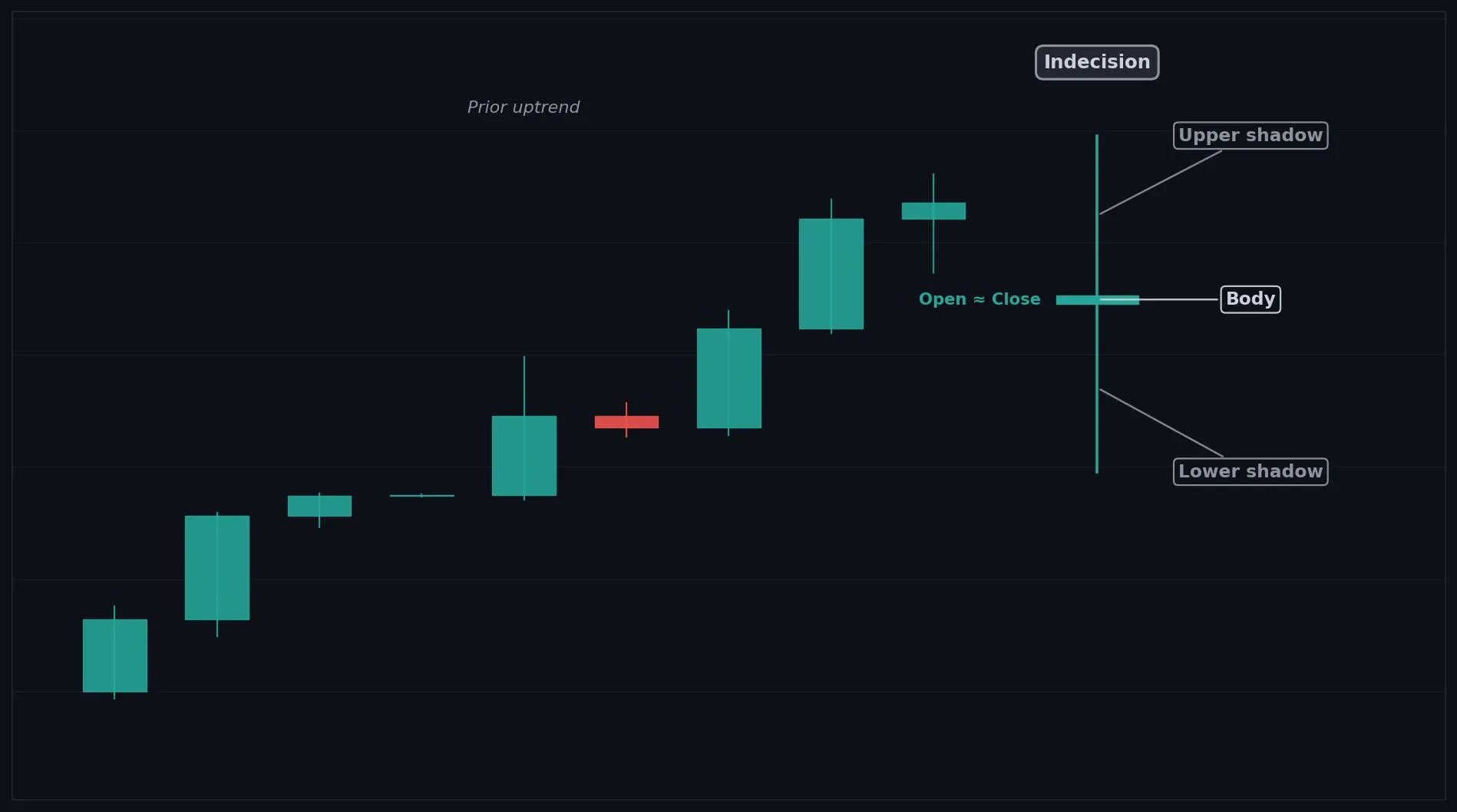
How to Interpret the Doji
Bullish: a Doji after a downtrend hints sellers are losing control, watch for an upside confirmation candle.
Bearish: a Doji after an uptrend hints buyers are losing control, watch for a downside confirmation candle.
Neutral: inside a sideways range, a Doji is just noise and usually means keep waiting.
Common Use Cases
Reversal warning
momentum exhaustion filter
entry timing trigger (only after confirmation)
an exit signal to protect open profits when a trend stalls
Advanced Use Cases
Most meaningful after an extended trend or right at a support or resistance level
Pair with Support and resistance levels for a higher conviction trade setup.
CoinQuant Examples
Exit Long when a Doji forms after an uptrend and Close crosses below the previous Low.
Enter Long when a Doji forms after a downtrend and Close crosses above the previous High.
Advantages
Easy to spot, works on any timeframe, and gives an early heads up that momentum is fading before price actually reverses.
Limitations
On its own it only signals indecision, not direction. It produces many false signals in ranging markets and always needs a confirmation candle before acting.
Works Best With
Support and resistance levels
RSI (for overbought or oversold context)
a following confirmation candle such as a Bullish or Bearish Marubozu
Quick Reference
Bias: Neutral
Type: Indecision (potential reversal)
Trend Context: Strongest after a clear up or down trend
Confirmation Needed: Yes, next candle must confirm direction
Dragonfly Doji
Overview
A Dragonfly Doji is a bullish leaning candle where price sold off sharply then recovered to close near the open, showing strong rejection of lower prices.
What Is a Dragonfly Doji?
A tiny body sitting at the top of the range, with a long lower shadow and little to no upper shadow, forming a shape like the letter T. Sellers drove price down during the session, but buyers stepped in with force and pushed it all the way back up. That rejection of lower prices hints buyers are taking control.
Why Traders Use the Dragonfly Doji
Strongest after a downtrend or at a support level where buyers are expected to defend price
Anatomy
Open, High, and Close are all near the top of the candle and close together.
A long lower shadow extends well below the body.
Little or no upper shadow.
The longer the lower shadow, the stronger the buying rejection.
Example
Open: 100.0, High: 100.3, Low: 96.5, Close: 100.1. Price dropped to 96.5 then rallied back to close near the open, leaving a long lower wick. This qualifies because the body is tiny and sits at the top with a long lower shadow.
Dragonfly Doji Example Chart
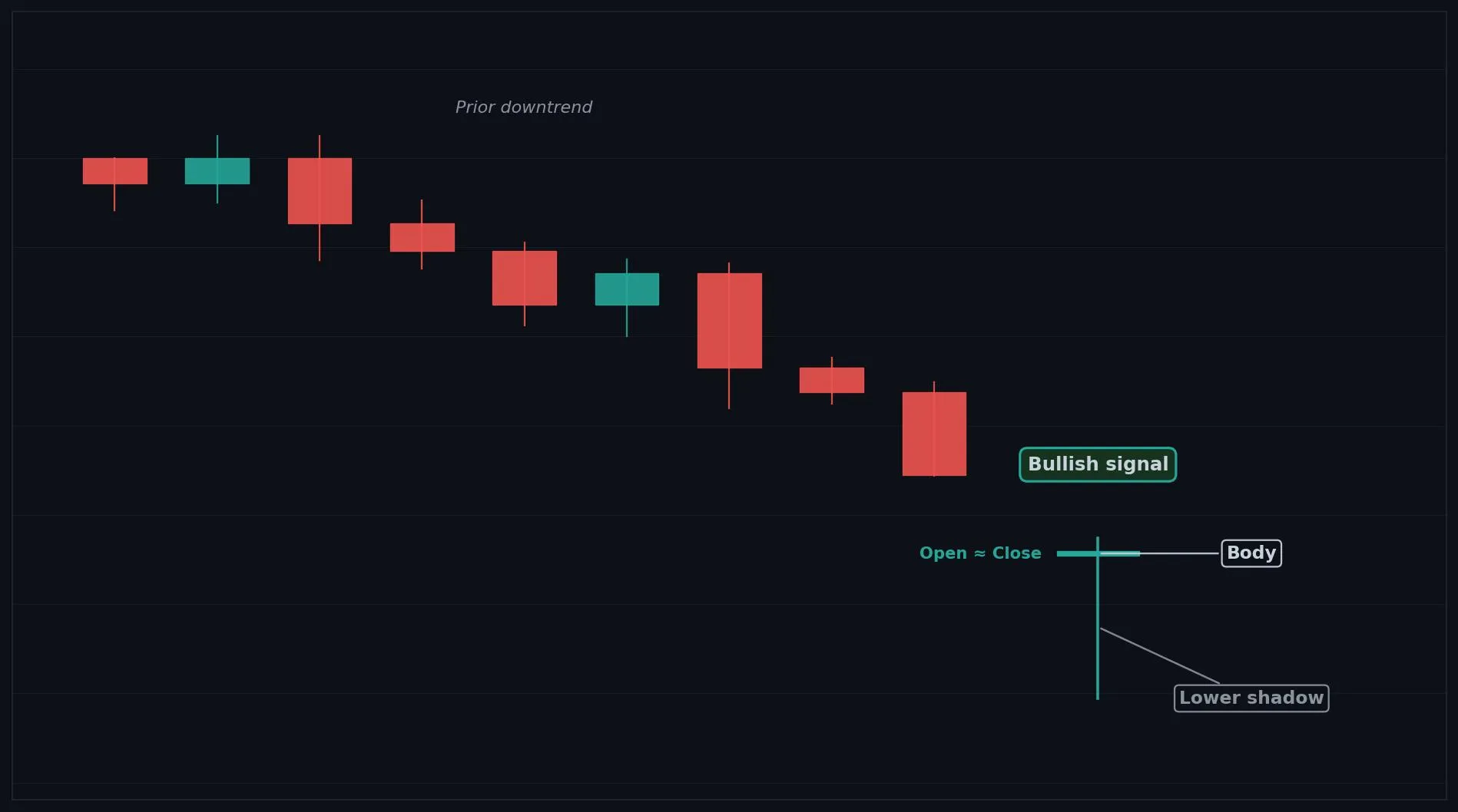
How to Interpret the Dragonfly Doji
Bullish: after a downtrend, a Dragonfly Doji signals sellers are exhausted and a reversal up may follow.
Bearish: rare, but at the top of an uptrend it can still warn of indecision before a drop.
Neutral: inside a range it is weaker and needs confirmation.
Common Use Cases
Reversal confirmation
entry timing near support
a signal that a selloff may be ending
Advanced Use Cases
Strongest after a downtrend or at a support level where buyers are expected to defend price
Pair with Support levels for a higher conviction trade setup.
CoinQuant Examples
Enter Long when a Dragonfly Doji forms after a downtrend and Close crosses above the previous High.
Exit Short when a Dragonfly Doji forms at a support level.
Advantages
Gives a clear visual of buyers defending a level, easy to recognize, and useful for timing reversal entries.
Limitations
Can appear inside ranges where it means little, and a single candle is not enough without a confirming candle or support level.
Works Best With
Support levels
RSI oversold readings
a bullish confirmation candle such as a Bullish Marubozu
Quick Reference
Bias: Bullish
Type: Reversal
Trend Context: Strongest after a downtrend or at support
Confirmation Needed: Yes, wait for an upside confirmation candle
Gravestone Doji
Overview
A Gravestone Doji is a bearish leaning candle where price rallied then fell back to close near the open, showing strong rejection of higher prices.
What Is a Gravestone Doji?
A tiny body sitting at the bottom of the range, with a long upper shadow and little to no lower shadow, forming an upside down T shape. Buyers pushed price up during the session, but sellers overwhelmed them and forced price back down to the open. That rejection of higher prices hints sellers are taking control.
Why Traders Use the Gravestone Doji
Strongest after an uptrend or at a resistance level where sellers are expected to defend price
Anatomy
Open, Low, and Close are all near the bottom of the candle and close together.
A long upper shadow extends well above the body.
Little or no lower shadow.
The longer the upper shadow, the stronger the selling rejection.
Example
Open: 100.0, High: 103.6, Low: 99.8, Close: 100.1. Price rose to 103.6 then fell back to close near the open, leaving a long upper wick. This qualifies because the body is tiny and sits at the bottom with a long upper shadow.
Gravestone Doji Example Chart
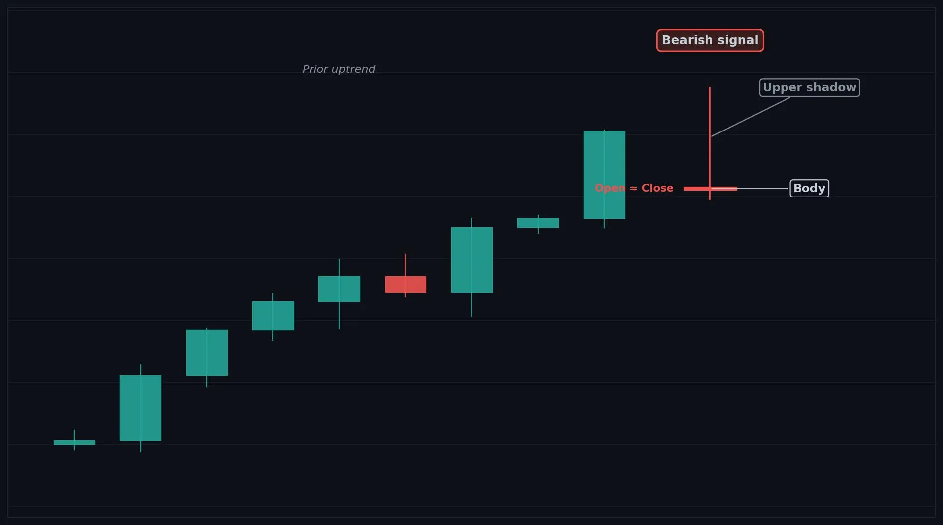
How to Interpret the Gravestone Doji
Bullish: rare, but at the bottom of a downtrend it can still signal indecision before a bounce.
Bearish: after an uptrend, a Gravestone Doji signals buyers are exhausted and a reversal down may follow.
Neutral: inside a range it is weaker and needs confirmation.
Common Use Cases
Reversal confirmation
exit timing near resistance
a signal that a rally may be ending
Advanced Use Cases
Strongest after an uptrend or at a resistance level where sellers are expected to defend price
Pair with Resistance levels for a higher conviction trade setup.
CoinQuant Examples
Exit Long when a Gravestone Doji forms after an uptrend and Close crosses below the previous Low.
Enter Short when a Gravestone Doji forms at a resistance level.
Advantages
Clearly shows sellers rejecting higher prices, easy to spot, and useful for timing reversal exits.
Limitations
Can appear inside ranges where it means little, and needs a confirming candle or resistance level to be reliable.
Works Best With
Resistance levels
RSI overbought readings
a bearish confirmation candle such as a Bearish Marubozu
Quick Reference
Bias: Bearish
Type: Reversal
Trend Context: Strongest after an uptrend or at resistance
Confirmation Needed: Yes, wait for a downside confirmation candle
Long-Legged Doji
Overview
A Long-Legged Doji is a neutral candle with long shadows on both sides and a tiny body, showing high volatility with no clear winner between buyers and sellers.
What Is a Long-Legged Doji?
A very small body sitting near the middle, with long upper and lower shadows of roughly similar length, showing a wide trading range that ended flat. Both buyers and sellers made aggressive moves during the session, but neither could hold control, so price closed back near where it opened. The wide range shows strong disagreement and rising volatility.
Why Traders Use the Long-Legged Doji
Most meaningful after an extended trend or near a key level, where the sudden volatility can mark a turning point
Anatomy
Open and Close are nearly equal (tiny body).
A long upper shadow and a long lower shadow, both well beyond the body.
The body sits roughly in the middle of the full range.
The longer both shadows, the stronger the indecision and volatility.
Example
Open: 100.0, High: 103.4, Low: 96.6, Close: 100.1. Price swung widely in both directions but closed near the open, leaving long wicks on each side. This qualifies because the tiny body sits in the middle of a wide range.
Long-Legged Doji Example Chart
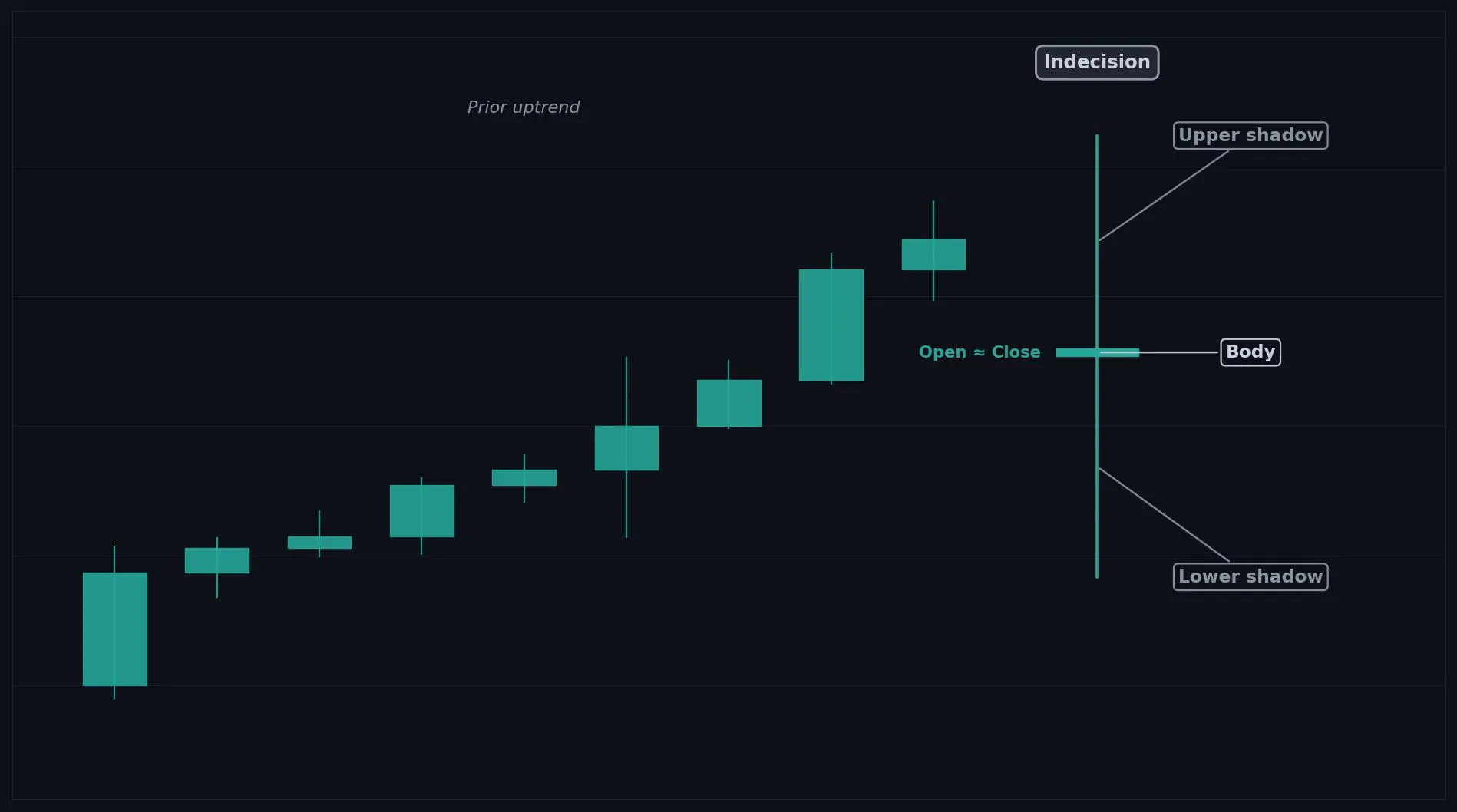
How to Interpret the Long-Legged Doji
Bullish: after a downtrend it can hint sellers are losing grip, but confirmation is essential.
Bearish: after an uptrend it can hint buyers are losing grip, but confirmation is essential.
Neutral: most often it simply signals rising volatility and indecision, meaning wait.
Common Use Cases
Volatility filter
reversal warning
a signal to tighten risk when the market becomes indecisive
Advanced Use Cases
Most meaningful after an extended trend or near a key level, where the sudden volatility can mark a turning point
Pair with ATR (for volatility context) for a higher conviction trade setup.
CoinQuant Examples
Exit Long when a Long-Legged Doji forms after an uptrend and Close crosses below the previous Low.
Enter Long when a Long-Legged Doji forms after a downtrend and Close crosses above the previous High.
Advantages
Highlights rising volatility and market indecision clearly, and can flag turning points early.
Limitations
Gives no direction on its own, appears often in volatile markets, and needs confirmation before acting.
Works Best With
ATR (for volatility context)
support and resistance levels
a confirmation candle
Quick Reference
Bias: Neutral
Type: Indecision (high volatility)
Trend Context: Strongest after a trend or at a key level
Confirmation Needed: Yes, next candle must confirm direction
Rickshaw Man
Overview
A Rickshaw Man is a neutral candle showing balanced indecision, with long wicks on both sides and a tiny body centered in the range.
What Is a Rickshaw Man?
A very small body positioned almost exactly in the center of the candle, with long upper and lower shadows of similar length. Buyers and sellers fought to a near perfect standstill. The centered body shows neither side gained any advantage by the close, which is the purest form of indecision.
Why Traders Use the Rickshaw Man
Most meaningful after a strong trend or at a key level, where balanced indecision can precede a reversal
Anatomy
Open and Close are nearly equal (tiny body).
The body sits in the center of the range, not near the top or bottom.
Long upper and lower shadows of similar length.
The more centered the body, the purer the indecision.
Example
Open: 100.0, High: 103.2, Low: 96.8, Close: 100.0. Price moved sharply both ways and closed exactly at the open, with the body dead center. This qualifies because the tiny body is centered with balanced long wicks.
Rickshaw Man Example Chart
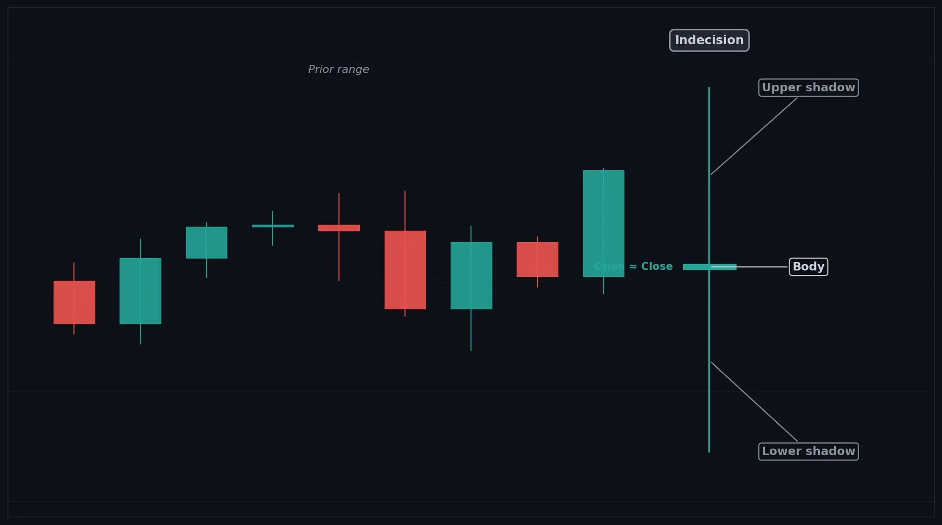
How to Interpret the Rickshaw Man
Bullish: after a downtrend it can hint at a possible bottom, but only with confirmation.
Bearish: after an uptrend it can hint at a possible top, but only with confirmation.
Neutral: most often it simply means the market is undecided, so wait.
Common Use Cases
Indecision filter
reversal warning
a cue to wait for clearer direction
Advanced Use Cases
Most meaningful after a strong trend or at a key level, where balanced indecision can precede a reversal
Pair with Support and resistance levels for a higher conviction trade setup.
CoinQuant Examples
Exit Long when a Rickshaw Man forms after an uptrend and Close crosses below the previous Low.
Enter Long when a Rickshaw Man forms after a downtrend and Close crosses above the previous High.
Advantages
Clearly marks moments of pure market balance and can warn of a stalling trend.
Limitations
Offers no direction alone, is common in choppy markets, and always needs confirmation.
Works Best With
Support and resistance levels
RSI
a confirmation candle
Quick Reference
Bias: Neutral
Type: Indecision (potential reversal)
Trend Context: Strongest after a clear trend
Confirmation Needed: Yes, next candle must confirm direction
Four Price Doji
Quick Summary
A Four Price Doji is a rare neutral candle where open, high, low, and close are all the same price, showing extreme indecision or very thin trading.
What It Measures
A single horizontal line with no visible body and no shadows, because every price for the session was identical. No side made any progress at all. This usually appears in very quiet or illiquid conditions where almost no trading took place, reflecting total balance or a lack of participation.
Why Traders Use It
Most common on low liquidity assets or quiet timeframes
On active markets it is very rare and usually a data quirk
Anatomy
Open, High, Low, and Close are all equal.
There is no body and no upper or lower shadow.
It appears as a flat horizontal line on the chart.
It typically forms in low volume or illiquid markets.
Example
Open: 100.0, High: 100.0, Low: 100.0, Close: 100.0. Price never moved during the session. This qualifies because all four prices are identical, leaving only a flat line.
Visual Example
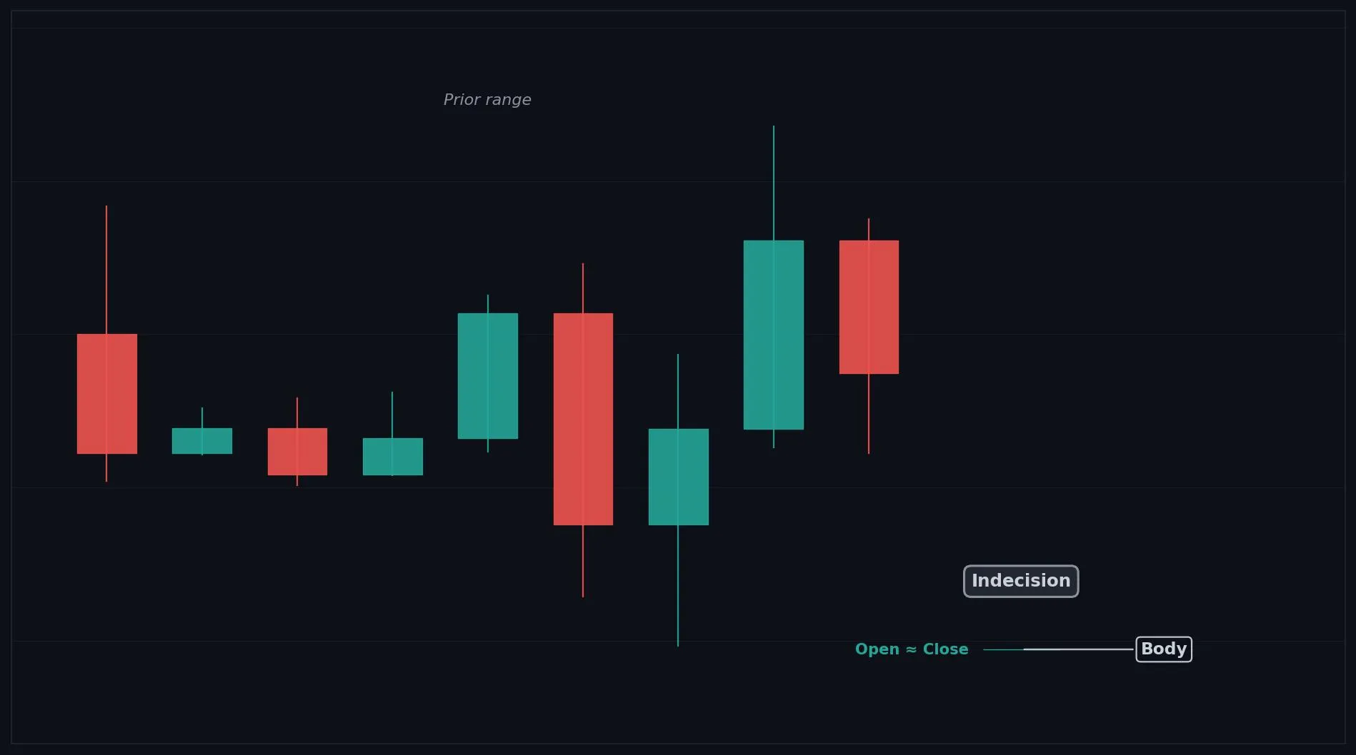
How To Read It
Bullish: not directional on its own, but a break upward from the line can start a move.
Bearish: not directional on its own, but a break downward from the line can start a move.
Neutral: it almost always means no participation or extreme indecision, so wait for a real move.
Common Trading Use Cases
Liquidity filter
a cue that a market is inactive
a marker to wait for volume to return
Advanced Use Cases
Most common on low liquidity assets or quiet timeframes
Pair with Volume indicators for a higher conviction trade setup.
CoinQuant Strategy Examples
Enter Long when Close crosses above the level of a Four Price Doji on rising volume.
Exit Long when a Four Price Doji shows trading has dried up during an uptrend.
Advantages
Instantly shows a market with no activity or complete balance, which is useful as a liquidity filter.
Limitations
Extremely rare on liquid assets, gives no direction, and is often just a sign of missing volume.
Best Used With
Volume indicators
VWAP
support and resistance levels
Quick Reference
Bias: Neutral
Type: Indecision (very low activity)
Trend Context: Low liquidity or quiet markets
Confirmation Needed: Yes, wait for a real move on volume
Takuri
Overview
A Takuri is a bullish leaning candle, similar to a Dragonfly Doji, with an unusually long lower shadow that signals aggressive buying pressure.
What Is a Takuri?
A small body near the top of the range with an exceptionally long lower shadow and little to no upper shadow, longer even than a typical hammer. Sellers pushed price sharply lower during the session, but buyers responded with strong force and drove it all the way back up. The very long lower wick shows aggressive buying at lower prices.
Why Traders Use the Takuri
Strongest after a downtrend or at a support level, where the deep wick shows buyers defending aggressively
Anatomy
A small body near the top of the range.
An unusually long lower shadow, typically much longer than the body.
Little or no upper shadow.
The longer the lower shadow relative to the body, the stronger the signal.
Example
Open: 100.0, High: 100.4, Low: 95.5, Close: 100.2. Price fell hard to 95.5 then rallied back near the open, leaving a very long lower wick. This qualifies because of the tiny top body and the exceptionally long lower shadow.
Takuri Example Chart
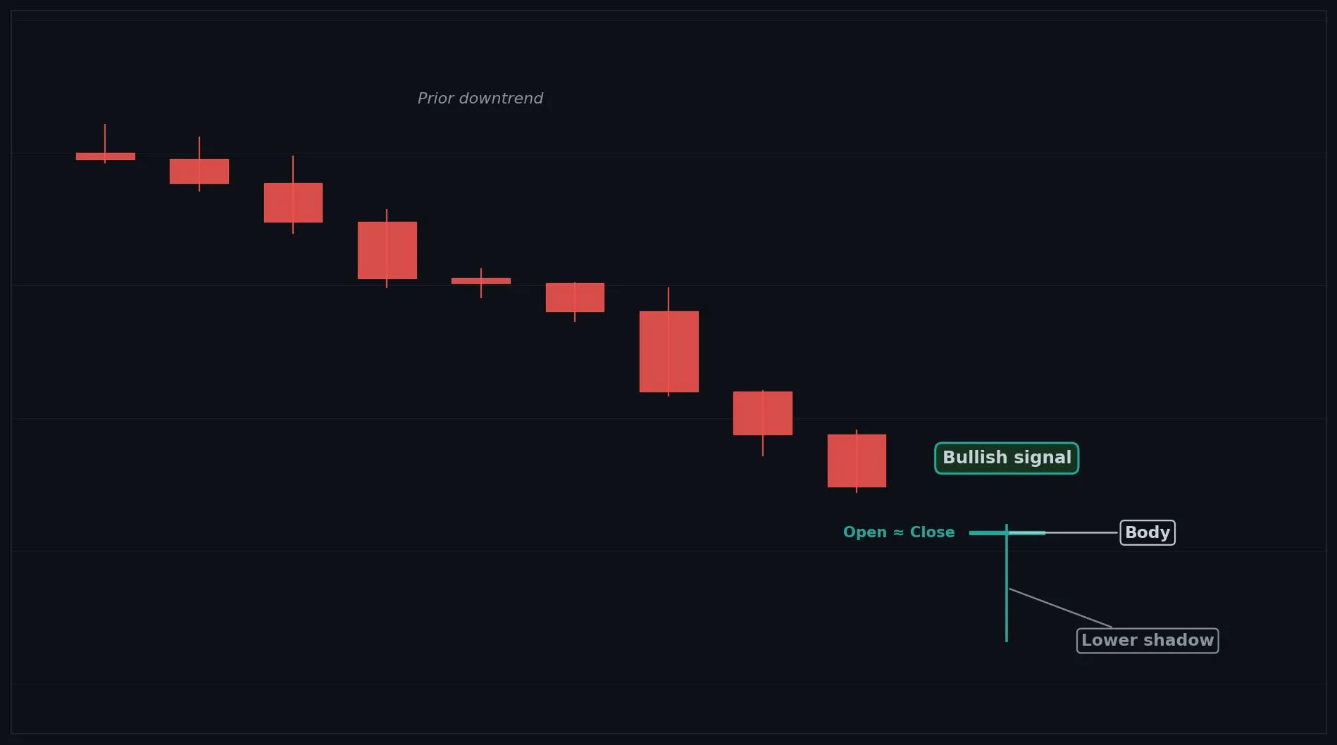
How to Interpret the Takuri
Bullish: after a downtrend, a Takuri strongly suggests sellers are exhausted and a reversal up may follow.
Bearish: rarely bearish, but at a top it can still reflect indecision.
Neutral: inside a range it is weaker and needs confirmation.
Common Use Cases
Reversal confirmation
entry timing near support
a signal of exhausted selling
Advanced Use Cases
Strongest after a downtrend or at a support level, where the deep wick shows buyers defending aggressively
Pair with Support levels for a higher conviction trade setup.
CoinQuant Examples
Enter Long when a Takuri forms after a downtrend and Close crosses above the previous High.
Exit Short when a Takuri forms at a support level.
Advantages
Shows aggressive buying rejection very clearly, and the deep wick makes reversals easy to time.
Limitations
Can produce false signals inside ranges, and always needs a confirming candle or support level.
Works Best With
Support levels
RSI oversold readings
a bullish confirmation candle
Quick Reference
Bias: Bullish
Type: Reversal
Trend Context: Strongest after a downtrend or at support
Confirmation Needed: Yes, wait for an upside confirmation candle
Hammer
Overview
A Hammer is a bullish reversal candle where buyers step in strongly after a decline, closing price back near the high.
What Is a Hammer?
A small body near the top of the range with a long lower shadow at least twice the body length and little to no upper shadow. Sellers pushed price down early in the session, but buyers took over and drove it back up to close near the high. That recovery shows buyers regaining control after a decline.
Why Traders Use the Hammer
Strongest after a clear downtrend or at a support level
Its meaning flips depending on the prior trend
Anatomy
A small body located in the upper part of the range.
A long lower shadow, ideally at least twice the height of the body.
Little or no upper shadow.
It appears after a downtrend to count as a reversal signal.
Example
Open: 100.0, High: 100.5, Low: 96.0, Close: 100.3. Price dropped to 96.0 then rallied to close near the high, leaving a long lower wick. This qualifies because of the small top body and the long lower shadow after a decline.
Hammer Example Chart
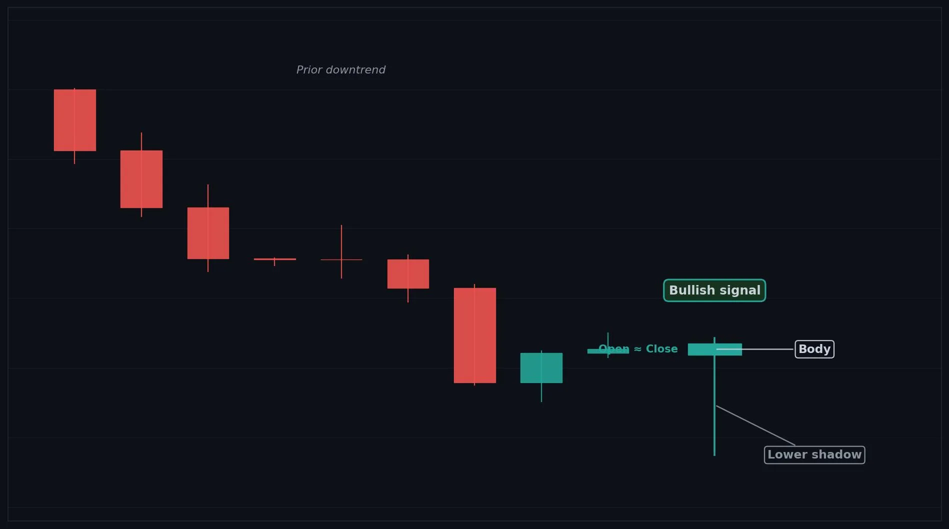
How to Interpret the Hammer
Bullish: after a downtrend, a Hammer signals buyers are stepping in and a reversal up may follow.
Bearish: the same shape after an uptrend is a Hanging Man, which is bearish, so context matters.
Neutral: inside a range it is weaker and needs confirmation.
Common Use Cases
Reversal confirmation
entry timing near support
a signal that a decline may be ending
Advanced Use Cases
Strongest after a clear downtrend or at a support level
Pair with Support levels for a higher conviction trade setup.
CoinQuant Examples
Enter Long when a Hammer forms after a downtrend and Close crosses above the previous High.
Exit Short when a Hammer forms at a support level.
Advantages
One of the most reliable and recognizable bullish reversal candles, and easy to time near support.
Limitations
Needs a prior downtrend to be valid, can fail in strong downtrends, and requires confirmation.
Works Best With
Support levels
RSI oversold readings
a bullish confirmation candle
Quick Reference
Bias: Bullish
Type: Reversal
Trend Context: Must appear after a downtrend
Confirmation Needed: Yes, wait for an upside confirmation candle
Inverted Hammer
Overview
An Inverted Hammer is a potential bullish reversal candle showing rejection of higher prices after a downtrend, hinting buyers are testing control.
What Is an Inverted Hammer?
A small body near the bottom of the range with a long upper shadow and little to no lower shadow, like an upside down hammer. Buyers pushed price up during the session but could not hold the highs, yet the attempt itself after a downtrend shows buying interest is returning. It hints the decline may be losing steam.
Why Traders Use the Inverted Hammer
Strongest after a downtrend or at a support level
Confirmation is especially important because the candle closed off its highs
Anatomy
A small body located in the lower part of the range.
A long upper shadow, ideally at least twice the body height.
Little or no lower shadow.
It appears after a downtrend to count as a reversal signal.
Example
Open: 100.0, High: 103.0, Low: 99.8, Close: 100.2. Price rose to 103.0 then eased back near the open, leaving a long upper wick. This qualifies because of the small bottom body and long upper shadow after a decline.
Inverted Hammer Example Chart
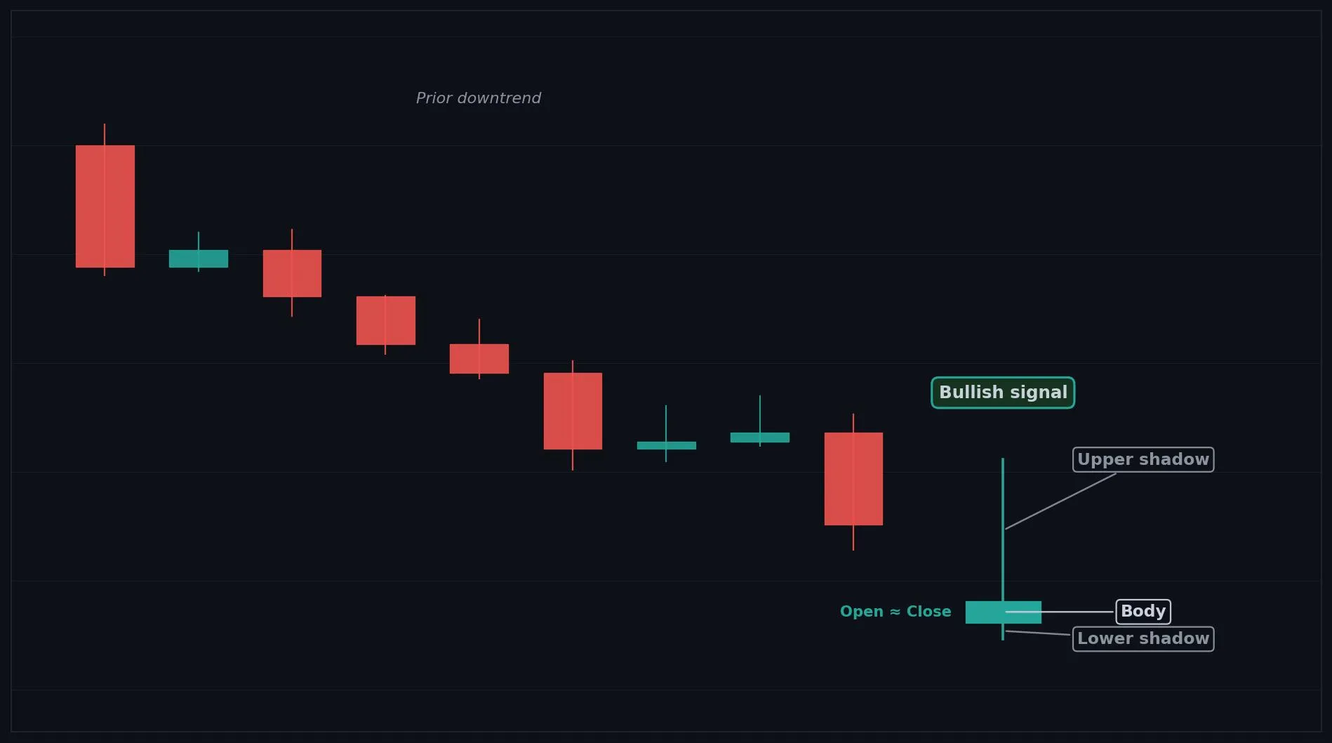
How to Interpret the Inverted Hammer
Bullish: after a downtrend, an Inverted Hammer hints buyers are testing higher prices and a reversal may follow with confirmation.
Bearish: the same shape after an uptrend is a Shooting Star, which is bearish, so context matters.
Neutral: without a prior downtrend it carries little meaning.
Common Use Cases
Reversal warning
entry timing near support after confirmation
a signal of returning buying interest
Advanced Use Cases
Strongest after a downtrend or at a support level
Pair with Support levels for a higher conviction trade setup.
CoinQuant Examples
Enter Long when an Inverted Hammer forms after a downtrend and Close crosses above the previous High.
Exit Short when an Inverted Hammer forms and the next candle closes higher.
Advantages
Flags early returning demand after a decline and pairs well with confirmation for reversal entries.
Limitations
Weaker than a Hammer because price closed off the highs, and it needs confirmation to avoid false signals.
Works Best With
Support levels
RSI oversold readings
a bullish confirmation candle
Quick Reference
Bias: Bullish
Type: Reversal
Trend Context: Must appear after a downtrend
Confirmation Needed: Yes, confirmation is essential
Hanging Man
Overview
A Hanging Man is a bearish warning candle that appears after an uptrend, showing selling pressure beneath the surface despite a small body near the high.
What Is a Hanging Man?
A small body near the top of the range with a long lower shadow and little to no upper shadow, identical in shape to a Hammer but appearing after an uptrend. Sellers pushed price sharply lower during the session before buyers recovered it. That deep intraday selling after an uptrend warns that demand may be weakening even though the candle closed high.
Why Traders Use the Hanging Man
Strongest after a clear uptrend or at a resistance level
The prior trend is what makes it bearish
Anatomy
A small body located in the upper part of the range.
A long lower shadow, ideally at least twice the body height.
Little or no upper shadow.
It appears after an uptrend to count as a bearish signal.
Example
Open: 100.0, High: 100.4, Low: 96.0, Close: 100.2. Price dropped to 96.0 then recovered near the open, leaving a long lower wick after a rally. This qualifies because of the small top body and long lower shadow after an uptrend.
Hanging Man Example Chart
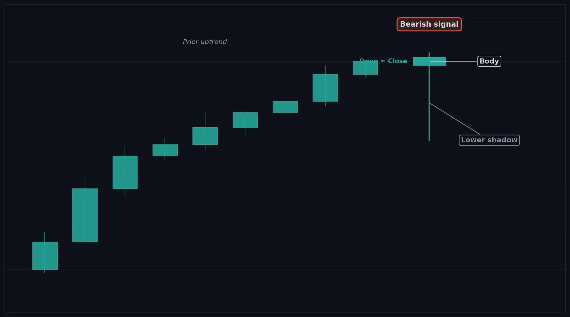
How to Interpret the Hanging Man
Bullish: the same shape after a downtrend is a Hammer, which is bullish, so context matters.
Bearish: after an uptrend, a Hanging Man warns buyers are losing grip and a reversal down may follow.
Neutral: without a prior uptrend it carries little meaning.
Common Use Cases
Reversal warning
exit timing near resistance
a signal that an uptrend may be stalling
Advanced Use Cases
Strongest after a clear uptrend or at a resistance level
Pair with Resistance levels for a higher conviction trade setup.
CoinQuant Examples
Exit Long when a Hanging Man forms after an uptrend and Close crosses below the previous Low.
Enter Short when a Hanging Man forms at a resistance level with a bearish confirmation candle.
Advantages
Gives an early warning that an uptrend is weakening and is easy to spot near resistance.
Limitations
Looks identical to a Hammer so context is critical, and it needs confirmation to avoid false signals.
Works Best With
Resistance levels
RSI overbought readings
a bearish confirmation candle
Quick Reference
Bias: Bearish
Type: Reversal
Trend Context: Must appear after an uptrend
Confirmation Needed: Yes, wait for a downside confirmation candle
Shooting Star
Overview
A Shooting Star is a bearish reversal candle caused by strong rejection of higher prices after an uptrend.
What Is a Shooting Star?
A small body near the bottom of the range with a long upper shadow at least twice the body length and little to no lower shadow. Buyers pushed price up sharply during the session, but sellers overwhelmed them and forced price back down to close near the low. That rejection of higher prices after a rally signals sellers taking control.
Why Traders Use the Shooting Star
Strongest after a clear uptrend or at a resistance level, where the long upper wick shows sellers defending
Anatomy
A small body located in the lower part of the range.
A long upper shadow, ideally at least twice the body height.
Little or no lower shadow.
It appears after an uptrend to count as a reversal signal.
Example
Open: 100.0, High: 103.5, Low: 99.7, Close: 99.9. Price rallied to 103.5 then fell back to close near the low, leaving a long upper wick after a rally. This qualifies because of the small bottom body and long upper shadow after an uptrend.
Shooting Star Example Chart
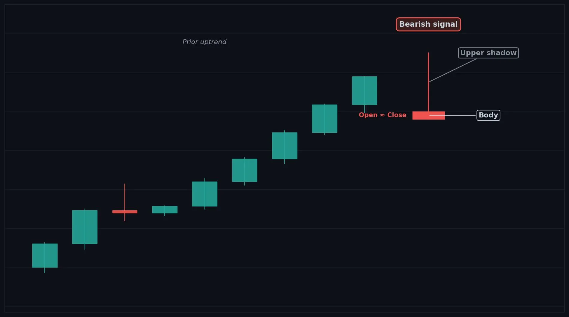
How to Interpret the Shooting Star
Bullish: the same shape after a downtrend is an Inverted Hammer, which leans bullish, so context matters.
Bearish: after an uptrend, a Shooting Star signals sellers are taking over and a reversal down may follow.
Neutral: without a prior uptrend it carries little meaning.
Common Use Cases
Reversal confirmation
exit timing near resistance
a signal that a rally has been rejected
Advanced Use Cases
Strongest after a clear uptrend or at a resistance level, where the long upper wick shows sellers defending
Pair with Resistance levels for a higher conviction trade setup.
CoinQuant Examples
Exit Long when a Shooting Star forms after an uptrend and Close crosses below the previous Low.
Enter Short when a Shooting Star forms at a resistance level.
Advantages
A clear and reliable bearish reversal signal that is easy to time near resistance.
Limitations
Needs a prior uptrend to be valid, can fail in strong uptrends, and requires confirmation.
Works Best With
Resistance levels
RSI overbought readings
a bearish confirmation candle
Quick Reference
Bias: Bearish
Type: Reversal
Trend Context: Must appear after an uptrend
Confirmation Needed: Yes, wait for a downside confirmation candle
Bullish Marubozu
Overview
A Bullish Marubozu is a strong bullish candle with buyers in control for the entire session, showing powerful upward momentum.
What Is a Bullish Marubozu?
A long green body with no upper or lower shadows, opening at the low and closing at the high of the session. Buyers dominated from open to close with no meaningful pushback from sellers. The absence of shadows shows relentless demand and strong conviction.
Why Traders Use the Bullish Marubozu
Powerful during trends and after breakouts
After a very extended move it can signal a buying climax
Anatomy
Open is at or very near the Low of the candle.
Close is at or very near the High of the candle.
Little or no upper or lower shadow.
A long body shows the strength of the move.
Example
Open: 100.0, High: 104.0, Low: 100.0, Close: 104.0. Price opened at the low and closed at the high with no wicks. This qualifies because the full range is one solid green body with no shadows.
Bullish Marubozu Example Chart
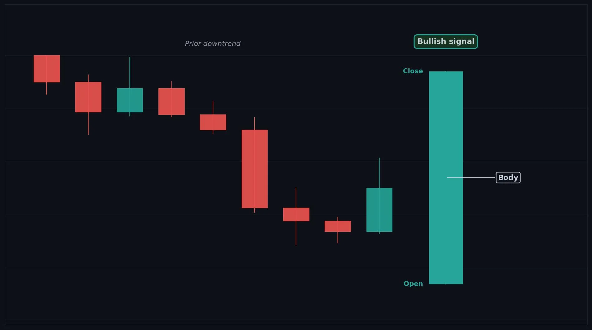
How to Interpret the Bullish Marubozu
Bullish: a Bullish Marubozu shows strong buying and often signals trend continuation or the start of a rally.
Bearish: not a bearish signal, though after an extended rally it can mark a climax to watch.
Neutral: rarely neutral, it is a clear momentum candle.
Common Use Cases
Trend continuation
breakout confirmation
momentum entry timing
Advanced Use Cases
Powerful during trends and after breakouts
Pair with Breakout levels for a higher conviction trade setup.
CoinQuant Examples
Enter Long when a Bullish Marubozu forms and Close crosses above a resistance level.
Exit Short when a Bullish Marubozu forms after a downtrend.
Advantages
A clear, high conviction momentum signal that confirms strong buying interest.
Limitations
Can appear near the top of a rally as a climax, and chasing it late risks buying into exhaustion.
Works Best With
Breakout levels
volume confirmation
moving averages for trend context
Quick Reference
Bias: Bullish
Type: Continuation (momentum)
Trend Context: Strong in trends and after breakouts
Confirmation Needed: Often acts on its own, volume helps
Bearish Marubozu
Overview
A Bearish Marubozu is a strong bearish candle with sellers in control for the entire session, showing powerful downward momentum.
What Is a Bearish Marubozu?
A long red body with no upper or lower shadows, opening at the high and closing at the low of the session. Sellers dominated from open to close with no meaningful pushback from buyers. The absence of shadows shows relentless supply and strong conviction.
Why Traders Use the Bearish Marubozu
Powerful during downtrends and after breakdowns
After a very extended drop it can signal a selling climax
Anatomy
Open is at or very near the High of the candle.
Close is at or very near the Low of the candle.
Little or no upper or lower shadow.
A long body shows the strength of the move.
Example
Open: 104.0, High: 104.0, Low: 100.0, Close: 100.0. Price opened at the high and closed at the low with no wicks. This qualifies because the full range is one solid red body with no shadows.
Bearish Marubozu Example Chart
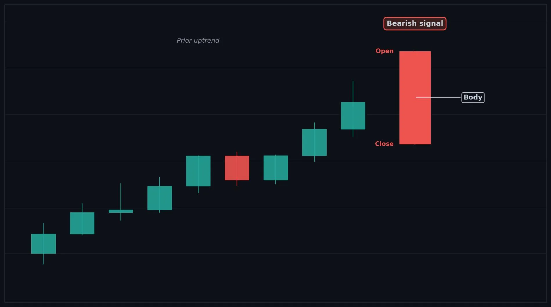
How to Interpret the Bearish Marubozu
Bullish: not a bullish signal, though after an extended selloff it can mark a selling climax to watch.
Bearish: a Bearish Marubozu shows strong selling and often signals trend continuation or the start of a decline.
Neutral: rarely neutral, it is a clear momentum candle.
Common Use Cases
Trend continuation
breakdown confirmation
momentum exit timing
Advanced Use Cases
Powerful during downtrends and after breakdowns
Pair with Breakdown levels for a higher conviction trade setup.
CoinQuant Examples
Exit Long when a Bearish Marubozu forms and Close crosses below a support level.
Enter Short when a Bearish Marubozu forms after an uptrend.
Advantages
A clear, high conviction momentum signal that confirms strong selling interest.
Limitations
Can appear near the bottom of a selloff as a climax, and shorting it late risks selling into exhaustion.
Works Best With
Breakdown levels
volume confirmation
moving averages for trend context
Quick Reference
Bias: Bearish
Type: Continuation (momentum)
Trend Context: Strong in downtrends and after breakdowns
Confirmation Needed: Often acts on its own, volume helps
Bullish Closing Marubozu
Overview
A Bullish Closing Marubozu is a bullish candle that closes at the high of the session, showing strong buying conviction into the close.
What Is a Bullish Closing Marubozu?
A long green body that closes at the high with no upper shadow, though it may have a small lower shadow from early selling. Buyers finished the session in full control, driving price to close at the very top. A small lower wick shows brief early selling that buyers quickly absorbed.
Why Traders Use the Bullish Closing Marubozu
Strong during uptrends and after breakouts, where a close at the high confirms buyer commitment
Anatomy
Close is at or very near the High of the candle (no upper shadow).
A small lower shadow may exist from early session selling.
The body is long and green.
The lack of an upper shadow shows buyers held control into the close.
Example
Open: 100.5, High: 103.6, Low: 100.0, Close: 103.6. Price dipped slightly early then closed at the high with no upper wick. This qualifies because the close sits at the high with only a small lower shadow.
Bullish Closing Marubozu Example Chart
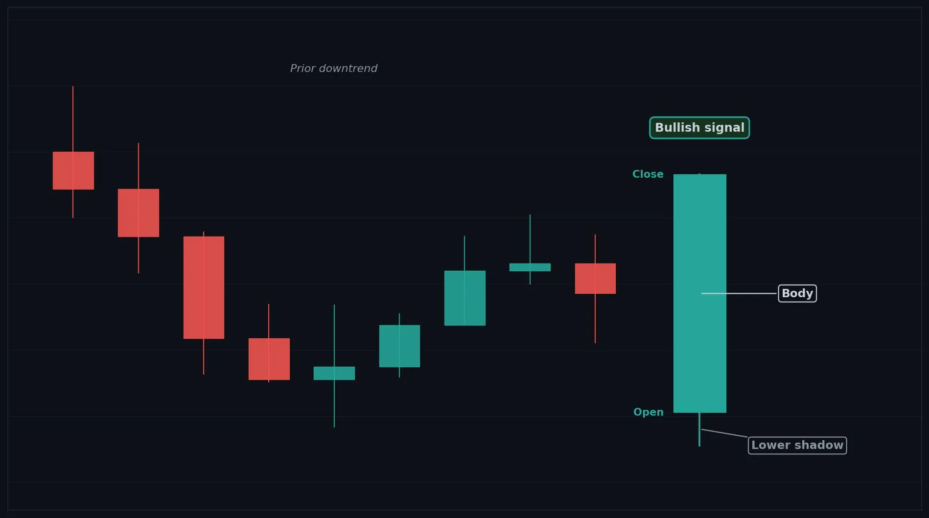
How to Interpret the Bullish Closing Marubozu
Bullish: closing at the high shows strong demand and often signals continuation.
Bearish: not bearish, though after a long rally it can hint at a climax.
Neutral: rarely neutral, it is a momentum candle.
Common Use Cases
Trend continuation
breakout confirmation
momentum entry timing
Advanced Use Cases
Strong during uptrends and after breakouts, where a close at the high confirms buyer commitment
Pair with Breakout levels for a higher conviction trade setup.
CoinQuant Examples
Enter Long when a Bullish Closing Marubozu forms and Close crosses above a resistance level.
Exit Short when a Bullish Closing Marubozu forms after a downtrend.
Advantages
Shows buyers finished strong, giving a clear continuation and breakout confirmation signal.
Limitations
Slightly weaker than a full Marubozu due to the early dip, and can appear late in a rally.
Works Best With
Breakout levels
volume confirmation
moving averages
Quick Reference
Bias: Bullish
Type: Continuation (momentum)
Trend Context: Strong in uptrends and after breakouts
Confirmation Needed: Often acts on its own, volume helps
Bearish Closing Marubozu
Overview
A Bearish Closing Marubozu is a bearish candle that closes at the low of the session, showing strong selling conviction into the close.
What Is a Bearish Closing Marubozu?
A long red body that closes at the low with no lower shadow, though it may have a small upper shadow from early buying. Sellers finished the session in full control, driving price to close at the very bottom. A small upper wick shows brief early buying that sellers quickly overwhelmed.
Why Traders Use the Bearish Closing Marubozu
Strong during downtrends and after breakdowns, where a close at the low confirms seller commitment
Anatomy
Close is at or very near the Low of the candle (no lower shadow).
A small upper shadow may exist from early session buying.
The body is long and red.
The lack of a lower shadow shows sellers held control into the close.
Example
Open: 103.5, High: 104.1, Low: 100.0, Close: 100.0. Price ticked up early then closed at the low with no lower wick. This qualifies because the close sits at the low with only a small upper shadow.
Bearish Closing Marubozu Example Chart

How to Interpret the Bearish Closing Marubozu
Bullish: not bullish, though after a long selloff it can hint at a climax.
Bearish: closing at the low shows strong supply and often signals continuation.
Neutral: rarely neutral, it is a momentum candle.
Common Use Cases
Trend continuation
breakdown confirmation
momentum exit timing
Advanced Use Cases
Strong during downtrends and after breakdowns, where a close at the low confirms seller commitment
Pair with Breakdown levels for a higher conviction trade setup.
CoinQuant Examples
Exit Long when a Bearish Closing Marubozu forms and Close crosses below a support level.
Enter Short when a Bearish Closing Marubozu forms after an uptrend.
Advantages
Shows sellers finished strong, giving a clear continuation and breakdown confirmation signal.
Limitations
Slightly weaker than a full Marubozu due to the early tick up, and can appear late in a selloff.
Works Best With
Breakdown levels
volume confirmation
moving averages
Quick Reference
Bias: Bearish
Type: Continuation (momentum)
Trend Context: Strong in downtrends and after breakdowns
Confirmation Needed: Often acts on its own, volume helps
Bullish Belt Hold
Overview
A Bullish Belt Hold is a strong bullish candle that opens at the low and rallies, signaling immediate buying strength after a decline.
What Is a Bullish Belt Hold?
A long green body that opens right at the session low with no lower shadow and a small or no upper shadow, rising steadily through the session. Price opened at the low and buyers immediately took charge, pushing it up all session. When this appears after a downtrend, it signals a sudden shift toward buyers.
Why Traders Use the Bullish Belt Hold
Strongest after a downtrend or at a support level, where opening at the low and rallying shows a decisive shift
Anatomy
Open is at or very near the Low of the candle.
A long green body rising through the session.
Little or no lower shadow, and a small or no upper shadow.
It appears after a downtrend to signal a reversal.
Example
Open: 100.0, High: 103.6, Low: 100.0, Close: 103.2. Price opened at the low and rallied strongly, closing near the high. This qualifies because it opened at the low with a long green body after a decline.
Bullish Belt Hold Example Chart
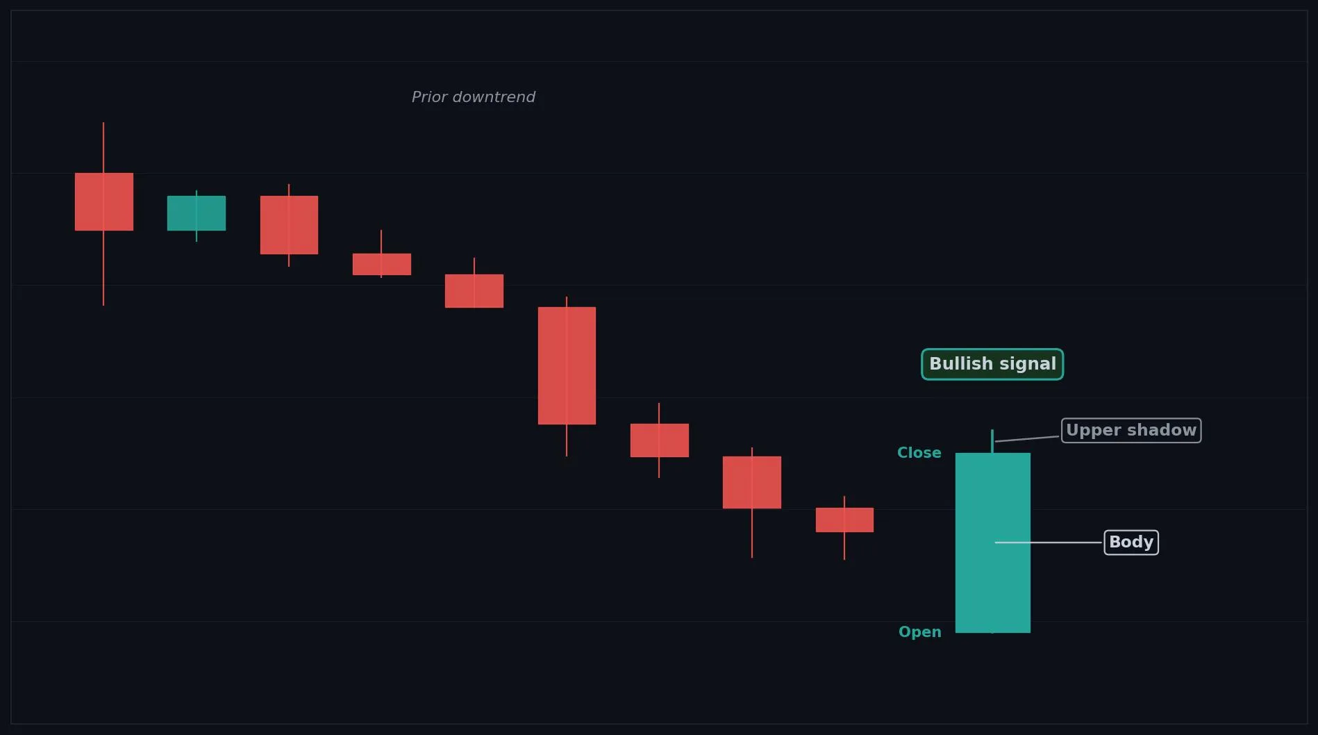
How to Interpret the Bullish Belt Hold
Bullish: after a downtrend, a Bullish Belt Hold signals buyers seized control and a reversal up may follow.
Bearish: not a bearish signal.
Neutral: inside a range it is weaker and needs confirmation.
Common Use Cases
Reversal confirmation
entry timing near support
a signal of sudden buying strength
Advanced Use Cases
Strongest after a downtrend or at a support level, where opening at the low and rallying shows a decisive shift
Pair with Support levels for a higher conviction trade setup.
CoinQuant Examples
Enter Long when a Bullish Belt Hold forms after a downtrend and Close crosses above the previous High.
Exit Short when a Bullish Belt Hold forms at a support level.
Advantages
Shows a decisive intraday shift to buyers and is easy to spot after a decline.
Limitations
Less reliable inside ranges, and a single candle needs confirmation or a support level to trust.
Works Best With
Support levels
RSI oversold readings
a bullish confirmation candle
Quick Reference
Bias: Bullish
Type: Reversal
Trend Context: Strongest after a downtrend
Confirmation Needed: Yes, wait for an upside confirmation candle
Bearish Belt Hold
Overview
A Bearish Belt Hold is a strong bearish candle that opens at the high and falls, signaling immediate selling pressure after a rally.
What Is a Bearish Belt Hold?
A long red body that opens right at the session high with no upper shadow and a small or no lower shadow, falling steadily through the session. Price opened at the high and sellers immediately took charge, pushing it down all session. When this appears after an uptrend, it signals a sudden shift toward sellers.
Why Traders Use the Bearish Belt Hold
Strongest after an uptrend or at a resistance level, where opening at the high and falling shows a decisive shift
Anatomy
Open is at or very near the High of the candle.
A long red body falling through the session.
Little or no upper shadow, and a small or no lower shadow.
It appears after an uptrend to signal a reversal.
Example
Open: 103.2, High: 103.2, Low: 99.8, Close: 100.0. Price opened at the high and sold off strongly, closing near the low. This qualifies because it opened at the high with a long red body after a rally.
Bearish Belt Hold Example Chart
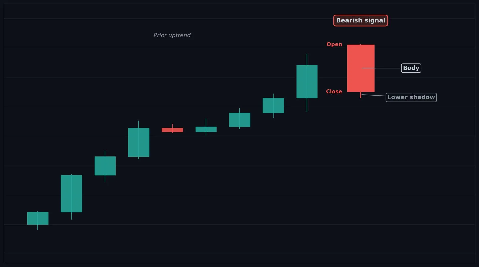
How to Interpret the Bearish Belt Hold
Bullish: not a bullish signal.
Bearish: after an uptrend, a Bearish Belt Hold signals sellers seized control and a reversal down may follow.
Neutral: inside a range it is weaker and needs confirmation.
Common Use Cases
Reversal confirmation
exit timing near resistance
a signal of sudden selling pressure
Advanced Use Cases
Strongest after an uptrend or at a resistance level, where opening at the high and falling shows a decisive shift
Pair with Resistance levels for a higher conviction trade setup.
CoinQuant Examples
Exit Long when a Bearish Belt Hold forms after an uptrend and Close crosses below the previous Low.
Enter Short when a Bearish Belt Hold forms at a resistance level.
Advantages
Shows a decisive intraday shift to sellers and is easy to spot after a rally.
Limitations
Less reliable inside ranges, and a single candle needs confirmation or a resistance level to trust.
Works Best With
Resistance levels
RSI overbought readings
a bearish confirmation candle
Quick Reference
Bias: Bearish
Type: Reversal
Trend Context: Strongest after an uptrend
Confirmation Needed: Yes, wait for a downside confirmation candle
Bullish Spinning Top
Overview
A Bullish Spinning Top is a small bodied green candle with long wicks, showing weakening momentum and indecision within a bullish tilt.
What Is a Bullish Spinning Top?
A small green body sitting near the middle of the candle, with upper and lower shadows longer than the body. Buyers closed slightly ahead, but the long wicks on both sides show a real fight and no strong conviction. It reflects fading momentum and growing indecision.
Why Traders Use the Bullish Spinning Top
Most meaningful after a strong move, where fading momentum can precede a pause or reversal
Anatomy
A small green body (Close slightly above Open).
Upper and lower shadows both longer than the body.
The body sits near the middle of the range.
The smaller the body relative to the shadows, the greater the indecision.
Example
Open: 100.0, High: 102.6, Low: 97.6, Close: 100.8. Price swung both ways and closed just above the open, with a small body and long wicks. This qualifies because of the small green body centered in a wide range.
Bullish Spinning Top Example Chart
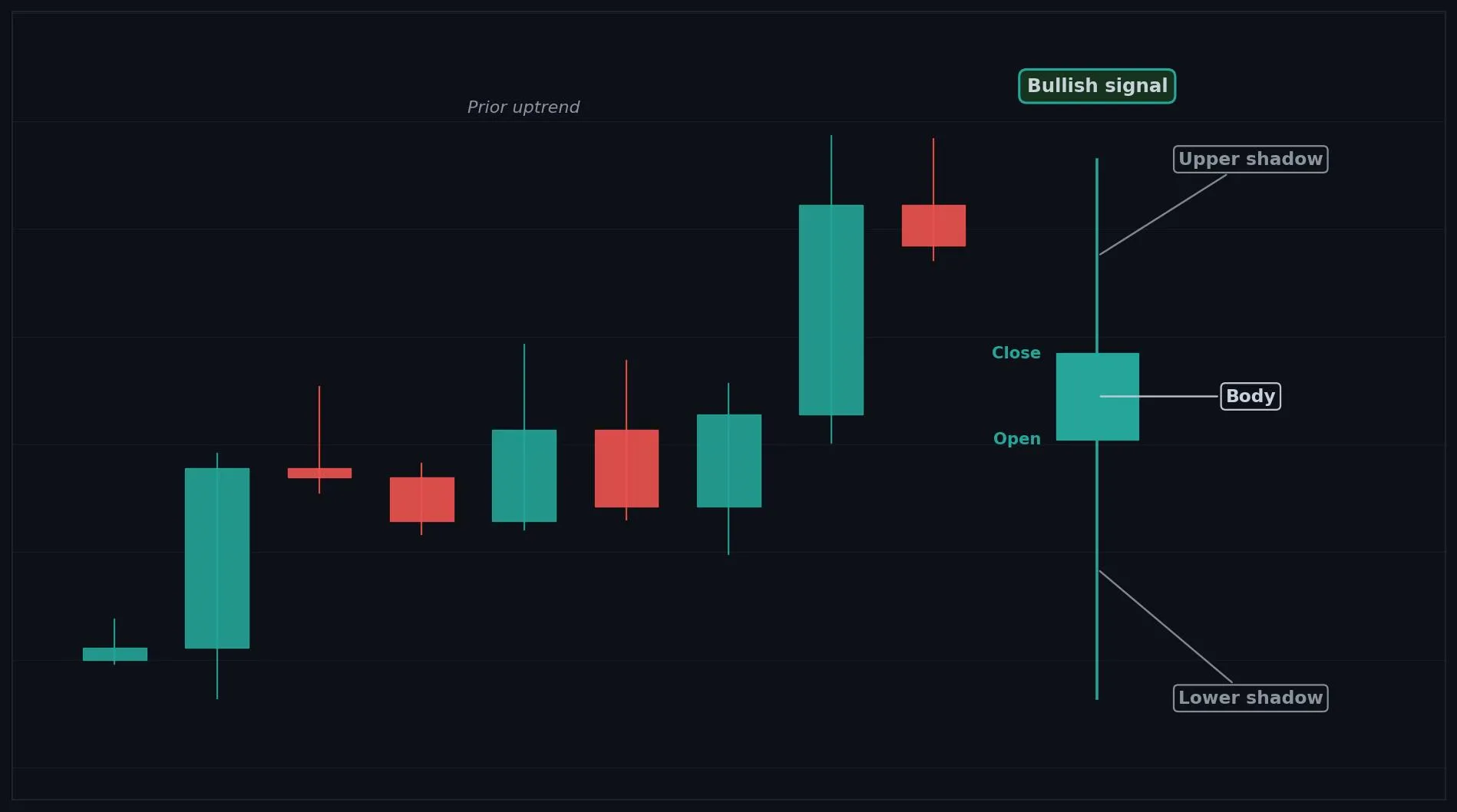
How to Interpret the Bullish Spinning Top
Bullish: in an uptrend it can signal a brief pause before continuation, but momentum is weakening.
Bearish: after a strong uptrend it can warn that buyers are tiring and a reversal may be near.
Neutral: most often it simply signals indecision, so wait for confirmation.
Common Use Cases
Indecision filter
momentum weakening warning
a cue to tighten risk
Advanced Use Cases
Most meaningful after a strong move, where fading momentum can precede a pause or reversal
Pair with Support and resistance levels for a higher conviction trade setup.
CoinQuant Examples
Exit Long when a Bullish Spinning Top forms after an uptrend and Close crosses below the previous Low.
Enter Long when a Bullish Spinning Top forms after a downtrend and Close crosses above the previous High.
Advantages
Flags weakening momentum early and highlights indecision within an ongoing move.
Limitations
Gives weak directional signal alone, is common in choppy markets, and needs confirmation.
Works Best With
Support and resistance levels
RSI
a confirmation candle
Quick Reference
Bias: Bullish (weak)
Type: Indecision
Trend Context: Strongest after a strong move
Confirmation Needed: Yes, next candle must confirm direction
Bearish Spinning Top
Overview
A Bearish Spinning Top is a small bodied red candle with long wicks, showing uncertainty and fading trend strength within a bearish tilt.
What Is a Bearish Spinning Top?
A small red body sitting near the middle of the candle, with upper and lower shadows longer than the body. Sellers closed slightly ahead, but the long wicks on both sides show a real fight and no strong conviction. It reflects fading trend strength and growing uncertainty.
Why Traders Use the Bearish Spinning Top
Most meaningful after a strong move, where fading trend strength can precede a pause or reversal
Anatomy
A small red body (Close slightly below Open).
Upper and lower shadows both longer than the body.
The body sits near the middle of the range.
The smaller the body relative to the shadows, the greater the indecision.
Example
Open: 100.8, High: 102.6, Low: 97.6, Close: 100.0. Price swung both ways and closed just below the open, with a small body and long wicks. This qualifies because of the small red body centered in a wide range.
Bearish Spinning Top Example Chart
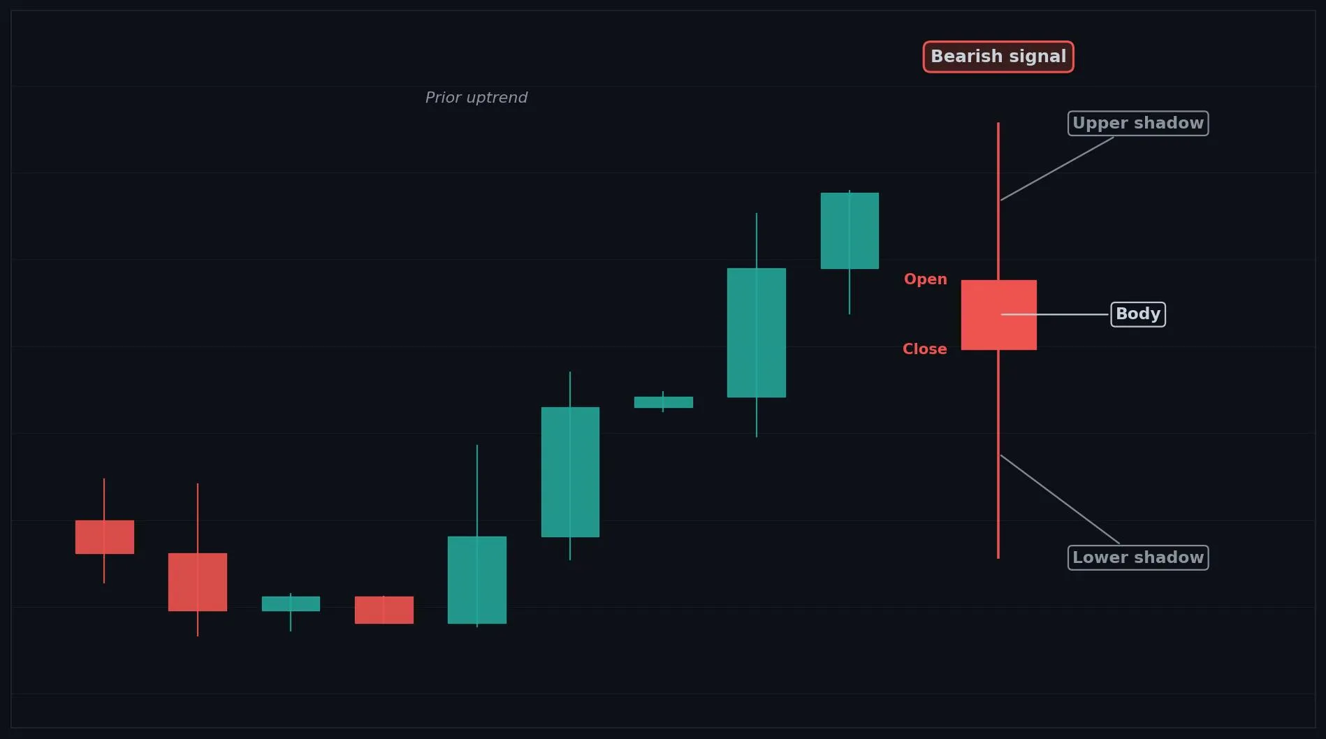
How to Interpret the Bearish Spinning Top
Bullish: after a strong downtrend it can warn that sellers are tiring and a bounce may be near.
Bearish: in a downtrend it can signal a brief pause before continuation, but momentum is fading.
Neutral: most often it simply signals indecision, so wait for confirmation.
Common Use Cases
Indecision filter
trend weakening warning
a cue to tighten risk
Advanced Use Cases
Most meaningful after a strong move, where fading trend strength can precede a pause or reversal
Pair with Support and resistance levels for a higher conviction trade setup.
CoinQuant Examples
Exit Short when a Bearish Spinning Top forms after a downtrend and Close crosses above the previous High.
Enter Short when a Bearish Spinning Top forms after an uptrend and Close crosses below the previous Low.
Advantages
Flags fading trend strength early and highlights uncertainty within an ongoing move.
Limitations
Gives weak directional signal alone, is common in choppy markets, and needs confirmation.
Works Best With
Support and resistance levels
RSI
a confirmation candle
Quick Reference
Bias: Bearish (weak)
Type: Indecision
Trend Context: Strongest after a strong move
Confirmation Needed: Yes, next candle must confirm direction
High Wave
Overview
A High Wave is a neutral candle with very long wicks on both sides and a small body, indicating extreme indecision and high volatility.
What Is a High Wave?
A small body near the middle of the candle with unusually long upper and lower shadows, showing a very wide trading range that ended near the open. Both buyers and sellers made large aggressive moves during the session, but neither could hold ground. The extreme wicks reflect sharp volatility and deep uncertainty about direction.
Why Traders Use the High Wave
Most meaningful after a trend or at a key level, where extreme volatility can mark a turning point or a warning to reduce risk
Anatomy
A small body (open and close close together).
Very long upper and lower shadows, longer than a normal spinning top.
The body sits near the middle of a very wide range.
The longer both wicks, the greater the volatility and indecision.
Example
Open: 100.0, High: 104.2, Low: 95.8, Close: 100.3. Price whipsawed sharply in both directions but closed near the open, leaving very long wicks. This qualifies because of the small body inside an unusually wide range.
High Wave Example Chart
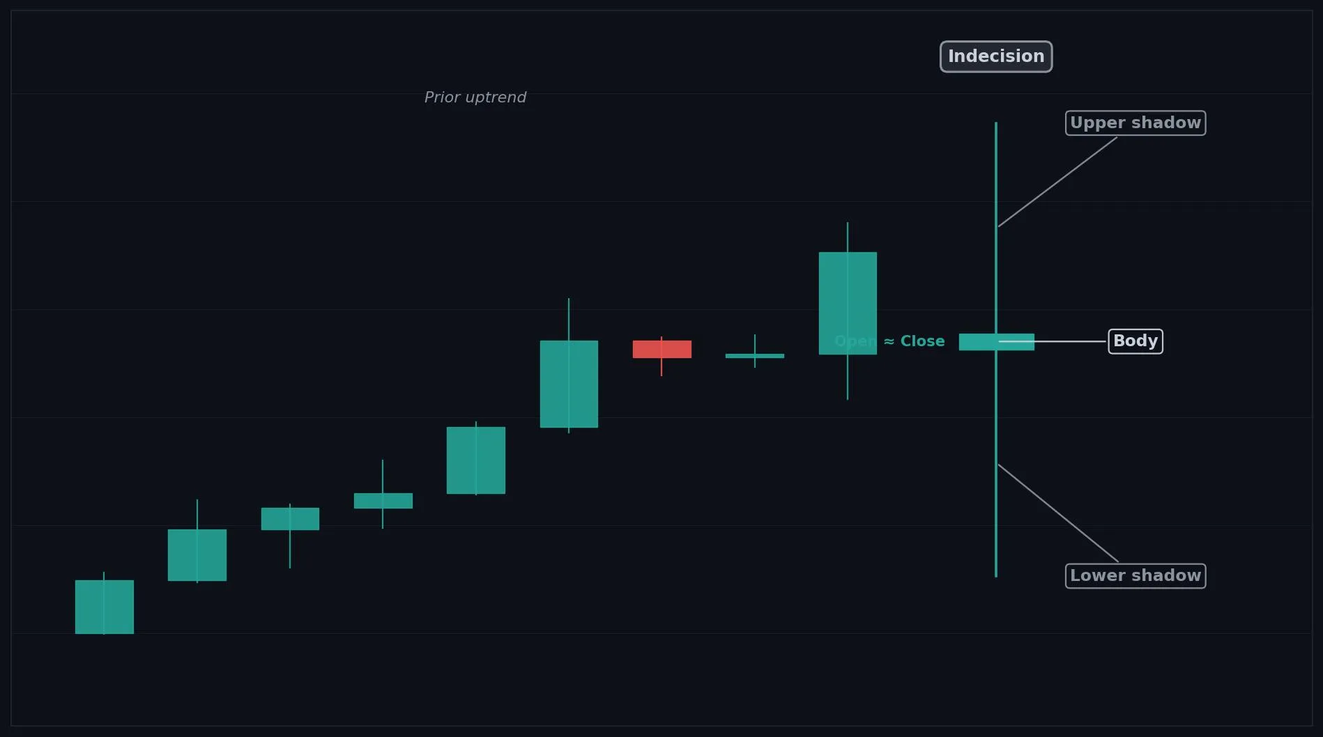
How to Interpret the High Wave
Bullish: after a downtrend it can hint at a bottom, but only with strong confirmation.
Bearish: after an uptrend it can hint at a top, but only with strong confirmation.
Neutral: most often it signals extreme indecision and volatility, meaning stay cautious and wait.
Common Use Cases
Volatility filter
reversal warning
a strong cue to tighten or pause risk
Advanced Use Cases
Most meaningful after a trend or at a key level, where extreme volatility can mark a turning point or a warning to reduce risk
Pair with ATR for volatility context for a higher conviction trade setup.
CoinQuant Examples
Exit Long when a High Wave forms after an uptrend and Close crosses below the previous Low.
Enter Long when a High Wave forms after a downtrend and Close crosses above the previous High.
Advantages
Strongly highlights rising volatility and deep indecision, useful as an early turning point flag.
Limitations
Gives no direction alone, appears in volatile chop, and needs solid confirmation before acting.
Works Best With
ATR for volatility context
support and resistance levels
a confirmation candle
Quick Reference
Bias: Neutral
Type: Indecision (high volatility)
Trend Context: Strongest after a trend or at a key level
Confirmation Needed: Yes, strong confirmation needed
Long Green Candle
Overview
A Long Green Candle is a large bullish candle showing strong upward momentum, with buyers clearly in control of the session.
What Is a Long Green Candle?
A tall green body that is much larger than recent candles, with small or no shadows, closing well above the open. Buyers pushed price sharply higher throughout the session with little resistance. The large body shows strong demand and decisive upward momentum.
Why Traders Use the Long Green Candle
Powerful during uptrends and after breakouts
Very late in a rally it can mark a buying climax
Anatomy
Close is well above Open, forming a large green body.
The body is clearly larger than the recent average candle.
Shadows are small relative to the body.
The bigger the body, the stronger the momentum.
Example
Open: 100.0, High: 104.7, Low: 99.7, Close: 104.4. Price rose strongly all session and closed near the high, forming a large green body. This qualifies because the body is much larger than surrounding candles.
Long Green Candle Example Chart
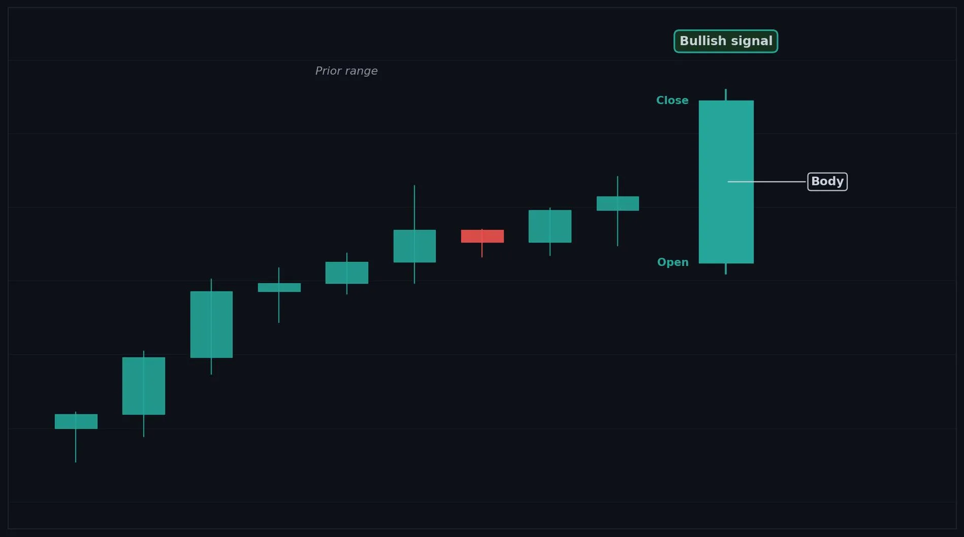
How to Interpret the Long Green Candle
Bullish: shows strong buying momentum and often signals continuation of an uptrend or a breakout.
Bearish: not bearish, though after a long rally it can hint at a climax.
Neutral: rarely neutral, it is a momentum candle.
Common Use Cases
Trend continuation
breakout confirmation
momentum entry timing
Advanced Use Cases
Powerful during uptrends and after breakouts
Pair with Breakout levels for a higher conviction trade setup.
CoinQuant Examples
Enter Long when a Long Green Candle closes above a resistance level.
Exit Short when a Long Green Candle forms after a downtrend.
Advantages
A clear, easy to read momentum signal that confirms strong buying interest.
Limitations
Can appear near the top of a rally as a climax, and buying late risks chasing exhaustion.
Works Best With
Breakout levels
volume confirmation
moving averages for trend context
Quick Reference
Bias: Bullish
Type: Continuation (momentum)
Trend Context: Strong in uptrends and after breakouts
Confirmation Needed: Often acts on its own, volume helps
Long Red Candle
Overview
A Long Red Candle is a large bearish candle showing strong downward momentum, with sellers clearly in control of the session.
What Is a Long Red Candle?
A tall red body that is much larger than recent candles, with small or no shadows, closing well below the open. Sellers pushed price sharply lower throughout the session with little resistance. The large body shows strong supply and decisive downward momentum.
Why Traders Use the Long Red Candle
Powerful during downtrends and after breakdowns
Very late in a selloff it can mark a selling climax
Anatomy
Close is well below Open, forming a large red body.
The body is clearly larger than the recent average candle.
Shadows are small relative to the body.
The bigger the body, the stronger the momentum.
Example
Open: 104.4, High: 104.7, Low: 99.7, Close: 100.0. Price fell strongly all session and closed near the low, forming a large red body. This qualifies because the body is much larger than surrounding candles.
Long Red Candle Example Chart
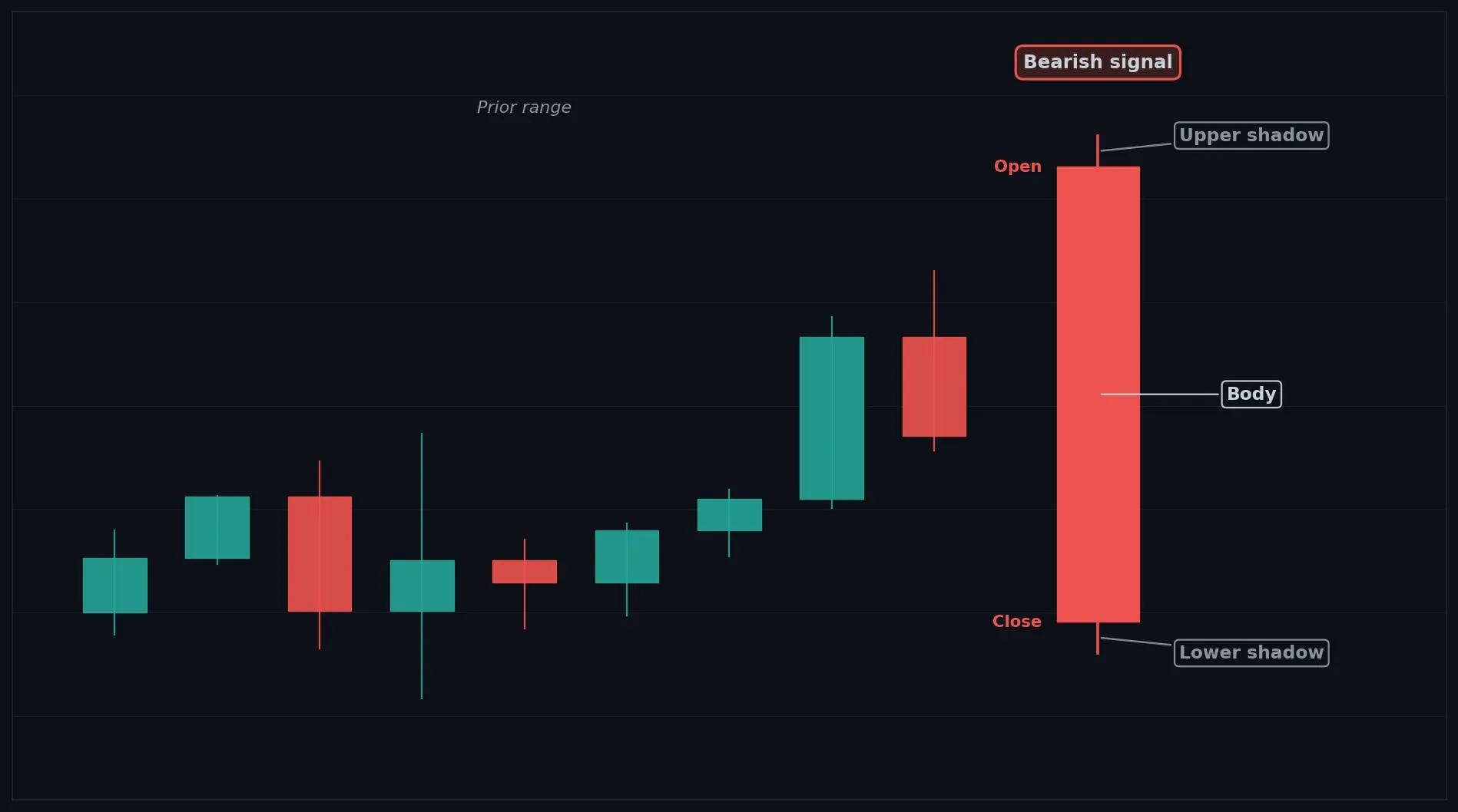
How to Interpret the Long Red Candle
Bullish: not bullish, though after a long selloff it can hint at a climax.
Bearish: shows strong selling momentum and often signals continuation of a downtrend or a breakdown.
Neutral: rarely neutral, it is a momentum candle.
Common Use Cases
Trend continuation
breakdown confirmation
momentum exit timing
Advanced Use Cases
Powerful during downtrends and after breakdowns
Pair with Breakdown levels for a higher conviction trade setup.
CoinQuant Examples
Exit Long when a Long Red Candle closes below a support level.
Enter Short when a Long Red Candle forms after an uptrend.
Advantages
A clear, easy to read momentum signal that confirms strong selling interest.
Limitations
Can appear near the bottom of a selloff as a climax, and shorting late risks chasing exhaustion.
Works Best With
Breakdown levels
volume confirmation
moving averages for trend context
Quick Reference
Bias: Bearish
Type: Continuation (momentum)
Trend Context: Strong in downtrends and after breakdowns
Confirmation Needed: Often acts on its own, volume helps
Short Green Candle
Overview
A Short Green Candle is a small bullish candle indicating weak buying pressure and limited upward movement.
What Is a Short Green Candle?
A small green body with short shadows, closing only slightly above the open, much smaller than nearby candles. Buyers closed ahead, but only barely. The small body shows limited conviction and quiet trading, often a pause rather than a strong move.
Why Traders Use the Short Green Candle
Most meaningful as context, showing whether momentum is steady or fading inside a trend or range
Anatomy
Close is slightly above Open, forming a small green body.
The body is smaller than the recent average candle.
Shadows are short.
The smaller the body, the weaker the buying pressure.
Example
Open: 100.0, High: 101.4, Low: 99.6, Close: 101.0. Price edged up modestly and closed a little above the open. This qualifies because the small green body reflects limited movement.
Short Green Candle Example Chart

How to Interpret the Short Green Candle
Bullish: in a calm uptrend it can show steady but quiet buying, hinting at slow continuation.
Bearish: after a strong rally it can show buying is fading.
Neutral: most often it simply reflects a quiet, low conviction session.
Common Use Cases
Momentum context
consolidation detection
a filter to avoid low conviction entries
Advanced Use Cases
Most meaningful as context, showing whether momentum is steady or fading inside a trend or range
Pair with Moving averages for a higher conviction trade setup.
CoinQuant Examples
Enter Long when a Short Green Candle forms during a pullback in an uptrend and Close crosses above the previous High.
Exit Long when repeated Short Green Candles show buying momentum is fading after a rally.
Advantages
Useful for reading quiet conditions and spotting fading or steady momentum inside a move.
Limitations
Weak on its own, easy to overinterpret, and best used only as supporting context.
Works Best With
Moving averages
volume
support and resistance levels
Quick Reference
Bias: Bullish (weak)
Type: Continuation or consolidation
Trend Context: Quiet trends or ranges
Confirmation Needed: Yes, weak on its own
Short Red Candle
Overview
A Short Red Candle is a small bearish candle indicating weak selling pressure and limited downward movement.
What Is a Short Red Candle?
A small red body with short shadows, closing only slightly below the open, much smaller than nearby candles. Sellers closed ahead, but only barely. The small body shows limited conviction and quiet trading, often a pause rather than a strong move.
Why Traders Use the Short Red Candle
Most meaningful as context, showing whether downward momentum is steady or fading inside a trend or range
Anatomy
Close is slightly below Open, forming a small red body.
The body is smaller than the recent average candle.
Shadows are short.
The smaller the body, the weaker the selling pressure.
Example
Open: 101.0, High: 101.4, Low: 99.6, Close: 100.0. Price eased down modestly and closed a little below the open. This qualifies because the small red body reflects limited movement.
Short Red Candle Example Chart
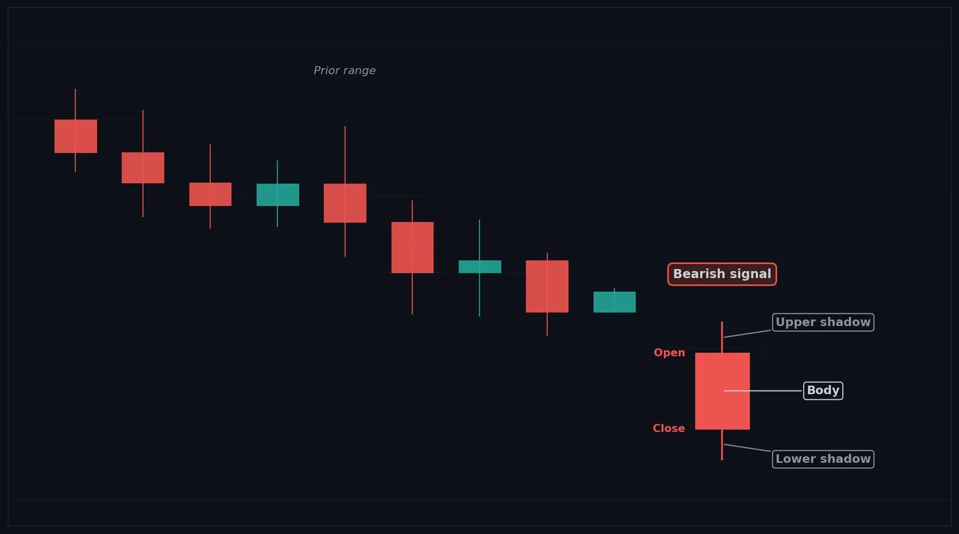
How to Interpret the Short Red Candle
Bullish: after a strong selloff it can show selling is fading.
Bearish: in a calm downtrend it can show steady but quiet selling, hinting at slow continuation.
Neutral: most often it simply reflects a quiet, low conviction session.
Common Use Cases
Momentum context
consolidation detection
a filter to avoid low conviction entries
Advanced Use Cases
Most meaningful as context, showing whether downward momentum is steady or fading inside a trend or range
Pair with Moving averages for a higher conviction trade setup.
CoinQuant Examples
Enter Short when a Short Red Candle forms during a bounce in a downtrend and Close crosses below the previous Low.
Exit Short when repeated Short Red Candles show selling momentum is fading after a decline.
Advantages
Useful for reading quiet conditions and spotting fading or steady momentum inside a move.
Limitations
Weak on its own, easy to overinterpret, and best used only as supporting context.
Works Best With
Moving averages
volume
support and resistance levels
Quick Reference
Bias: Bearish (weak)
Type: Continuation or consolidation
Trend Context: Quiet trends or ranges
Confirmation Needed: Yes, weak on its own
Long Lower Shadow
Overview
A Long Lower Shadow candle shows strong rejection of lower prices, suggesting buyer support stepped in during the session.
What Is a Long Lower Shadow?
A candle with a long lower shadow well below the body, a small to medium body, and little or no upper shadow. Sellers pushed price down sharply during the session, but buyers rejected those lower prices and pushed it back up. The long lower wick shows demand appearing at lower levels.
Why Traders Use the Long Lower Shadow
Strongest after a downtrend or at a support level, where the deep wick shows buyers stepping in
Anatomy
A long lower shadow extending well below the body.
A small to medium body near the top of the range.
Little or no upper shadow.
The longer the lower shadow, the stronger the buying rejection.
Example
Open: 101.4, High: 102.2, Low: 97.4, Close: 101.9. Price dropped to 97.4 then recovered to close near the top, leaving a long lower wick. This qualifies because the long lower shadow dwarfs the body.
Long Lower Shadow Example Chart
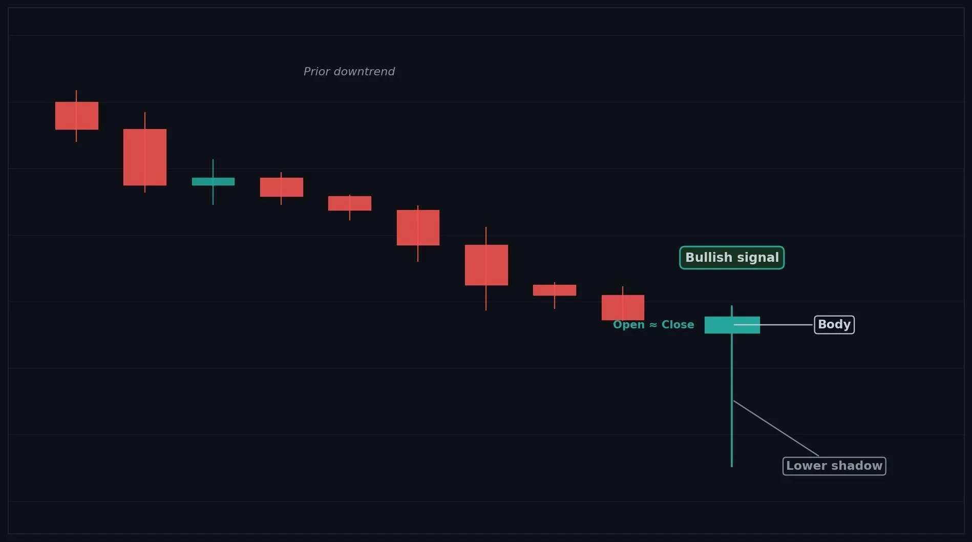
How to Interpret the Long Lower Shadow
Bullish: after a downtrend or at support, it signals buyers defending and a possible reversal up.
Bearish: rarely bearish, though inside a downtrend it can just be a pause.
Neutral: inside a range it is weaker and needs confirmation.
Common Use Cases
Reversal warning
support confirmation
entry timing after a rejection of lower prices
Advanced Use Cases
Strongest after a downtrend or at a support level, where the deep wick shows buyers stepping in
Pair with Support levels for a higher conviction trade setup.
CoinQuant Examples
Enter Long when a Long Lower Shadow forms at support and Close crosses above the previous High.
Exit Short when a Long Lower Shadow forms after a downtrend.
Advantages
Clearly shows buyer support at lower prices and helps confirm support levels.
Limitations
Meaning depends on context and body position, and it needs confirmation to avoid false signals.
Works Best With
Support levels
RSI oversold readings
a bullish confirmation candle
Quick Reference
Bias: Bullish
Type: Reversal or support test
Trend Context: Strongest after a downtrend or at support
Confirmation Needed: Yes, wait for an upside confirmation candle
Long Upper Shadow
Overview
A Long Upper Shadow candle shows strong rejection of higher prices, suggesting seller resistance stepped in during the session.
What Is a Long Upper Shadow?
A candle with a long upper shadow well above the body, a small to medium body, and little or no lower shadow. Buyers pushed price up sharply during the session, but sellers rejected those higher prices and forced it back down. The long upper wick shows supply appearing at higher levels.
Why Traders Use the Long Upper Shadow
Strongest after an uptrend or at a resistance level, where the long wick shows sellers stepping in
Anatomy
A long upper shadow extending well above the body.
A small to medium body near the bottom of the range.
Little or no lower shadow.
The longer the upper shadow, the stronger the selling rejection.
Example
Open: 100.0, High: 103.0, Low: 99.2, Close: 99.5. Price rose to 103.0 then fell back to close near the bottom, leaving a long upper wick. This qualifies because the long upper shadow dwarfs the body.
Long Upper Shadow Example Chart
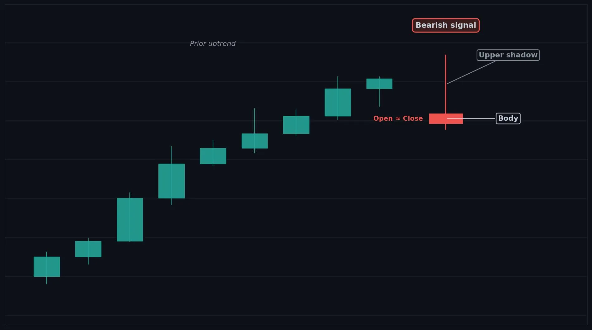
How to Interpret the Long Upper Shadow
Bullish: rarely bullish, though inside an uptrend it can just be a pause.
Bearish: after an uptrend or at resistance, it signals sellers defending and a possible reversal down.
Neutral: inside a range it is weaker and needs confirmation.
Common Use Cases
Reversal warning
resistance confirmation
exit timing after a rejection of higher prices
Advanced Use Cases
Strongest after an uptrend or at a resistance level, where the long wick shows sellers stepping in
Pair with Resistance levels for a higher conviction trade setup.
CoinQuant Examples
Exit Long when a Long Upper Shadow forms at resistance and Close crosses below the previous Low.
Enter Short when a Long Upper Shadow forms after an uptrend.
Advantages
Clearly shows seller resistance at higher prices and helps confirm resistance levels.
Limitations
Meaning depends on context and body position, and it needs confirmation to avoid false signals.
Works Best With
Resistance levels
RSI overbought readings
a bearish confirmation candle
Quick Reference
Bias: Bearish
Type: Reversal or resistance test
Trend Context: Strongest after an uptrend or at resistance
Confirmation Needed: Yes, wait for a downside confirmation candle
Bullish Opening Marubozu
Overview
A Bullish Opening Marubozu is a bullish candle that opens at the low and rallies strongly upward, showing immediate buying strength.
What Is a Bullish Opening Marubozu?
A long green body that opens at the low with no lower shadow, though it may have a small upper shadow from late selling. Buyers seized control right from the open and drove price up all session. A small upper wick shows some late profit taking, but demand controlled the move from the start.
Why Traders Use the Bullish Opening Marubozu
Strong at the start of uptrends and after breakouts, where an open at the low shows early buyer control
Anatomy
Open is at or very near the Low of the candle (no lower shadow).
A small upper shadow may exist from late session selling.
The body is long and green.
The lack of a lower shadow shows buyers controlled from the open.
Example
Open: 100.0, High: 104.1, Low: 100.0, Close: 103.6. Price opened at the low and rallied all session, easing only slightly at the end. This qualifies because the open sits at the low with only a small upper shadow.
Bullish Opening Marubozu Example Chart
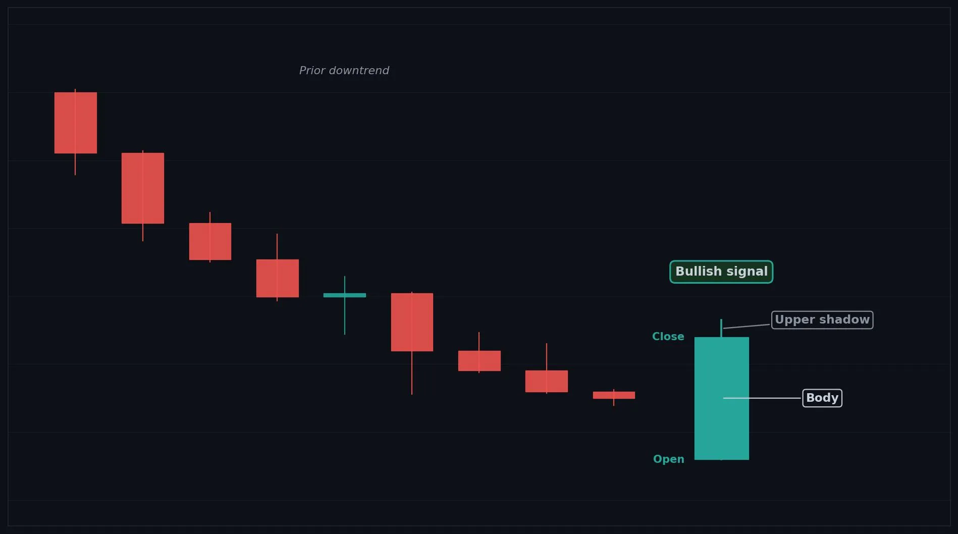
How to Interpret the Bullish Opening Marubozu
Bullish: opening at the low and rallying shows immediate demand and often signals continuation.
Bearish: not bearish, though after a long rally it can hint at a climax.
Neutral: rarely neutral, it is a momentum candle.
Common Use Cases
Trend continuation
breakout confirmation
early momentum entry timing
Advanced Use Cases
Strong at the start of uptrends and after breakouts, where an open at the low shows early buyer control
Pair with Breakout levels for a higher conviction trade setup.
CoinQuant Examples
Enter Long when a Bullish Opening Marubozu forms and Close crosses above a resistance level.
Exit Short when a Bullish Opening Marubozu forms after a downtrend.
Advantages
Shows buyers took control from the open, giving an early momentum and continuation signal.
Limitations
The late dip makes it slightly weaker than a full Marubozu, and it can appear late in a rally.
Works Best With
Breakout levels
volume confirmation
moving averages
Quick Reference
Bias: Bullish
Type: Continuation (momentum)
Trend Context: Strong at the start of uptrends
Confirmation Needed: Often acts on its own, volume helps
Bearish Opening Marubozu
Overview
A Bearish Opening Marubozu is a bearish candle that opens at the high and sells off sharply, showing immediate selling pressure.
What Is a Bearish Opening Marubozu?
A long red body that opens at the high with no upper shadow, though it may have a small lower shadow from late buying. Sellers seized control right from the open and drove price down all session. A small lower wick shows some late buying, but supply controlled the move from the start.
Why Traders Use the Bearish Opening Marubozu
Strong at the start of downtrends and after breakdowns, where an open at the high shows early seller control
Anatomy
Open is at or very near the High of the candle (no upper shadow).
A small lower shadow may exist from late session buying.
The body is long and red.
The lack of an upper shadow shows sellers controlled from the open.
Example
Open: 104.0, High: 104.0, Low: 99.9, Close: 100.4. Price opened at the high and sold off all session, recovering only slightly at the end. This qualifies because the open sits at the high with only a small lower shadow.
Bearish Opening Marubozu Example Chart
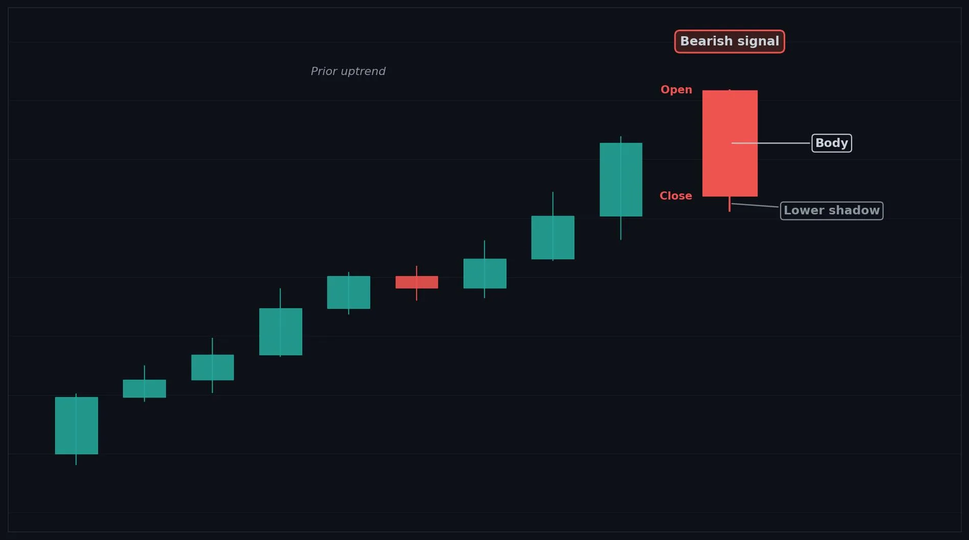
How to Interpret the Bearish Opening Marubozu
Bullish: not bullish, though after a long selloff it can hint at a climax.
Bearish: opening at the high and selling off shows immediate supply and often signals continuation.
Neutral: rarely neutral, it is a momentum candle.
Common Use Cases
Trend continuation
breakdown confirmation
early momentum exit timing
Advanced Use Cases
Strong at the start of downtrends and after breakdowns, where an open at the high shows early seller control
Pair with Breakdown levels for a higher conviction trade setup.
CoinQuant Examples
Exit Long when a Bearish Opening Marubozu forms and Close crosses below a support level.
Enter Short when a Bearish Opening Marubozu forms after an uptrend.
Advantages
Shows sellers took control from the open, giving an early momentum and breakdown signal.
Limitations
The late recovery makes it slightly weaker than a full Marubozu, and it can appear late in a selloff.
Works Best With
Breakdown levels
volume confirmation
moving averages
Quick Reference
Bias: Bearish
Type: Continuation (momentum)
Trend Context: Strong at the start of downtrends
Confirmation Needed: Often acts on its own, volume helps
Two-Candle Patterns
Bullish Engulfing
Overview
A Bullish Engulfing is a strong two candle bullish reversal where a large bullish candle fully overtakes the prior bearish candle.
What Is a Bullish Engulfing?
Two candles: a smaller bearish (red) candle first, then a larger bullish (green) candle whose body completely covers the prior body from below the previous close to above the previous open. Sellers were in control on the first candle, but buyers surged back on the second and overwhelmed them entirely. Fully engulfing the prior body shows a decisive shift of control to buyers.
Why Traders Use the Bullish Engulfing
Strongest after a clear downtrend or at a support level, where the engulfing shows a decisive shift to buyers
Anatomy
Candle 1 is a bearish (red) candle, ideally after a downtrend.
Candle 2 is a bullish (green) candle.
Candle 2 opens at or below the close of Candle 1.
Candle 2 closes at or above the open of Candle 1, so its body engulfs Candle 1's body.
Example
Candle 1 (bearish): Open 101.5, High 101.8, Low 100.9, Close 101.1. Candle 2 (bullish): Open 100.8, High 102.6, Low 100.5, Close 101.9. Candle 2's body (100.8 to 101.9) fully wraps Candle 1's body (101.1 to 101.5), which qualifies as a Bullish Engulfing.
Bullish Engulfing Example Chart
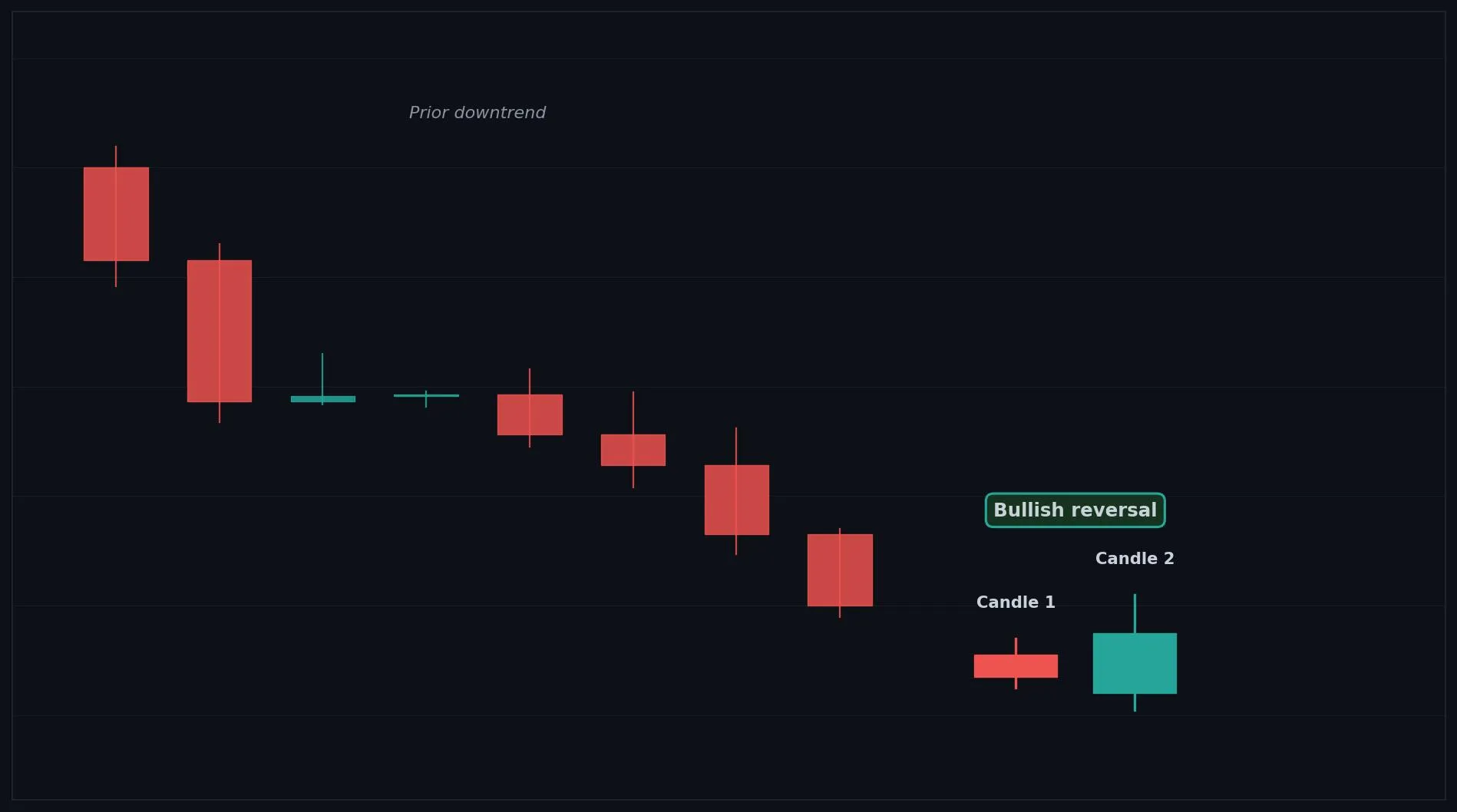
How to Interpret the Bullish Engulfing
Bullish: after a downtrend, a Bullish Engulfing signals buyers have taken control and a reversal up is likely.
Bearish: not a bearish signal; the same idea reversed is a Bearish Engulfing.
Neutral: inside a range it is weaker and needs confirmation.
Common Use Cases
Reversal confirmation
entry timing near support
a signal that a decline has ended
Advanced Use Cases
Strongest after a clear downtrend or at a support level, where the engulfing shows a decisive shift to buyers
Pair with Support levels for a higher conviction trade setup.
CoinQuant Examples
Enter Long when a Bullish Engulfing forms after a downtrend and Close crosses above the previous High.
Exit Short when a Bullish Engulfing forms at a support level.
Advantages
One of the most reliable and easy to read two candle reversal signals, with a clear shift of control.
Limitations
Less reliable inside ranges, can fail in strong downtrends, and works best with confirmation and volume.
Works Best With
Support levels
RSI oversold readings
rising volume on the engulfing candle
Quick Reference
Bias: Bullish
Type: Reversal
Trend Context: Strongest after a downtrend
Confirmation Needed: Confirmation and volume strengthen it
Bearish Engulfing
Overview
A Bearish Engulfing is a strong two candle bearish reversal where a large bearish candle fully overtakes the prior bullish candle.
What Is a Bearish Engulfing?
Two candles: a smaller bullish (green) candle first, then a larger bearish (red) candle whose body completely covers the prior body from above the previous close to below the previous open. Buyers were in control on the first candle, but sellers surged back on the second and overwhelmed them entirely. Fully engulfing the prior body shows a decisive shift of control to sellers.
Why Traders Use the Bearish Engulfing
Strongest after a clear uptrend or at a resistance level, where the engulfing shows a decisive shift to sellers
Anatomy
Candle 1 is a bullish (green) candle, ideally after an uptrend.
Candle 2 is a bearish (red) candle.
Candle 2 opens at or above the close of Candle 1.
Candle 2 closes at or below the open of Candle 1, so its body engulfs Candle 1's body.
Example
Candle 1 (bullish): Open 101.1, High 101.8, Low 100.9, Close 101.5. Candle 2 (bearish): Open 101.9, High 102.6, Low 100.5, Close 100.8. Candle 2's body (101.9 to 100.8) fully wraps Candle 1's body (101.1 to 101.5), which qualifies as a Bearish Engulfing.
Bearish Engulfing Example Chart
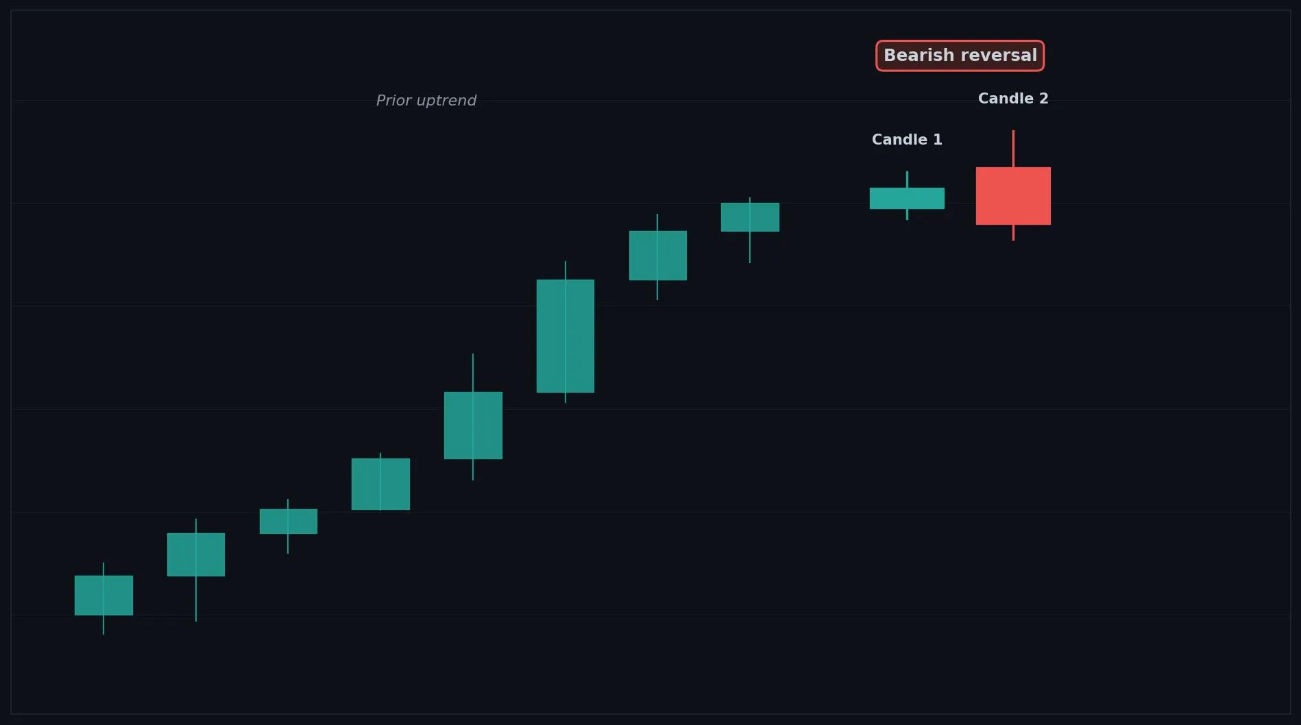
How to Interpret the Bearish Engulfing
Bullish: not a bullish signal; the same idea reversed is a Bullish Engulfing.
Bearish: after an uptrend, a Bearish Engulfing signals sellers have taken control and a reversal down is likely.
Neutral: inside a range it is weaker and needs confirmation.
Common Use Cases
Reversal confirmation
exit timing near resistance
a signal that a rally has ended
Advanced Use Cases
Strongest after a clear uptrend or at a resistance level, where the engulfing shows a decisive shift to sellers
Pair with Resistance levels for a higher conviction trade setup.
CoinQuant Examples
Exit Long when a Bearish Engulfing forms after an uptrend and Close crosses below the previous Low.
Enter Short when a Bearish Engulfing forms at a resistance level.
Advantages
One of the most reliable and easy to read two candle reversal signals, with a clear shift of control.
Limitations
Less reliable inside ranges, can fail in strong uptrends, and works best with confirmation and volume.
Works Best With
Resistance levels
RSI overbought readings
rising volume on the engulfing candle
Quick Reference
Bias: Bearish
Type: Reversal
Trend Context: Strongest after an uptrend
Confirmation Needed: Confirmation and volume strengthen it
Bullish Harami
Overview
A Bullish Harami is a two candle reversal hint where a small bullish candle forms inside a prior large bearish candle, showing selling pressure is weakening.
What Is a Bullish Harami?
Two candles: a large bearish (red) candle first, then a small bullish (green) candle whose body sits entirely inside the range of the prior body. Sellers dominated the first candle, but the small contained second candle shows their momentum has stalled. The pause after strong selling hints the downtrend may be losing steam.
Why Traders Use the Bullish Harami
Strongest after a strong downtrend or at a support level, where the sudden pause suggests selling is fading
Anatomy
Candle 1 is a large bearish (red) candle, ideally after a downtrend.
Candle 2 is a small bullish (green) candle.
Candle 2's body sits entirely inside Candle 1's body.
The smaller Candle 2 is relative to Candle 1, the stronger the loss of selling momentum.
Example
Candle 1 (bearish): Open 102.4, High 102.6, Low 99.8, Close 100.0. Candle 2 (bullish): Open 100.7, High 101.3, Low 100.5, Close 101.1. Candle 2's small body (100.7 to 101.1) sits inside Candle 1's body, which qualifies as a Bullish Harami.
Bullish Harami Example Chart
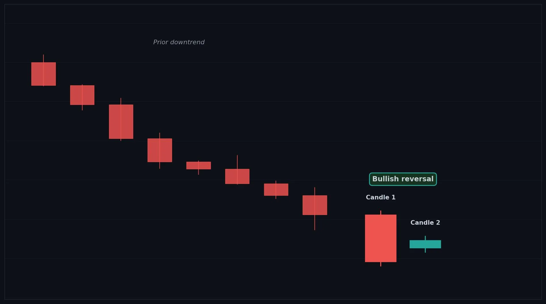
How to Interpret the Bullish Harami
Bullish: after a downtrend, a Bullish Harami hints sellers are weakening and a reversal may follow with confirmation.
Bearish: not a bearish signal.
Neutral: inside a range it carries little meaning.
Common Use Cases
Reversal warning
entry timing after confirmation
a signal of stalling downside momentum
Advanced Use Cases
Strongest after a strong downtrend or at a support level, where the sudden pause suggests selling is fading
Pair with Support levels for a higher conviction trade setup.
CoinQuant Examples
Enter Long when a Bullish Harami forms after a downtrend and Close crosses above the previous High.
Exit Short when a Bullish Harami forms at a support level.
Advantages
Gives an early warning that a downtrend is losing momentum before a full reversal appears.
Limitations
Weaker than an engulfing pattern, only signals a pause, and needs confirmation before acting.
Works Best With
Support levels
RSI oversold readings
a bullish confirmation candle
Quick Reference
Bias: Bullish
Type: Reversal (early warning)
Trend Context: Strongest after a downtrend
Confirmation Needed: Yes, confirmation is essential
Bearish Harami
Overview
A Bearish Harami is a two candle reversal hint where a small bearish candle forms inside a prior large bullish candle, showing buying pressure is weakening.
What Is a Bearish Harami?
Two candles: a large bullish (green) candle first, then a small bearish (red) candle whose body sits entirely inside the range of the prior body. Buyers dominated the first candle, but the small contained second candle shows their momentum has stalled. The pause after strong buying hints the uptrend may be losing steam.
Why Traders Use the Bearish Harami
Strongest after a strong uptrend or at a resistance level, where the sudden pause suggests buying is fading
Anatomy
Candle 1 is a large bullish (green) candle, ideally after an uptrend.
Candle 2 is a small bearish (red) candle.
Candle 2's body sits entirely inside Candle 1's body.
The smaller Candle 2 is relative to Candle 1, the stronger the loss of buying momentum.
Example
Candle 1 (bullish): Open 100.0, High 102.6, Low 99.8, Close 102.4. Candle 2 (bearish): Open 101.6, High 102.0, Low 101.2, Close 101.4. Candle 2's small body (101.6 to 101.4) sits inside Candle 1's body, which qualifies as a Bearish Harami.
Bearish Harami Example Chart
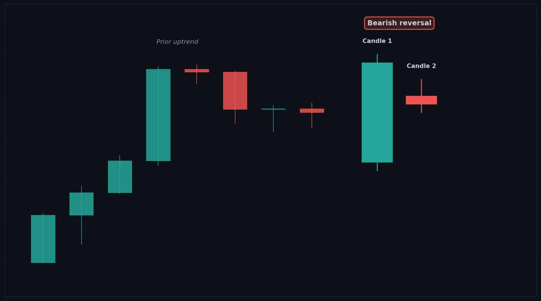
How to Interpret the Bearish Harami
Bullish: not a bullish signal.
Bearish: after an uptrend, a Bearish Harami hints buyers are weakening and a reversal may follow with confirmation.
Neutral: inside a range it carries little meaning.
Common Use Cases
Reversal warning
exit timing after confirmation
a signal of stalling upside momentum
Advanced Use Cases
Strongest after a strong uptrend or at a resistance level, where the sudden pause suggests buying is fading
Pair with Resistance levels for a higher conviction trade setup.
CoinQuant Examples
Exit Long when a Bearish Harami forms after an uptrend and Close crosses below the previous Low.
Enter Short when a Bearish Harami forms at a resistance level.
Advantages
Gives an early warning that an uptrend is losing momentum before a full reversal appears.
Limitations
Weaker than an engulfing pattern, only signals a pause, and needs confirmation before acting.
Works Best With
Resistance levels
RSI overbought readings
a bearish confirmation candle
Quick Reference
Bias: Bearish
Type: Reversal (early warning)
Trend Context: Strongest after an uptrend
Confirmation Needed: Yes, confirmation is essential
Bullish Harami Cross
Overview
A Bullish Harami Cross is a stronger Harami where a doji forms inside a prior bearish candle, signaling strong indecision and a possible bullish reversal.
What Is a Bullish Harami Cross?
Two candles: a large bearish (red) candle first, then a doji (tiny body, open and close nearly equal) whose body sits entirely inside the prior body. Sellers controlled the first candle, but the doji shows the market has swung to total indecision. This sharp stall after strong selling is a stronger reversal hint than a normal Harami.
Why Traders Use the Bullish Harami Cross
Strongest after a strong downtrend or at a support level, where the doji marks a sharp loss of selling control
Anatomy
Candle 1 is a large bearish (red) candle, ideally after a downtrend.
Candle 2 is a doji, with open and close nearly equal.
The doji sits entirely inside Candle 1's body.
The doji makes the indecision, and the potential reversal, stronger than a normal Harami.
Example
Candle 1 (bearish): Open 102.4, High 102.6, Low 99.8, Close 100.0. Candle 2 (doji): Open 101.0, High 101.5, Low 100.6, Close 101.05. The near equal open and close inside Candle 1's body qualify this as a Bullish Harami Cross.
Bullish Harami Cross Example Chart
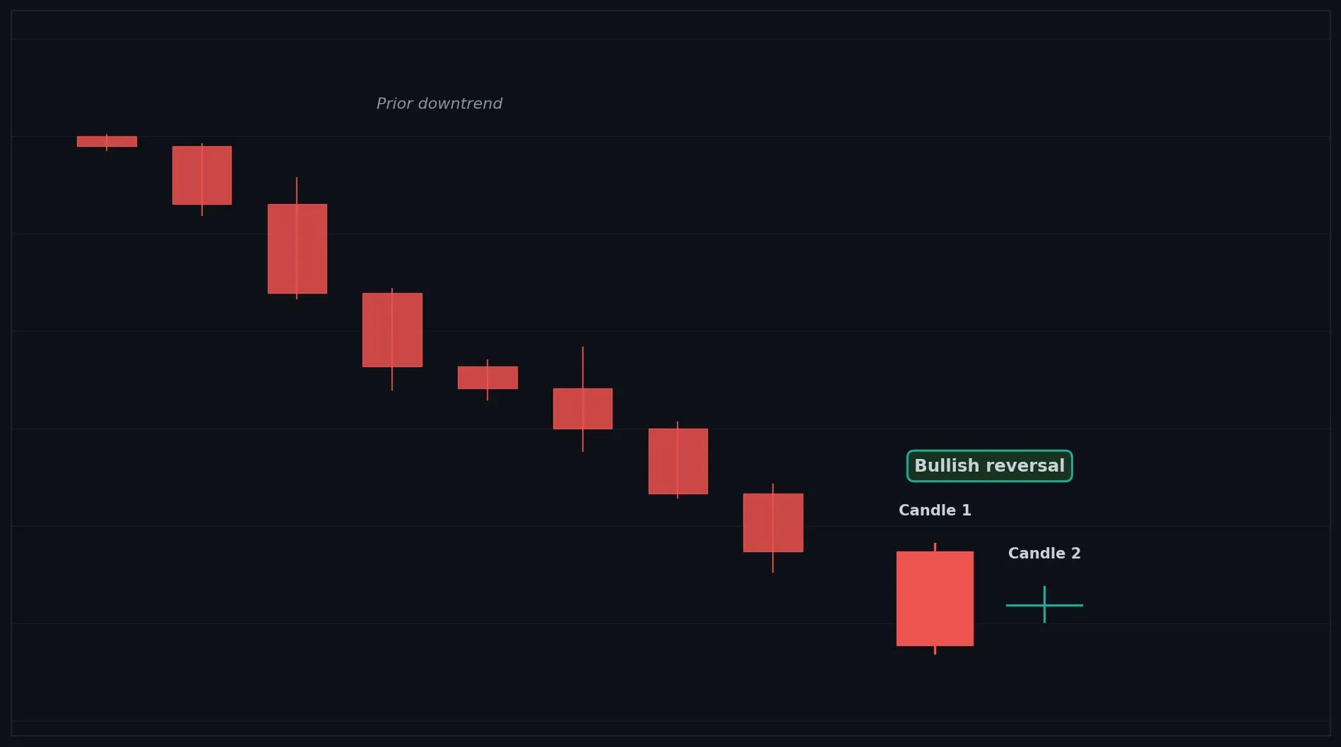
How to Interpret the Bullish Harami Cross
Bullish: after a downtrend, a Bullish Harami Cross strongly hints sellers are exhausted and a reversal may follow.
Bearish: not a bearish signal.
Neutral: the doji itself is neutral, so confirmation is still needed.
Common Use Cases
Reversal warning
entry timing after confirmation
a signal of exhausted selling
Advanced Use Cases
Strongest after a strong downtrend or at a support level, where the doji marks a sharp loss of selling control
Pair with Support levels for a higher conviction trade setup.
CoinQuant Examples
Enter Long when a Bullish Harami Cross forms after a downtrend and Close crosses above the previous High.
Exit Short when a Bullish Harami Cross forms at a support level.
Advantages
A stronger reversal hint than a normal Harami because the doji shows a sharper stall in selling.
Limitations
Still only a warning, not a confirmed reversal, and needs a confirming candle before acting.
Works Best With
Support levels
RSI oversold readings
a bullish confirmation candle
Quick Reference
Bias: Bullish
Type: Reversal (strong warning)
Trend Context: Strongest after a downtrend
Confirmation Needed: Yes, confirmation is essential
Bearish Harami Cross
Overview
A Bearish Harami Cross is a stronger Harami where a doji forms inside a prior bullish candle, signaling strong indecision and a possible bearish reversal.
What Is a Bearish Harami Cross?
Two candles: a large bullish (green) candle first, then a doji (tiny body, open and close nearly equal) whose body sits entirely inside the prior body. Buyers controlled the first candle, but the doji shows the market has swung to total indecision. This sharp stall after strong buying is a stronger reversal hint than a normal Harami.
Why Traders Use the Bearish Harami Cross
Strongest after a strong uptrend or at a resistance level, where the doji marks a sharp loss of buying control
Anatomy
Candle 1 is a large bullish (green) candle, ideally after an uptrend.
Candle 2 is a doji, with open and close nearly equal.
The doji sits entirely inside Candle 1's body.
The doji makes the indecision, and the potential reversal, stronger than a normal Harami.
Example
Candle 1 (bullish): Open 100.0, High 102.6, Low 99.8, Close 102.4. Candle 2 (doji): Open 101.4, High 101.8, Low 100.9, Close 101.4. The near equal open and close inside Candle 1's body qualify this as a Bearish Harami Cross.
Bearish Harami Cross Example Chart
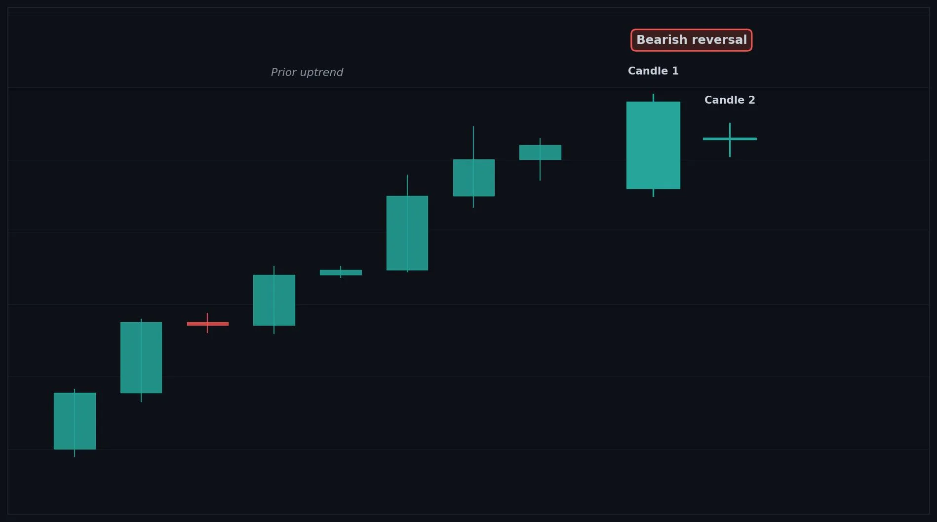
How to Interpret the Bearish Harami Cross
Bullish: not a bullish signal.
Bearish: after an uptrend, a Bearish Harami Cross strongly hints buyers are exhausted and a reversal may follow.
Neutral: the doji itself is neutral, so confirmation is still needed.
Common Use Cases
Reversal warning
exit timing after confirmation
a signal of exhausted buying
Advanced Use Cases
Strongest after a strong uptrend or at a resistance level, where the doji marks a sharp loss of buying control
Pair with Resistance levels for a higher conviction trade setup.
CoinQuant Examples
Exit Long when a Bearish Harami Cross forms after an uptrend and Close crosses below the previous Low.
Enter Short when a Bearish Harami Cross forms at a resistance level.
Advantages
A stronger reversal hint than a normal Harami because the doji shows a sharper stall in buying.
Limitations
Still only a warning, not a confirmed reversal, and needs a confirming candle before acting.
Works Best With
Resistance levels
RSI overbought readings
a bearish confirmation candle
Quick Reference
Bias: Bearish
Type: Reversal (strong warning)
Trend Context: Strongest after an uptrend
Confirmation Needed: Yes, confirmation is essential
Homing Pigeon
Overview
A Homing Pigeon is a two candle bullish reversal hint made of two bearish candles where selling pressure begins to fade.
What Is a Homing Pigeon?
Two candles, both bearish (red): a large first candle, then a smaller second candle whose body sits inside the range of the first, similar to a Harami but with both candles red. Sellers stayed in control on both candles, but the much smaller second candle shows their momentum is shrinking. Selling that fades this way after a downtrend hints a bottom may be near.
Why Traders Use the Homing Pigeon
Strongest after a downtrend or near a support level, where shrinking bearish candles suggest selling is drying up
Anatomy
Candle 1 is a large bearish (red) candle, ideally after a downtrend.
Candle 2 is a smaller bearish (red) candle.
Candle 2's body sits inside Candle 1's body.
The shrinking second candle shows selling pressure is fading.
Example
Candle 1 (bearish): Open 102.4, High 102.7, Low 99.9, Close 100.0. Candle 2 (bearish): Open 101.9, High 102.1, Low 100.6, Close 100.9. Candle 2's smaller body sits inside Candle 1's body, which qualifies as a Homing Pigeon.
Homing Pigeon Example Chart
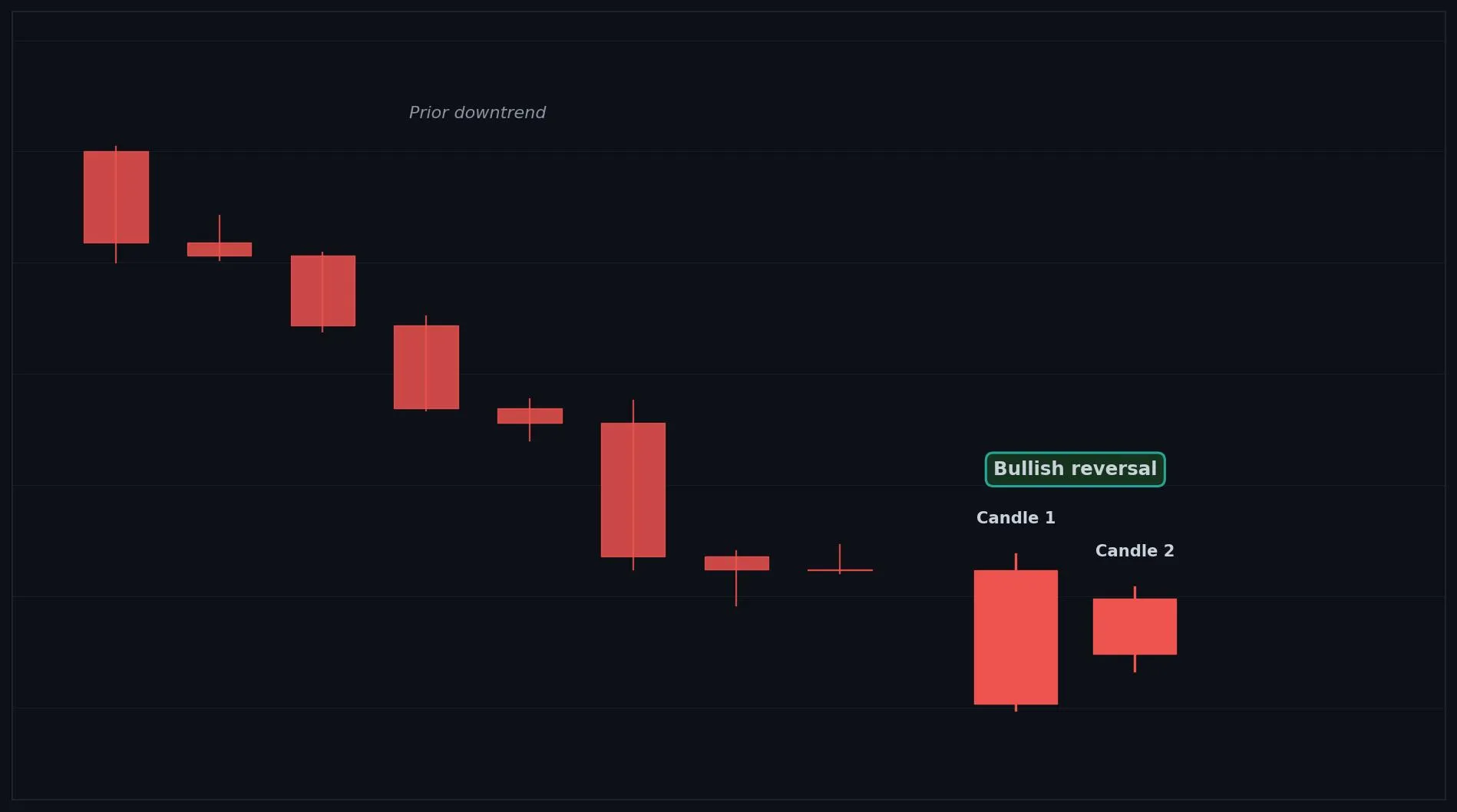
How to Interpret the Homing Pigeon
Bullish: after a downtrend, a Homing Pigeon hints selling is fading and a reversal up may follow with confirmation.
Bearish: although both candles are red, in context it is read as a fading downtrend, not fresh selling.
Neutral: inside a range it carries little meaning.
Common Use Cases
Reversal warning
entry timing after confirmation
a signal of exhausting selling
Advanced Use Cases
Strongest after a downtrend or near a support level, where shrinking bearish candles suggest selling is drying up
Pair with Support levels for a higher conviction trade setup.
CoinQuant Examples
Enter Long when a Homing Pigeon forms after a downtrend and Close crosses above the previous High.
Exit Short when a Homing Pigeon forms at a support level.
Advantages
Highlights fading selling pressure early, even while candles remain bearish.
Limitations
A subtle signal that is easy to miss, only a warning, and needs confirmation before acting.
Works Best With
Support levels
RSI oversold readings
a bullish confirmation candle
Quick Reference
Bias: Bullish
Type: Reversal (early warning)
Trend Context: Strongest after a downtrend
Confirmation Needed: Yes, confirmation is essential
Bullish Doji Star
Overview
A Bullish Doji Star is a two candle reversal hint where a doji forms after a strong bearish candle, pointing to a potential bullish turn.
What Is a Bullish Doji Star?
Two candles: a strong bearish (red) candle first, then a doji (tiny body) that often gaps lower, sitting apart from the first candle's body. Sellers pushed hard on the first candle, but the doji shows momentum suddenly stalled into indecision. After strong selling, this abrupt pause hints a bullish turn may be forming.
Why Traders Use the Bullish Doji Star
Strongest after a strong downtrend or at a support level, where the doji marks a sudden loss of selling momentum
Anatomy
Candle 1 is a strong bearish (red) candle, ideally after a downtrend.
Candle 2 is a doji, with open and close nearly equal.
The doji often gaps below the first candle, showing a sharp stall in selling.
The clearer the doji and the gap, the stronger the reversal hint.
Example
Candle 1 (bearish): Open 102.6, High 102.8, Low 99.9, Close 100.0. Candle 2 (doji): Open 99.4, High 100.1, Low 98.9, Close 99.45. The doji with a near equal open and close after a strong red candle qualifies this as a Bullish Doji Star.
Bullish Doji Star Example Chart
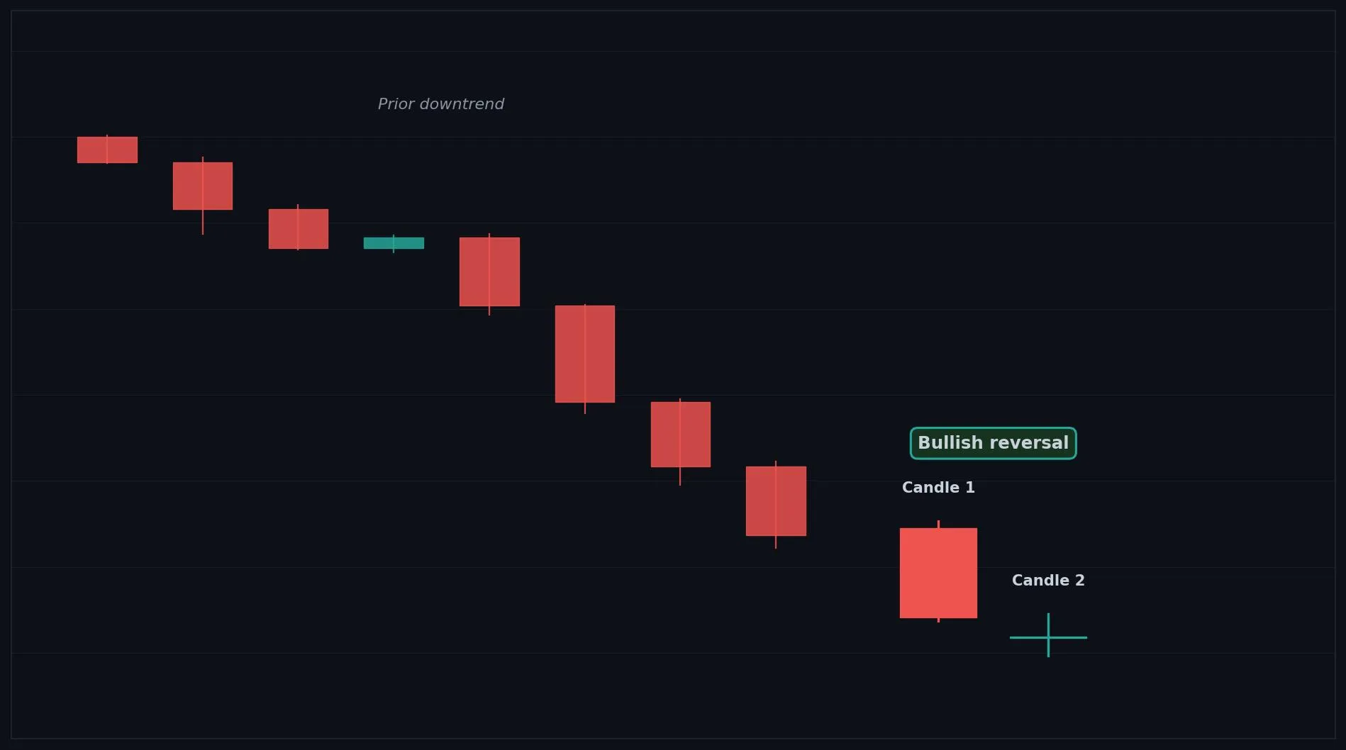
How to Interpret the Bullish Doji Star
Bullish: after a downtrend, a Bullish Doji Star hints sellers are stalling and a reversal up may follow with confirmation.
Bearish: not a bearish signal.
Neutral: the doji itself is neutral, so confirmation is essential.
Common Use Cases
Reversal warning
entry timing after confirmation
a signal of stalling selling
Advanced Use Cases
Strongest after a strong downtrend or at a support level, where the doji marks a sudden loss of selling momentum
Pair with Support levels for a higher conviction trade setup.
CoinQuant Examples
Enter Long when a Bullish Doji Star forms after a downtrend and Close crosses above the previous High.
Exit Short when a Bullish Doji Star forms at a support level.
Advantages
Flags a sharp stall in selling early and often precedes a Morning Star style reversal with confirmation.
Limitations
Only a warning, the doji gives no direction alone, and it needs a confirming candle before acting.
Works Best With
Support levels
RSI oversold readings
a bullish confirmation candle
Quick Reference
Bias: Bullish
Type: Reversal (early warning)
Trend Context: Strongest after a downtrend
Confirmation Needed: Yes, confirmation is essential
Bearish Doji Star
Overview
A Bearish Doji Star is a two candle reversal hint where a doji forms after a strong bullish candle, pointing to a potential bearish turn.
What Is a Bearish Doji Star?
Two candles: a strong bullish (green) candle first, then a doji (tiny body) that often gaps higher, sitting apart from the first candle's body. Buyers pushed hard on the first candle, but the doji shows momentum suddenly stalled into indecision. After strong buying, this abrupt pause hints a bearish turn may be forming.
Why Traders Use the Bearish Doji Star
Strongest after a strong uptrend or at a resistance level, where the doji marks a sudden loss of buying momentum
Anatomy
Candle 1 is a strong bullish (green) candle, ideally after an uptrend.
Candle 2 is a doji, with open and close nearly equal.
The doji often gaps above the first candle, showing a sharp stall in buying.
The clearer the doji and the gap, the stronger the reversal hint.
Example
Candle 1 (bullish): Open 100.0, High 102.7, Low 99.9, Close 102.6. Candle 2 (doji): Open 103.1, High 103.7, Low 102.9, Close 103.15. The doji with a near equal open and close after a strong green candle qualifies this as a Bearish Doji Star.
Bearish Doji Star Example Chart
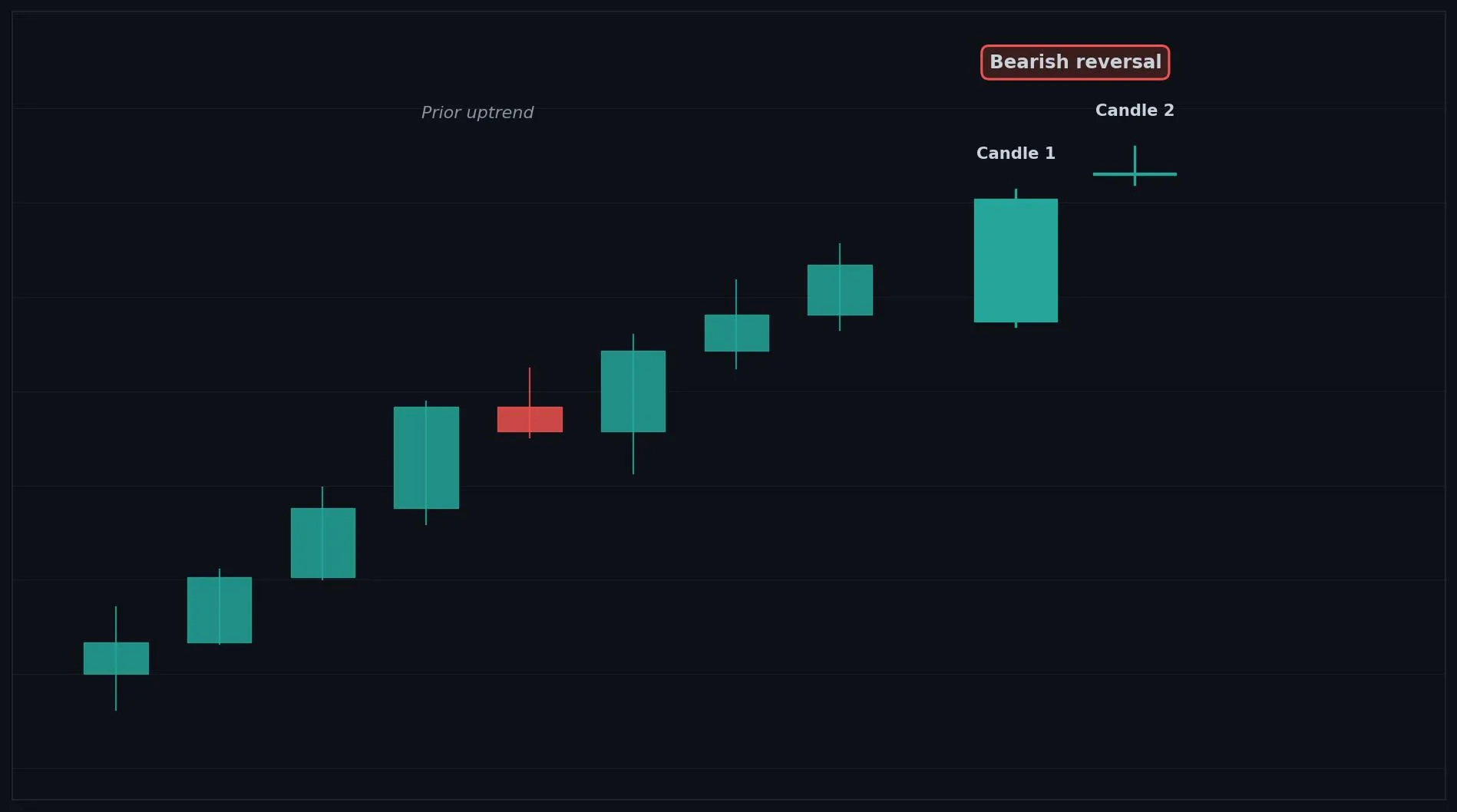
How to Interpret the Bearish Doji Star
Bullish: not a bullish signal.
Bearish: after an uptrend, a Bearish Doji Star hints buyers are stalling and a reversal down may follow with confirmation.
Neutral: the doji itself is neutral, so confirmation is essential.
Common Use Cases
Reversal warning
exit timing after confirmation
a signal of stalling buying
Advanced Use Cases
Strongest after a strong uptrend or at a resistance level, where the doji marks a sudden loss of buying momentum
Pair with Resistance levels for a higher conviction trade setup.
CoinQuant Examples
Exit Long when a Bearish Doji Star forms after an uptrend and Close crosses below the previous Low.
Enter Short when a Bearish Doji Star forms at a resistance level.
Advantages
Flags a sharp stall in buying early and often precedes an Evening Star style reversal with confirmation.
Limitations
Only a warning, the doji gives no direction alone, and it needs a confirming candle before acting.
Works Best With
Resistance levels
RSI overbought readings
a bearish confirmation candle
Quick Reference
Bias: Bearish
Type: Reversal (early warning)
Trend Context: Strongest after an uptrend
Confirmation Needed: Yes, confirmation is essential
Descending Hawk
Overview
A Descending Hawk is a two candle bearish reversal hint made of two bullish candles with shrinking momentum, suggesting buying strength is fading.
What Is a Descending Hawk?
Two candles, both bullish (green): a large first candle, then a smaller second candle whose body sits inside the range of the first, similar to a Harami but with both candles green. Buyers stayed in control on both candles, but the much smaller second candle shows their momentum is shrinking. Buying that fades this way after an uptrend hints a top may be near.
Why Traders Use the Descending Hawk
Strongest after an uptrend or near a resistance level, where shrinking bullish candles suggest buying is drying up
Anatomy
Candle 1 is a large bullish (green) candle, ideally after an uptrend.
Candle 2 is a smaller bullish (green) candle.
Candle 2's body sits inside Candle 1's body.
The shrinking second candle shows buying pressure is fading.
Example
Candle 1 (bullish): Open 100.0, High 102.6, Low 99.9, Close 102.4. Candle 2 (bullish): Open 100.6, High 102.1, Low 100.4, Close 101.9. Candle 2's smaller body sits inside Candle 1's body, which qualifies as a Descending Hawk.
Descending Hawk Example Chart
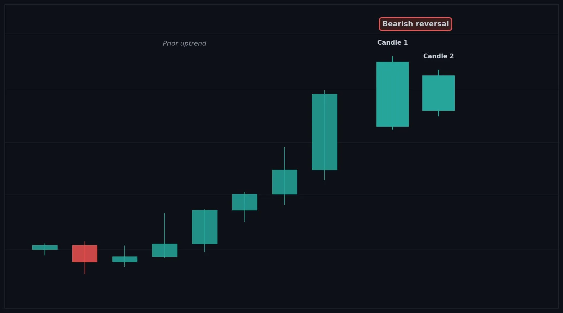
How to Interpret the Descending Hawk
Bullish: although both candles are green, in context it is read as a fading uptrend, not fresh buying.
Bearish: after an uptrend, a Descending Hawk hints buying is fading and a reversal down may follow with confirmation.
Neutral: inside a range it carries little meaning.
Common Use Cases
Reversal warning
exit timing after confirmation
a signal of exhausting buying
Advanced Use Cases
Strongest after an uptrend or near a resistance level, where shrinking bullish candles suggest buying is drying up
Pair with Resistance levels for a higher conviction trade setup.
CoinQuant Examples
Exit Long when a Descending Hawk forms after an uptrend and Close crosses below the previous Low.
Enter Short when a Descending Hawk forms at a resistance level.
Advantages
Highlights fading buying pressure early, even while candles remain bullish.
Limitations
A subtle signal that is easy to miss, only a warning, and needs confirmation before acting.
Works Best With
Resistance levels
RSI overbought readings
a bearish confirmation candle
Quick Reference
Bias: Bearish
Type: Reversal (early warning)
Trend Context: Strongest after an uptrend
Confirmation Needed: Yes, confirmation is essential
Piercing Pattern
Overview
A Piercing Pattern is a two candle bullish reversal where a bullish candle closes deep into the prior bearish candle, signaling reversal strength.
What Is a Piercing Pattern?
Two candles: a bearish (red) candle first, then a bullish (green) candle that opens below the prior low but closes above the midpoint of the prior body. Sellers looked in control when the second candle gapped down at the open, but buyers stormed back and pushed price deep into the prior candle. Recovering more than half the prior loss shows strong returning demand.
Why Traders Use the Piercing Pattern
Strongest after a clear downtrend or at a support level, where the deep close shows buyers reclaiming ground
Anatomy
Candle 1 is a bearish (red) candle, ideally after a downtrend.
Candle 2 is a bullish (green) candle that opens below Candle 1's low.
Candle 2 closes above the midpoint of Candle 1's body, but below its open.
The deeper Candle 2 closes into Candle 1, the stronger the reversal signal.
Example
Candle 1 (bearish): Open 102.6, High 102.8, Low 100.0, Close 100.2. Candle 2 (bullish): Open 99.3, High 102.1, Low 99.0, Close 102.0. Candle 2 opened below Candle 1's low and closed above its midpoint (101.4), which qualifies as a Piercing Pattern.
Piercing Pattern Example Chart
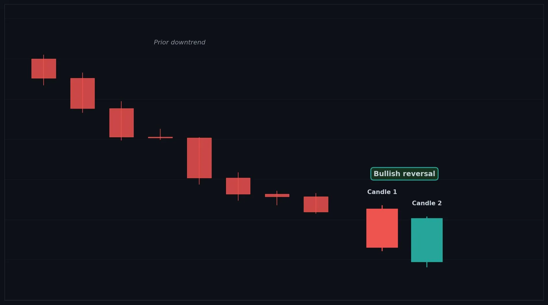
How to Interpret the Piercing Pattern
Bullish: after a downtrend, a Piercing Pattern signals buyers are stepping back in and a reversal up may follow.
Bearish: not a bearish signal; the mirror image is Dark Cloud Cover.
Neutral: inside a range it is weaker and needs confirmation.
Common Use Cases
Reversal confirmation
entry timing near support
a signal that selling is being overpowered
Advanced Use Cases
Strongest after a clear downtrend or at a support level, where the deep close shows buyers reclaiming ground
Pair with Support levels for a higher conviction trade setup.
CoinQuant Examples
Enter Long when a Piercing Pattern forms after a downtrend and Close crosses above the previous High.
Exit Short when a Piercing Pattern forms at a support level.
Advantages
A strong reversal signal, nearly as powerful as an engulfing, showing buyers reclaiming lost ground.
Limitations
Slightly weaker than a full engulfing, needs the close above the midpoint to be valid, and benefits from confirmation.
Works Best With
Support levels
RSI oversold readings
rising volume on the bullish candle
Quick Reference
Bias: Bullish
Type: Reversal
Trend Context: Strongest after a downtrend
Confirmation Needed: Confirmation and volume strengthen it
Dark Cloud Cover
Overview
A Dark Cloud Cover is a two candle bearish reversal where a bearish candle closes deep into the prior bullish candle, signaling increased reversal risk.
What Is a Dark Cloud Cover?
Two candles: a bullish (green) candle first, then a bearish (red) candle that opens above the prior high but closes below the midpoint of the prior body. Buyers looked in control when the second candle gapped up at the open, but sellers took over and pushed price deep into the prior candle. Erasing more than half the prior gain shows strong returning supply.
Why Traders Use the Dark Cloud Cover
Strongest after a clear uptrend or at a resistance level, where the deep close shows sellers reclaiming ground
Anatomy
Candle 1 is a bullish (green) candle, ideally after an uptrend.
Candle 2 is a bearish (red) candle that opens above Candle 1's high.
Candle 2 closes below the midpoint of Candle 1's body, but above its open.
The deeper Candle 2 closes into Candle 1, the stronger the reversal signal.
Example
Candle 1 (bullish): Open 100.2, High 102.8, Low 100.0, Close 102.6. Candle 2 (bearish): Open 103.4, High 103.7, Low 100.6, Close 100.8. Candle 2 opened above Candle 1's high and closed below its midpoint (101.4), which qualifies as a Dark Cloud Cover.
Dark Cloud Cover Example Chart
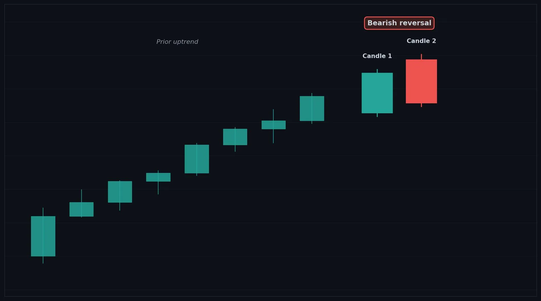
How to Interpret the Dark Cloud Cover
Bullish: not a bullish signal; the mirror image is the Piercing Pattern.
Bearish: after an uptrend, a Dark Cloud Cover signals sellers are stepping in and a reversal down may follow.
Neutral: inside a range it is weaker and needs confirmation.
Common Use Cases
Reversal confirmation
exit timing near resistance
a signal that buying is being overpowered
Advanced Use Cases
Strongest after a clear uptrend or at a resistance level, where the deep close shows sellers reclaiming ground
Pair with Resistance levels for a higher conviction trade setup.
CoinQuant Examples
Exit Long when a Dark Cloud Cover forms after an uptrend and Close crosses below the previous Low.
Enter Short when a Dark Cloud Cover forms at a resistance level.
Advantages
A strong reversal signal, nearly as powerful as an engulfing, showing sellers reclaiming lost ground.
Limitations
Slightly weaker than a full engulfing, needs the close below the midpoint to be valid, and benefits from confirmation.
Works Best With
Resistance levels
RSI overbought readings
rising volume on the bearish candle
Quick Reference
Bias: Bearish
Type: Reversal
Trend Context: Strongest after an uptrend
Confirmation Needed: Confirmation and volume strengthen it
