
User-Friendly Backtesting Software: The 2026 Usability Scorecard

"User-friendly" is the most abused phrase in software marketing. Every platform claims it; almost none define it. So here is a working definition: user friendly backtesting software gets you from a strategy idea to a trustworthy result with the fewest steps, the least code, and no hidden homework.
Judged that way, usability is not about pretty charts. It is about time-to-value, and it is measurable in an afternoon.
This scorecard compares the major platforms on five named criteria, using documented capabilities rather than vibes. Every cell traces to a fact you can check in the product, not a number we invented.
User Friendly Backtesting Software: The Five Criteria That Matter
- Time to first backtest. How long from opening the tool to seeing your first result? The less setup between you and evidence, the better.
- No-code depth. Can a non-programmer define a real strategy, or does serious testing eventually require code?
- Clarity of results. Does the report arrive complete, with drawdown, fees, and profit factor visible, or do you have to compute the risk picture yourself?
- Iteration speed. How cheap is the second test, and the tenth? Strategy work is a loop, and the loop should not punish you.
- Data transparency. Can you name the price data behind a result without a support ticket?
These five decide whether the tool is pleasant for a demo and painful in practice, or the reverse.
The 2026 Usability Scorecard
Ratings reflect documented workflow facts checked in September 2026, not opinion scores. "Strong" means the product does it out of the box; "Moderate" means it works with extra effort or a template; "Limited" means the workflow caps out or bends back toward code.
| Criterion | CoinQuant | TradingView | Coinrule | Composer |
|---|---|---|---|---|
| Time to first backtest | Strong: describe the strategy and run | Moderate: template or script needed | Moderate: rule building plus account setup | Moderate: template-led workflow |
| No-code depth | Strong: plain English to tested strategy | Limited: custom logic runs on Pine Script | Strong: rule-based builder | Strong: visual strategy building |
| Clarity of results | Strong: full metric set, fees included | Moderate: depends on what the script reports | Moderate: tier and workflow dependent | Moderate: backtest stats available |
| Iteration speed | Strong: re-prompt and re-run | Moderate: edit code, re-run | Moderate: edit rules, re-run | Moderate: edit strategy, re-run |
| Data transparency | Strong: Kaiko feeds, exchanges named | Moderate: exchange feeds labeled per market | Limited: not detailed in reviewed public sources | Moderate: US market data; crypto discontinued in 2026 |
Read the table as a map of working styles, not a leaderboard. TradingView is a charting-first platform where custom testing runs on Pine Script. Coinrule optimizes for automation workflows. Composer builds US stock and ETF strategies visually, and it stepped away from crypto assets after January 2026. CoinQuant is the one built crypto-first around plain-English validation, which is why it leads this particular rubric.
What "Strong" Actually Looks Like in Practice
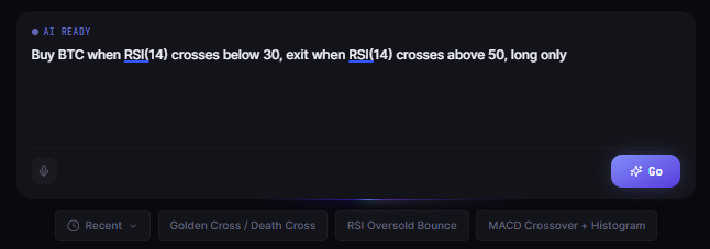
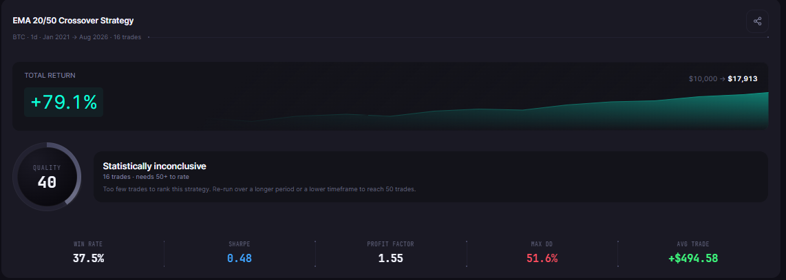
On a platform that scores well, the workflow feels like this. You type the strategy the way you would explain it to a colleague: "Buy BTC when RSI(14) crosses below 30, exit when RSI(14) crosses above 50, long only." You pick the window, run it, and read a report with total return, win rate, profit factor, Sharpe ratio, max drawdown, and total fees already in place.
Then the second test takes one edit. That property, a cheap second test, is the real usability feature. Everything else is decoration.
What the Scorecard Does Not Measure
A note on honesty: this rubric scores workflow, not profits. A friendly tool does not make a strategy good, and a clunky one does not make it bad. Usability decides how fast you learn and how cheaply you iterate; the edge decisions still come from the numbers. If a platform ever sells ease of use as a shortcut to results, walk away. The scorecard exists to remove friction from the research loop, nothing more.
The Usability Traps Buyers Fall For
- The demo effect. Beautiful onboarding is not the same as a fast tenth iteration. Watch where the workflow slows down.
- "No-code" that needs code eventually. Ask what happens when the strategy grows beyond two conditions.
- The hidden setup tax. API keys, connector settings, and data add-ons can turn a five-minute promise into a weekend project.
- Incomplete reports. A tool that shows return but not drawdown moves the risk math back onto you.
- Free tiers that cannot finish the loop. A trial that cannot complete a full backtest teaches you nothing about the tool.
How to Run Your Own Usability Test in an Afternoon
- Write one strategy idea down in plain English before you open any tool.
- In each candidate, clock how long until the first completed backtest.
- Check the report for the full metric set and the fee line.
- Make one change and run the second test. Time that too.
- Ask where the data comes from without leaving the product.
Five steps, one afternoon, and you will know more about usability than any marketing page can tell you.
The Practical Lesson
- Usability equals time to a trustworthy result, not visual polish
- Five criteria separate pleasant demos from pleasant workflows: setup time, no-code depth, result clarity, iteration speed, data transparency
- The cheap second test is the single best usability signal in any tool
- Score candidates yourself in an afternoon; the marketing copy loses that contest
See why traders choose CoinQuant's plain-English workflow on CoinQuant
Disclaimer:
This content is for educational and informational purposes only and does not constitute financial, investment, or trading advice. All strategies and examples are for illustrative purposes and do not guarantee results. Always conduct your own research before making financial decisions.
